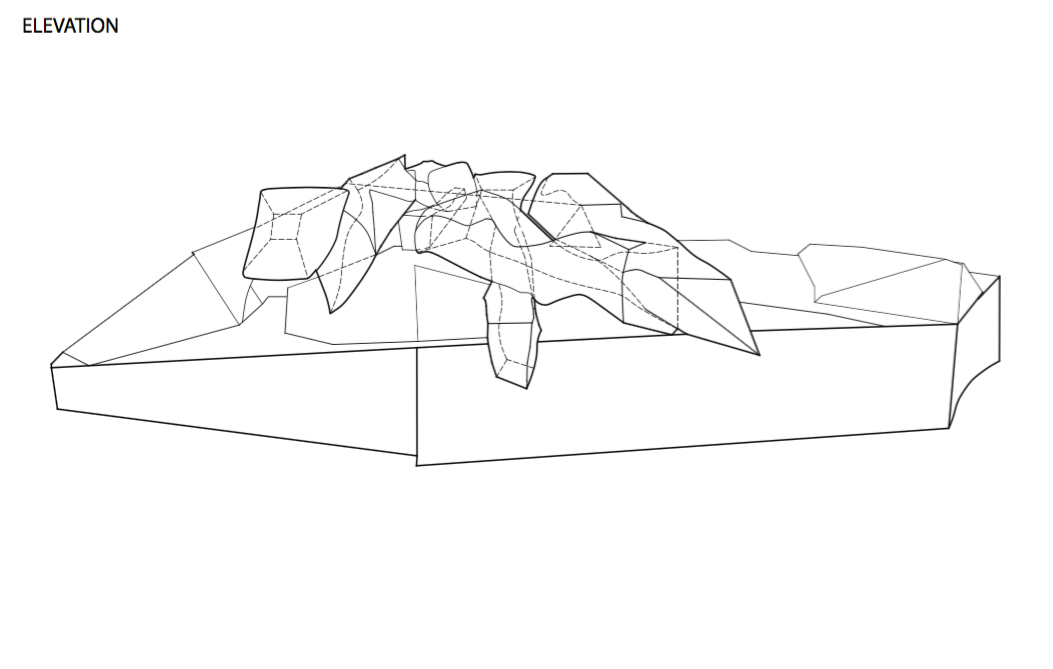
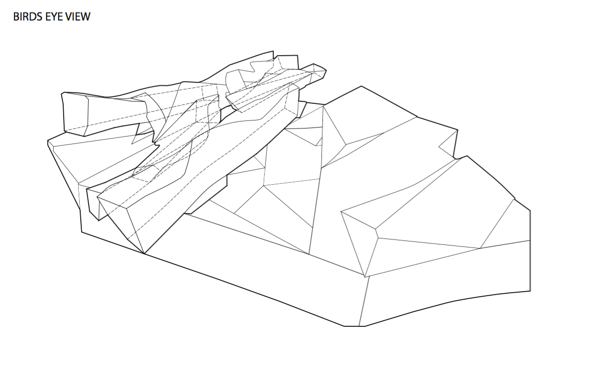
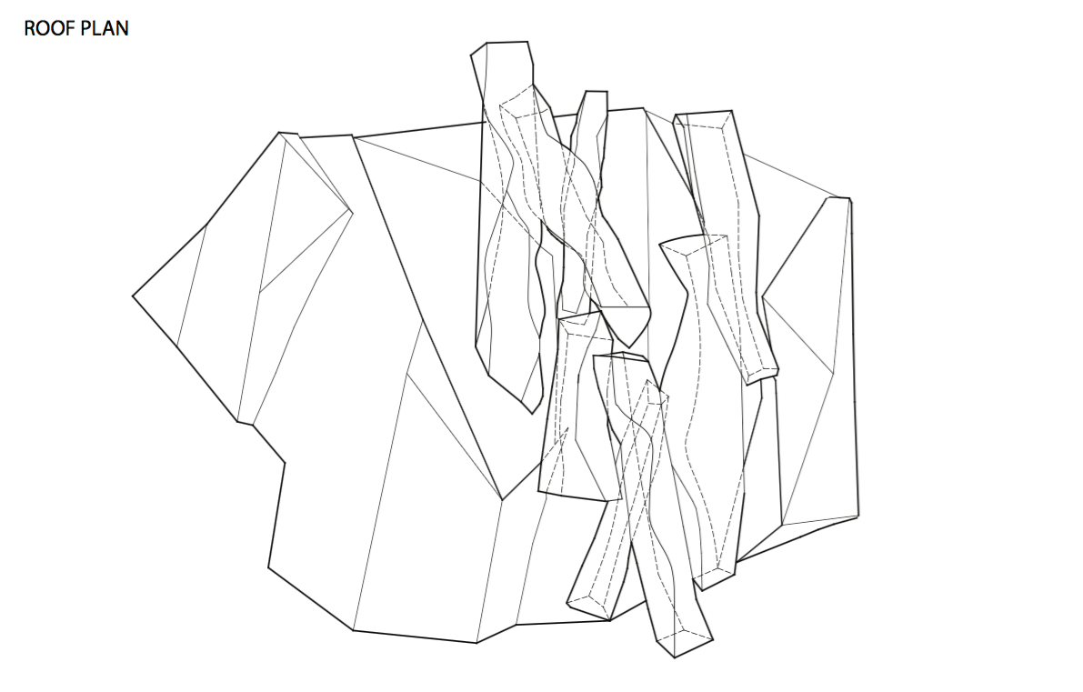
These drawings were hand drawn from photographs, scanned, traced in Rhino, then exported to illustrator to differentiate line weights. The dashed lines represent what is unseen.
This excercise was built to develop our drawing skills on many interfaces. The line weights were essential to make a two-dimensional drawing look three-dimensional.
Both the outline of the mass and the ground were the heaviest lines in order to differentiate the two. The voids were also given heavier line weights in order to establish depth. To provide perspective the objects in the back were given lighter lines compared to the ones in the front that had darker.
All of these drawings show different perspectives that are essential for the section cuts to be made in future weeks.


