Reflection and Summary

The theme running throughout class and in W.J.R  Curtis’ Modern Architecture since 1900 is that structures are constantly evolving from each other. There are no truly original ideals in architecture because everything is constructed in reaction to one another. This reaction can be either positive or negative.

For example Le Corbusier’s Villa Savoye was inspired by the Parthenon of ancient Greece. His five points of architecture includes pilotis, the stilts on which the building is raised off the ground. These are reinterpreted classical columns that surround the Parthenon. The procession to the Villa by car can also be compared to the ceremonial route found in the Acropolis. Lastly, the color scheme of white exterior,  blue roof garden forms, and dark recessed walls refer back to the polychromy scheme of the Parthenon. Although these structures were generations apart and were both considered revolutionary during their times, they still share fundamental architectual elements in common.

Another instance is the Vienna Secession Building of 1897 in Vienna, Austria.  It was built in the secession style, a branch of Art Nouveau,  with simplified geometric forms. When breaking down the shapes it refers back to the Pantheon of Rome. It has a interpreted dome, columns, and pediment which  originated from the Roman temple built in 125 CE.

These are just the few instances where the classical was reinvented into new structures and styles. Robert Venturi also based his work off of the Modernist movement but he rejected it and constructed an entirely new movement: the post modern.

Considering it too cold and simplistic, Venturi complicates his designs with contradicting elements that create dynamic tension his his projects. For example in the Venturi house he has a broad entrance but the doorway is actually tucked on the side. The proportions are very skewed as well, with exaggerated forms like the centralized fireplace that is broken by the front facade.

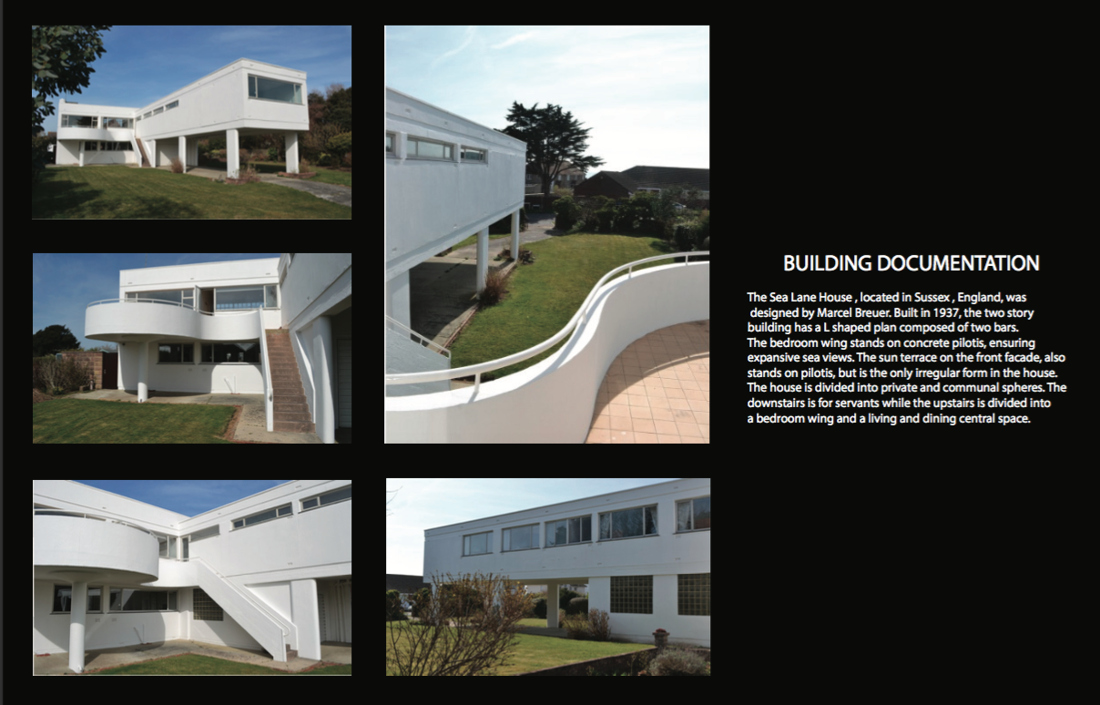
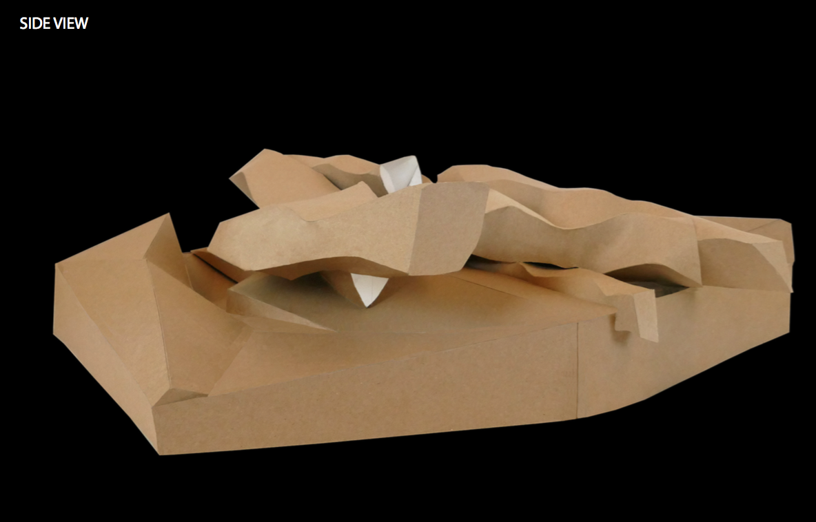
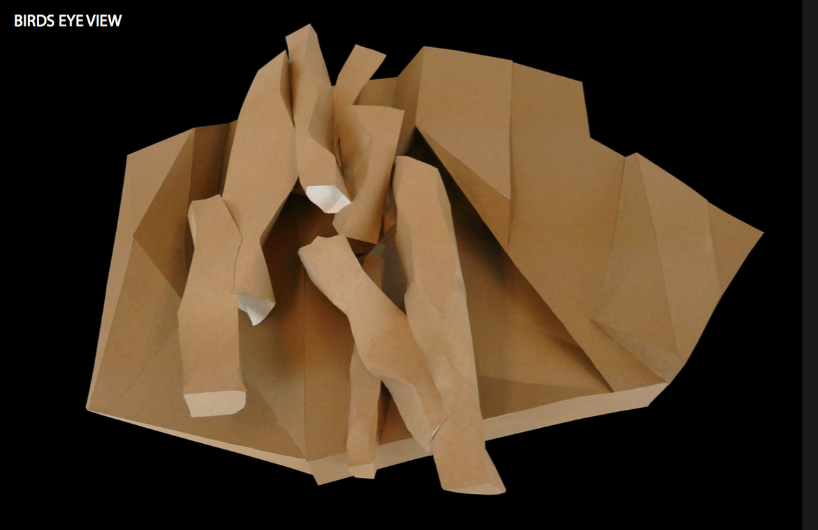
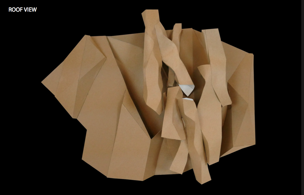
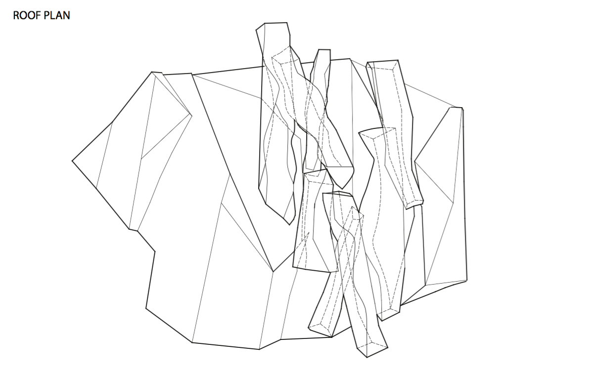
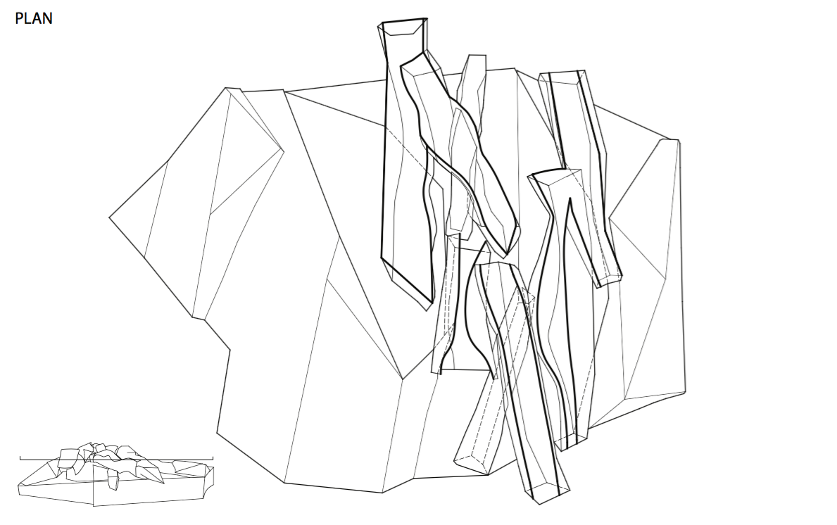
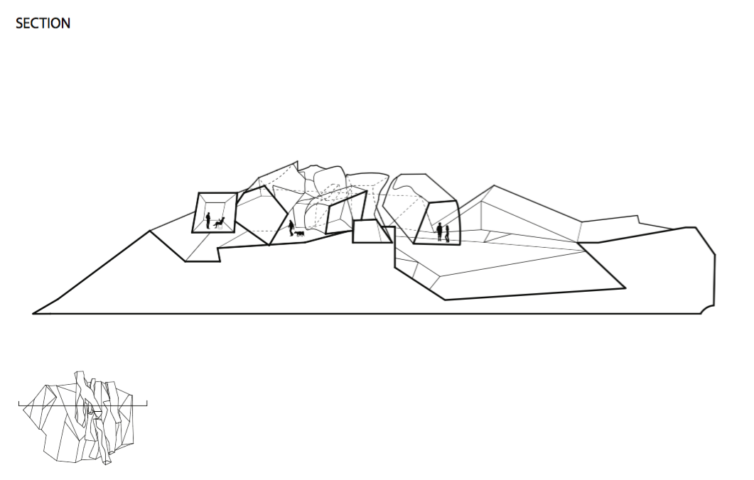
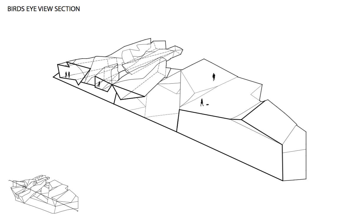
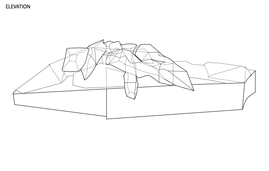
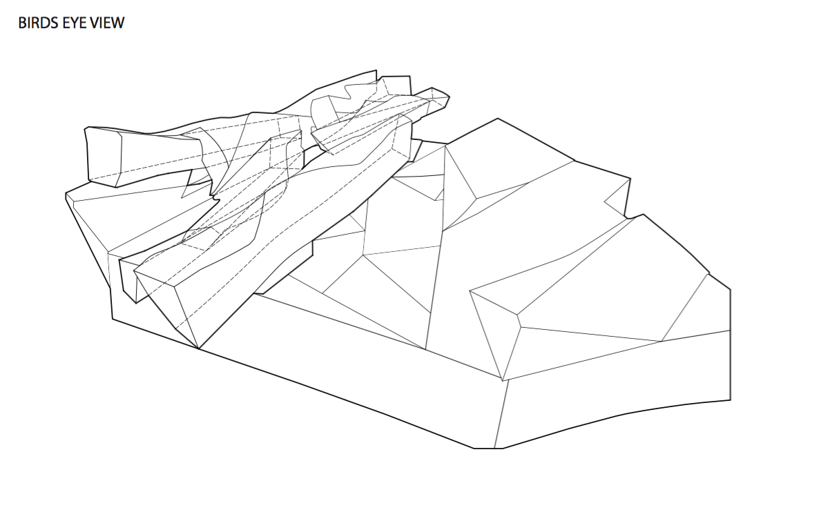
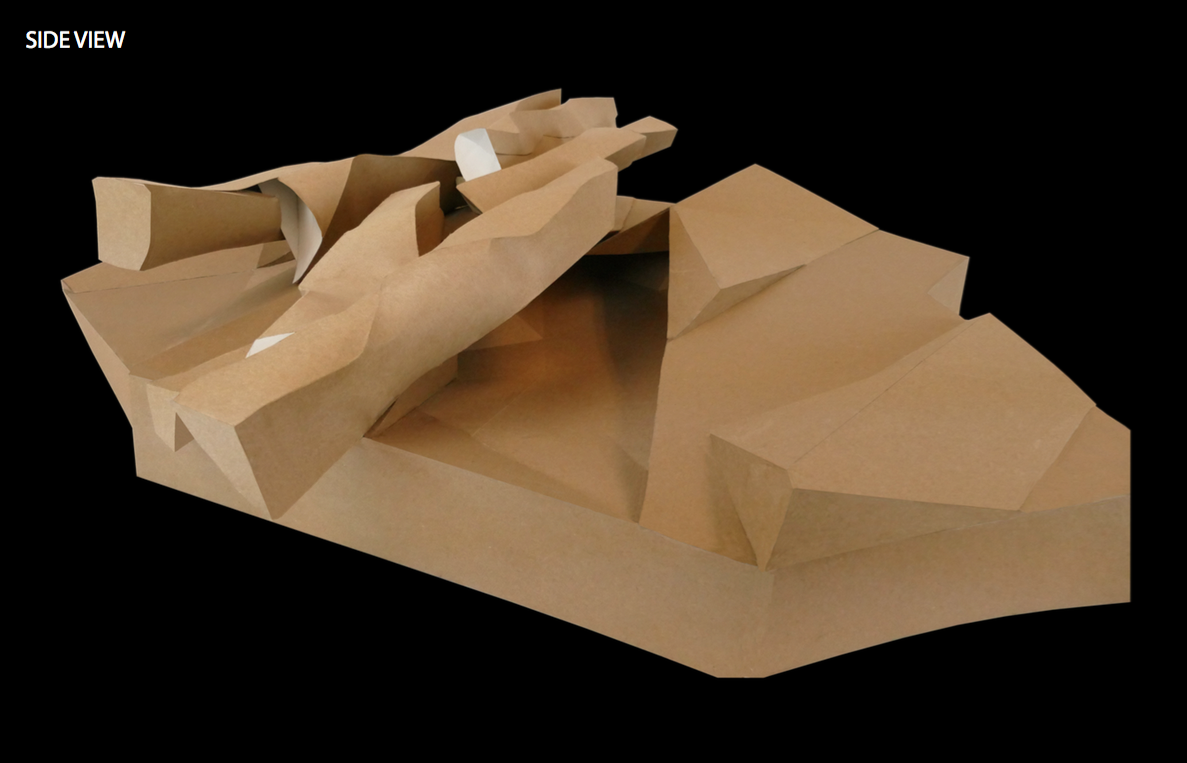
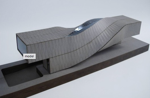
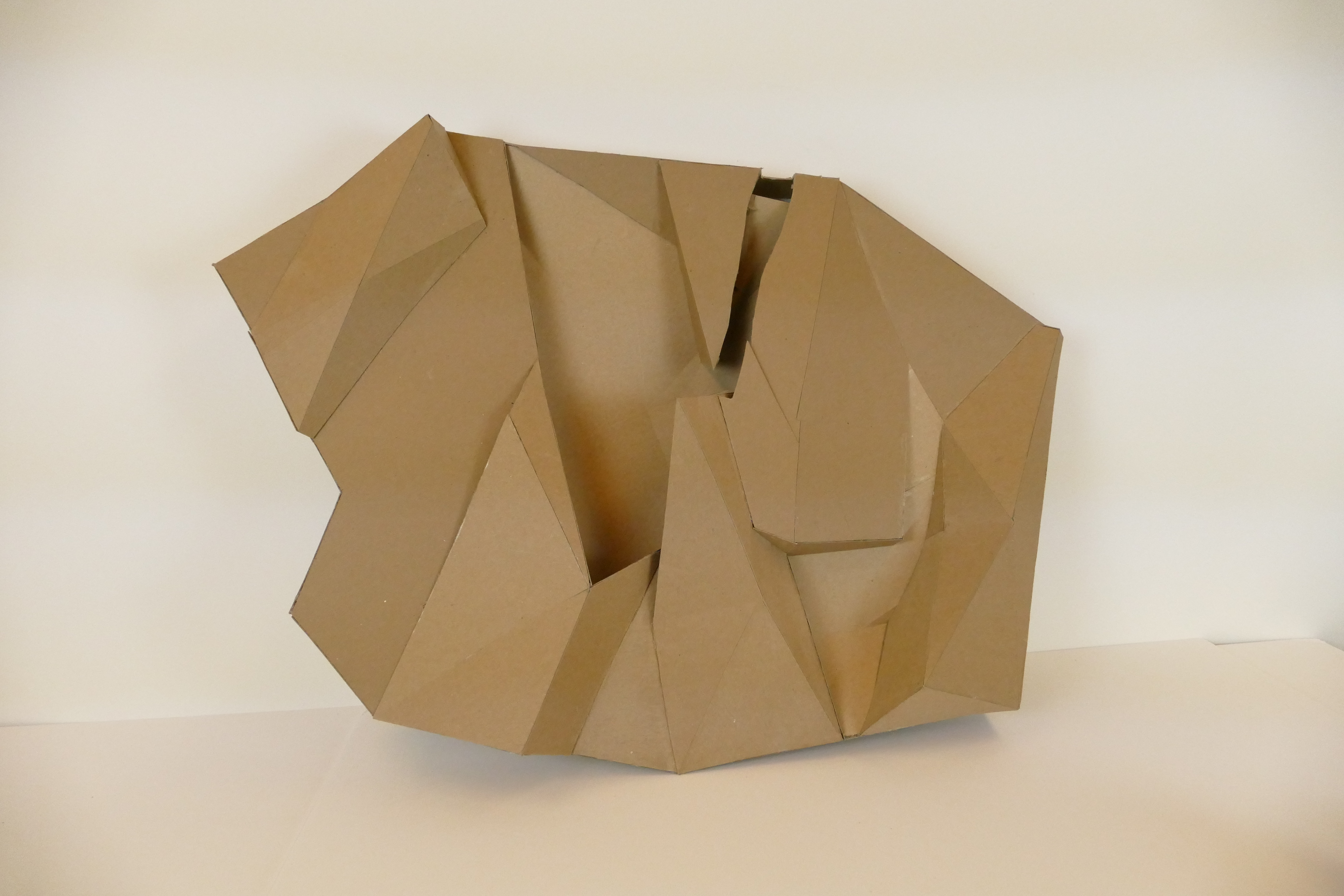
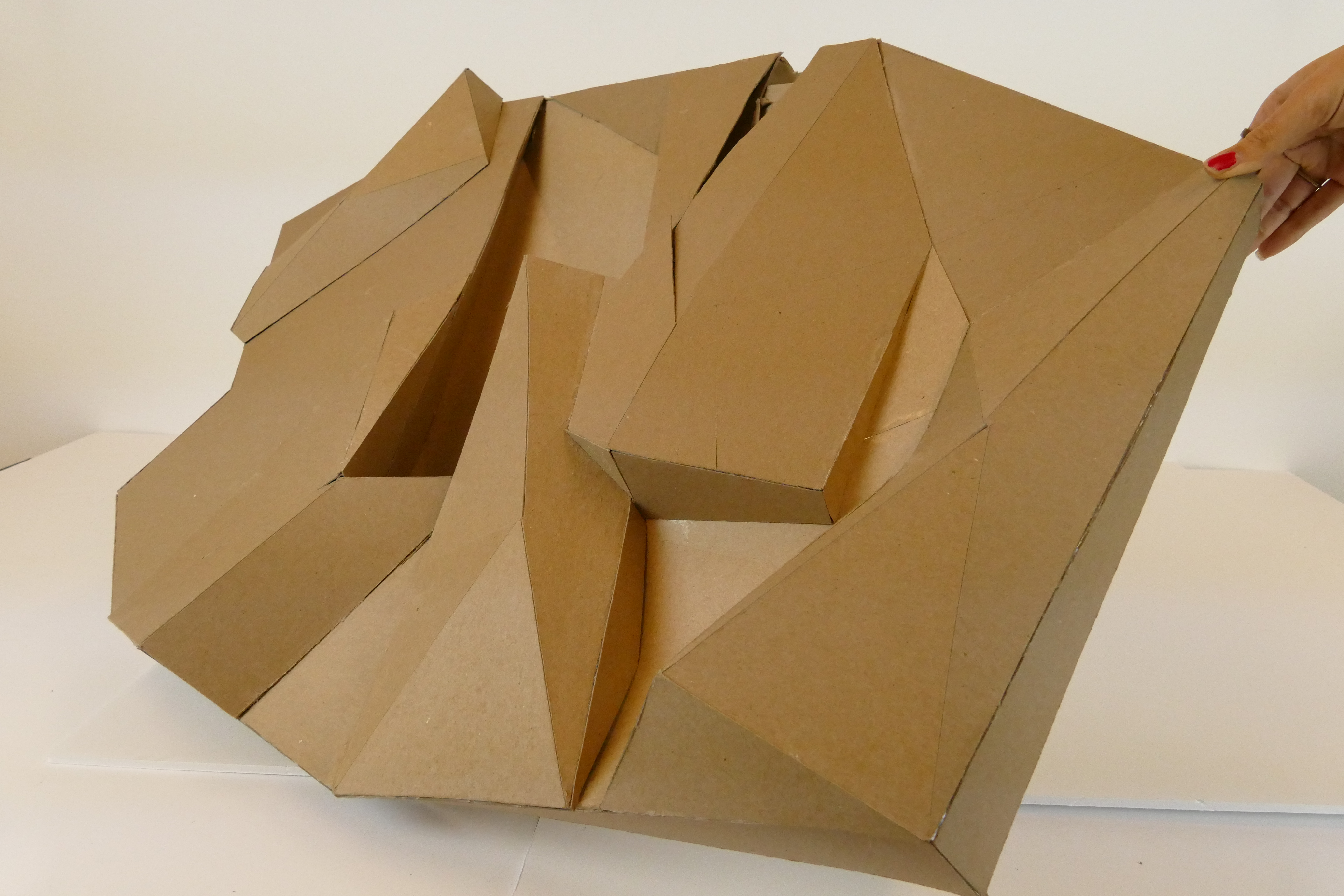
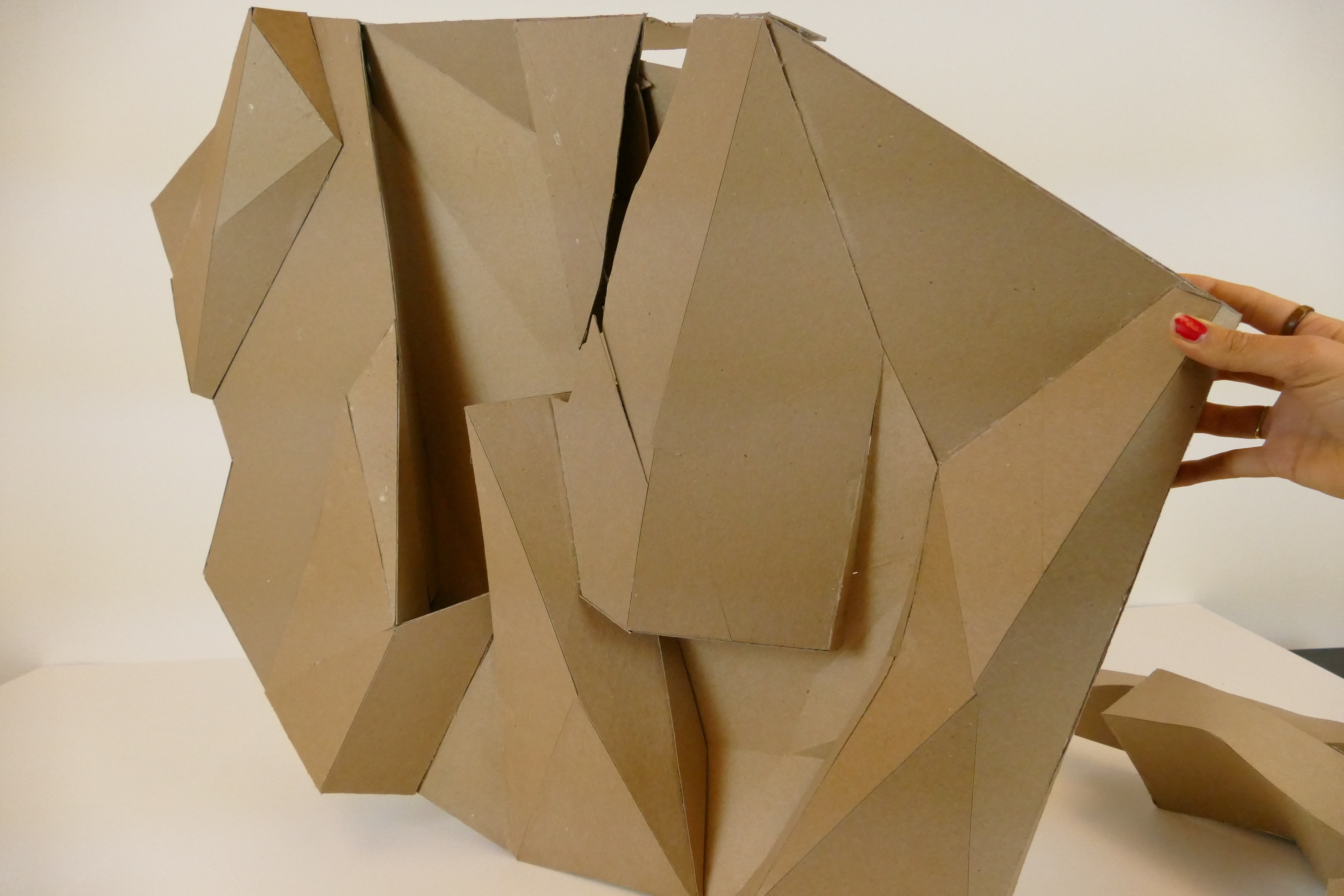
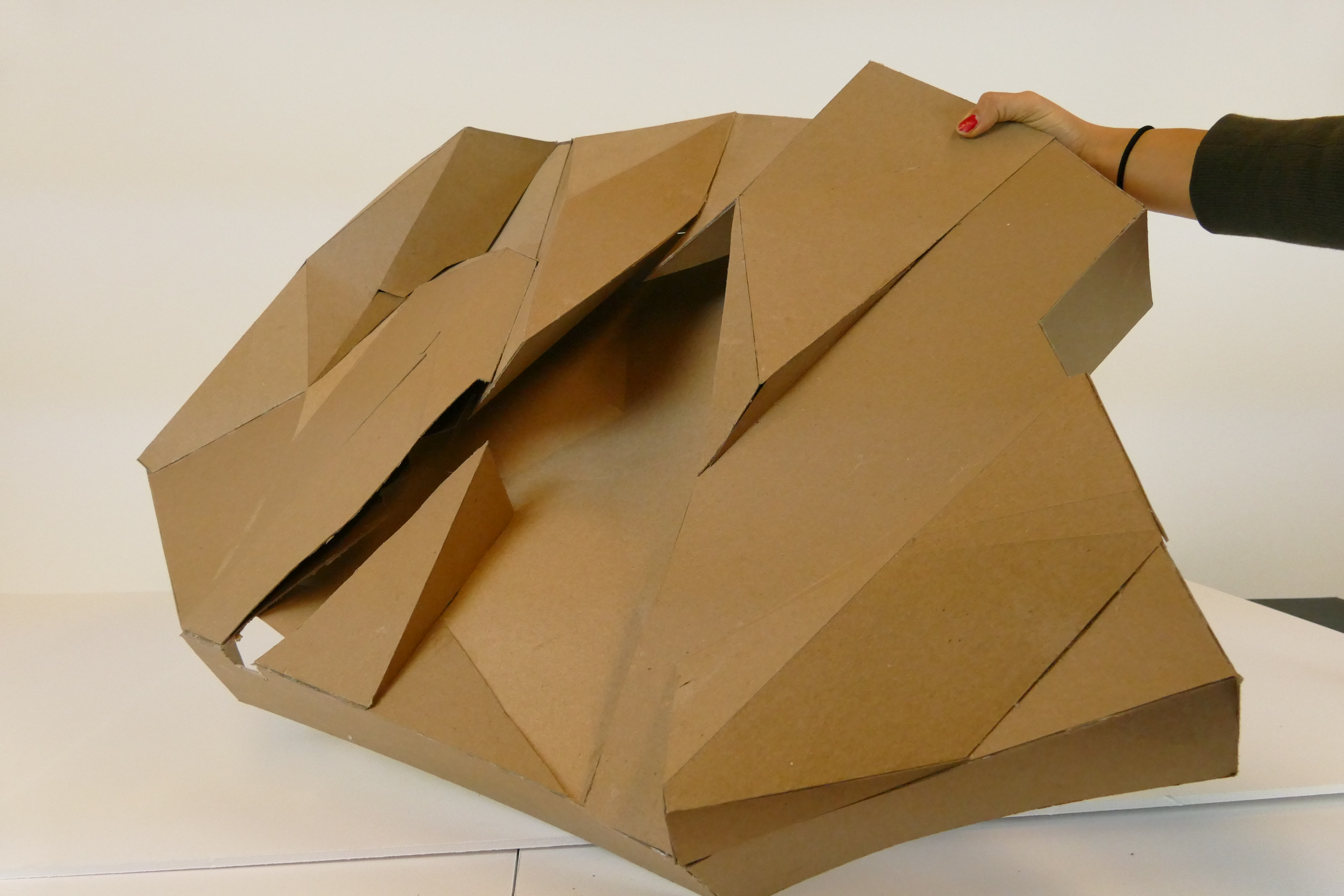
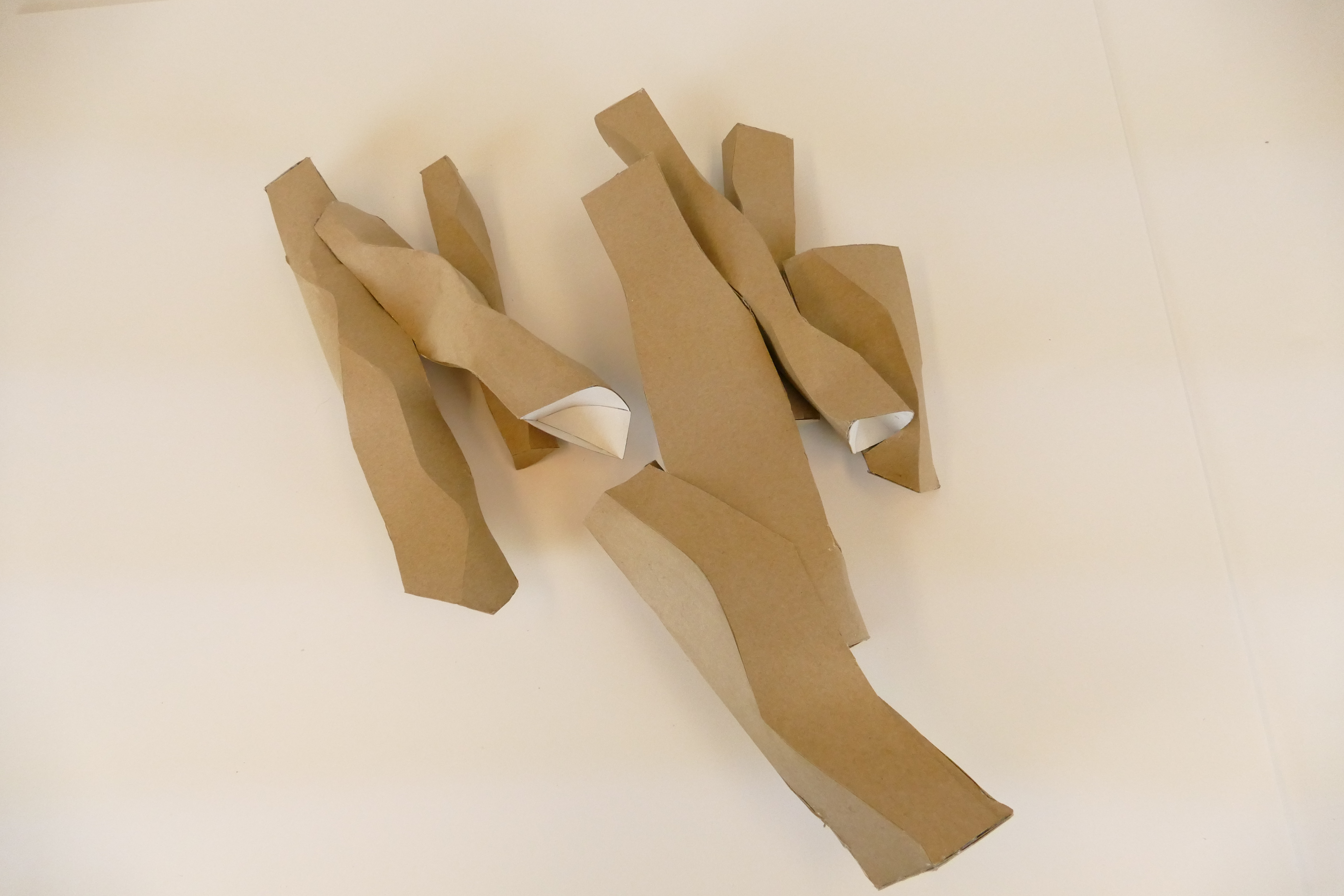
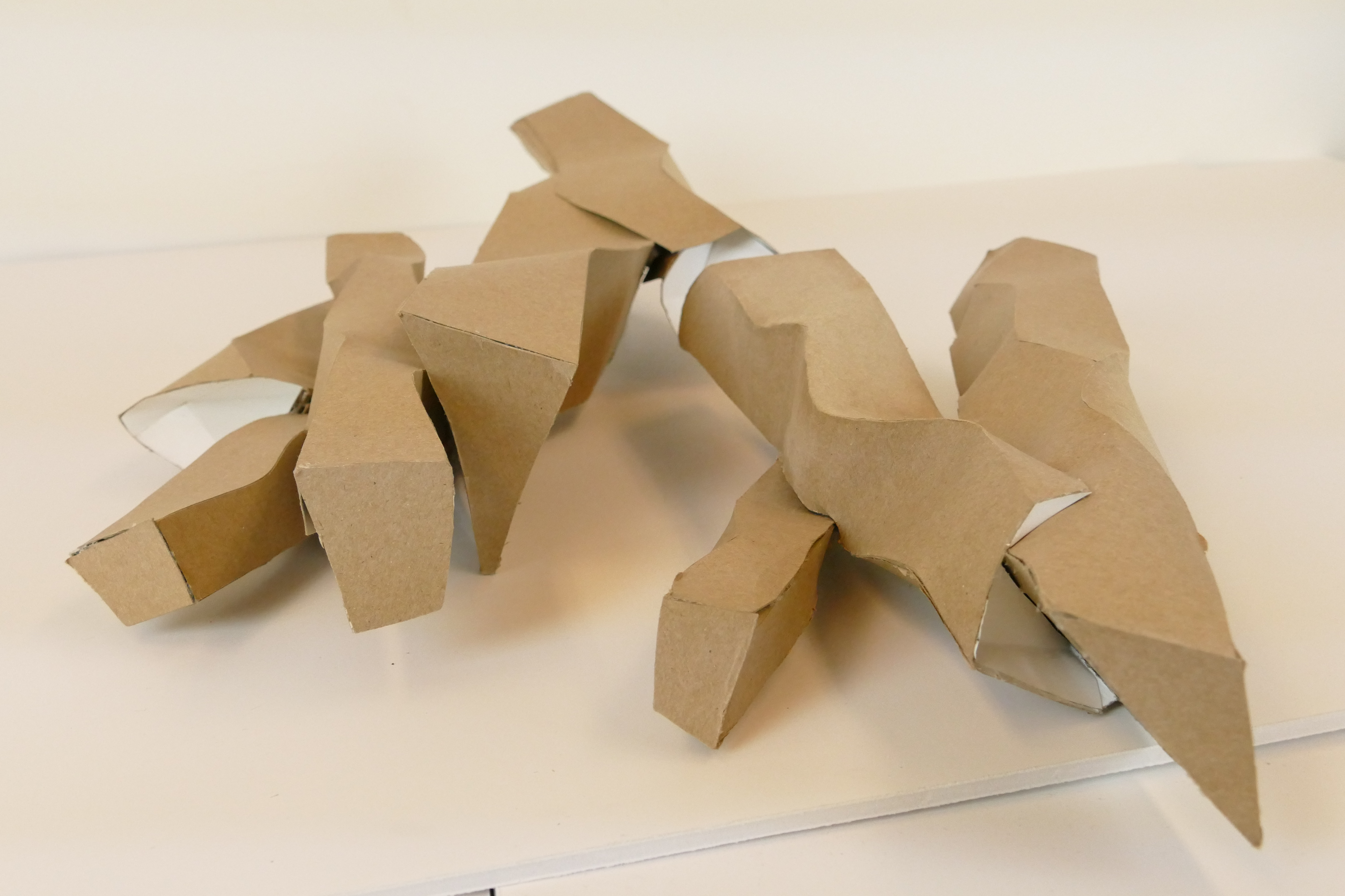
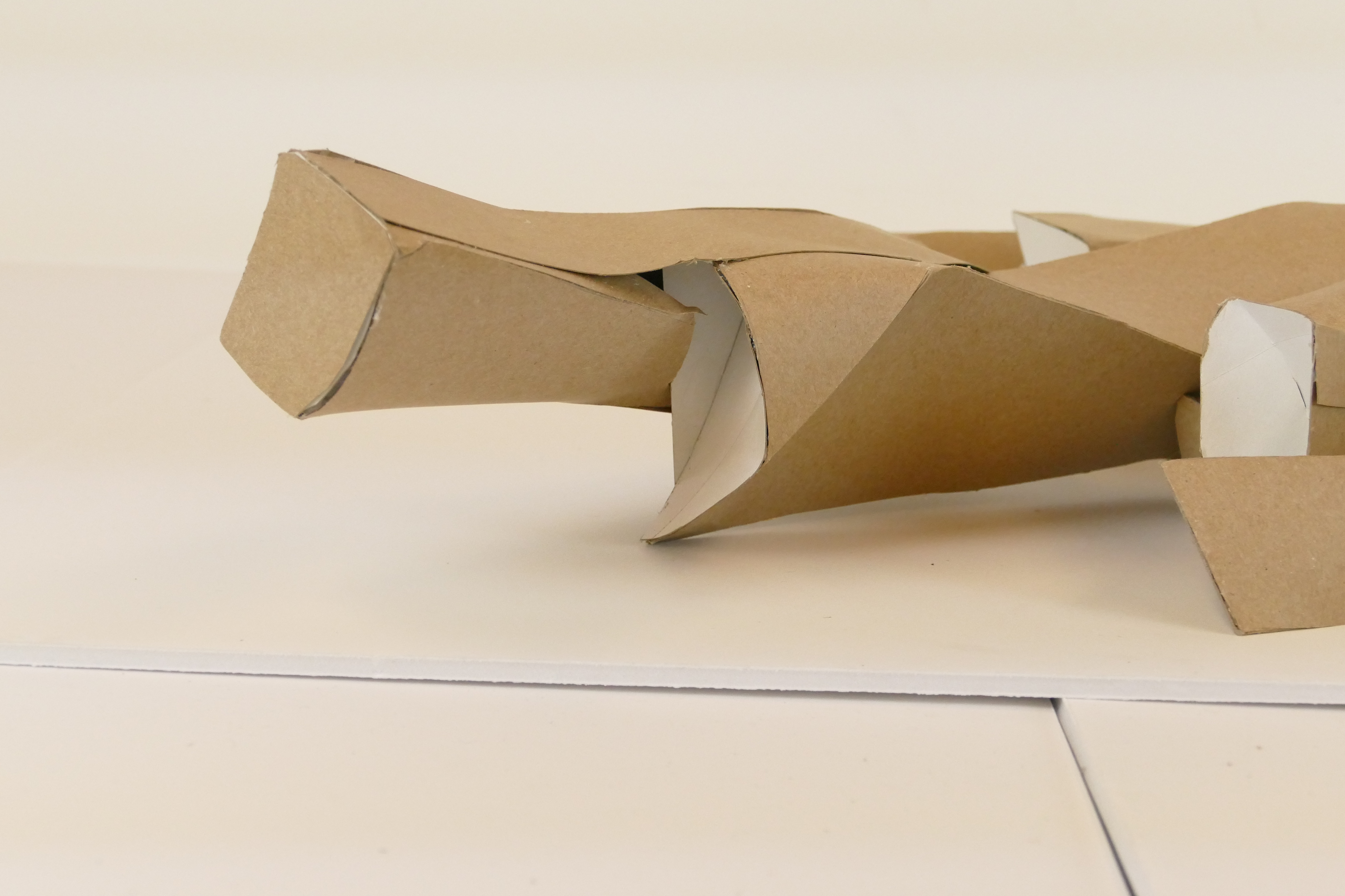
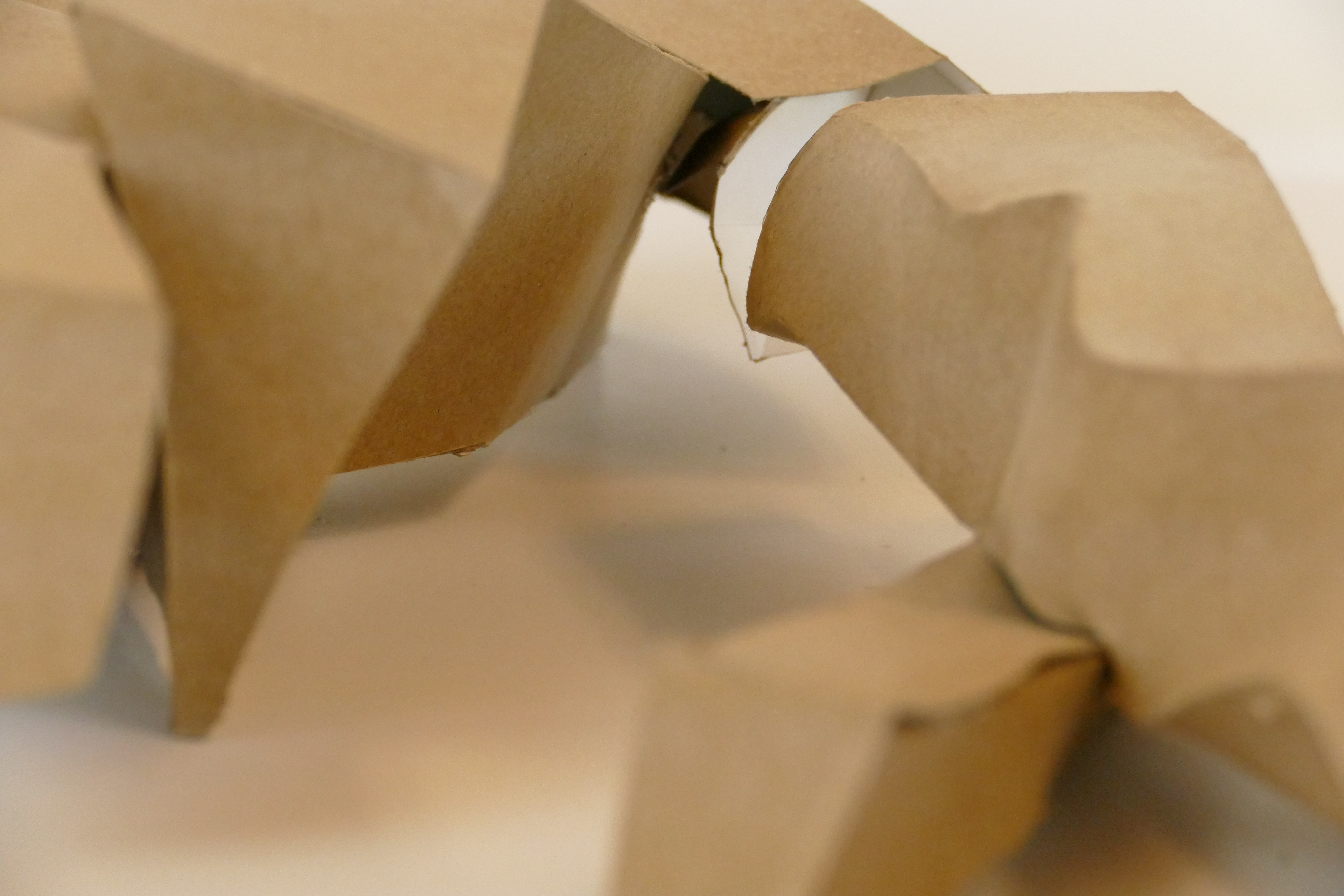
Jean’s project is also based on the idea of taking an old overly abused architectual principle and transforming it. However, although the new structure is unrecognizable the underlying current that connects it to the existing Breuer house it still there. For example the Sea Lane House’s bedroom wing is suspended on pilotis. Although, my model does not have pilotis the mass still hovers over the ground giving that interstitial space that is provided by pilotis.

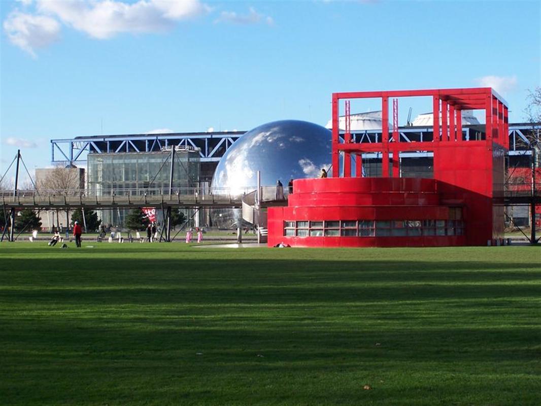
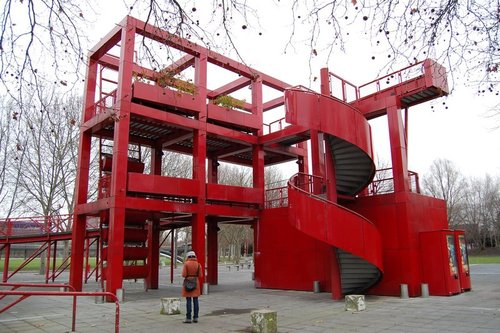
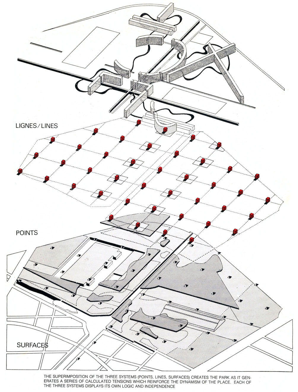
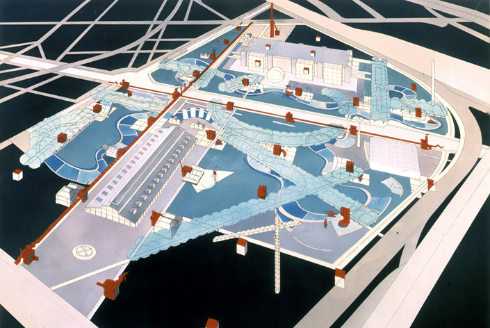
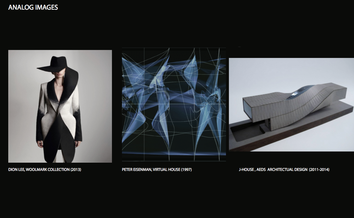
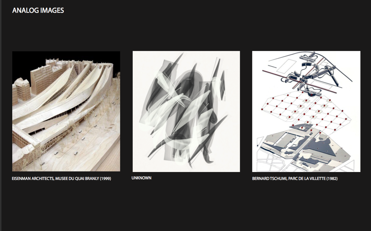
I also used many architects existing work to inspire me. For instance Bernards Tshumi’s Parc or Peter Eisenman’s Wexner building both share the overlapping grid concept that is prevalent in my project.

Although architecture is constantly evolving it has to be based in guiding principles. However, these principles could be rejecting or accepting  but it is always a reaction to them. This blog as well as the  Architectual history class taught by Micheal Davis enabled me to come to this conclusion. The class also stressed the importance of learning the history because knowing the rules of architecture allows one to break or develop them.

In both classes I have not only developed technical skills but also reasoning and analysis skills. This understanding allows me to draw connections between projects and concepts. I can then use these ideals to create well informed decisions about my own design process as I did with the transformed Sea Lane House.

Parc de la Villette, Bernard Tschumi

Project: Parc De la Villette

Architect: Bernard Tschumi

Year: 1982-1998

Location: Paris

The design principle for the park was to mark the vision of an era and to embody the future economic and cultural development of Paris. It is the third largest park in the world and includes many cultural venues such as three major concert halls, the Conservatoire de Paris, and the Cité des Sciences et de l’Industrie.

Designed by Bernard Tschumi, the park is  inspired by the post-modernist architectural ideas of deconstructionism. The park was intended to create space for activity and interaction, rather than be the place for the conventional relaxation and self-indulgence. The vast expanse of the park encourages freedom, exploration, and discovery.

The Parc de la Villette has a collection of ten themed gardens. Each garden is created with a different representation of architectural deconstructionism. They vary, for example while some of the gardens are minimalist in design, others are constructed for children.

There are thirty five large red follies in the park that are architectural representations of deconstruction. They are distinctly organized on a grid creating a regularity to the park. These follies are meant to act as points of reference that help visitors gain a sense of direction and navigate throughout the space. 

The follies create one grid of rationality. This grid is laid on top of a second grid made of lines and surfaces. On its own these two grids are regulated and rational however, when you layer the two, as Tschumi had, the plan becomes irrational and sporadic. It is where these two grids intersect that architecture happens, according to Tschumi. The intersection of the grids throws the parks visitors into a world not defined by conventional architecture.

The two overlapping grids relates to my own project. In my indexical sequence I also have one grid that is highly organized (the horizontal lines) and one that is not confined by strict rules (the curvilinear vertical lines). When separated these grids are rational however, when placed on top of one another they intersect a multitude of times creating pockets of densities destroying the regularity of the grids.


Final Layout

The final layout was what was displayed during the final review. I had to present on these concepts and defend them from a panel of critiques.

In all, this project transforms Breuer’s predictable Sea Lane House into a mass and ground that defies traditional notions of the domestic home. In my projects both intersection and interstitial spaces are questioned and transformed. Instead of just one intersection that occurred in the precedent house, I exaggerated and varied intersections of the bars in the model. The original  house also floated on pilotis creating regulated space underneath. This concept  was also dramatically transformed in my model with the voids created as well as the varying spaces between the bars.

This house takes Marcel Breuer’s ideals about the private and communal spheres and transforms it. Instead of having a predictable plan, the communal spaces in my house are not regular creating an interaction between the resident and the building as they need to navigate to find the joined spaces.  

This project questions domesticity because instead of having everything on one regulated system working together to obtain a cohesive whole, my house converges two systems, orthogonal and curvilinear, creating instability. Typically houses want to maintain a level of stability as the residents want to feel security however my building defies this notion rediscovering the definition of domesticity.


Section and Plans

These sections and roof plans were made from the original drawings. I printed them and had to spatially consider what the model would look like when cut. This was difficult as I had to imagine what the intersections would be. I had to consider if the intersecting bars would cancel each other out, remain whole, or only one would merge. I also had to consider where to cut and if I had to leave bars intact or slice them depending on their depth.

The small version of the original drawing in the lower left corner,  depicts where the model was cut. This informs the viewer of the principle and location behind the cut. The cut is highlighted with the darkest line weight. This means the bars were often reduced to geometrical shapes.

This excercise not only developed our spacial skills but allowed us to see a interior view of our domestic home. It helped us to further visualize the functionality of the spaces.  We also had to produce what was unseen and depict it using dashed lines.

The figures, located in both the  section and Bird’s-Eye view section, established a scale to how massive the house would be. It also provided an idea of what spaces could be occupied and what would happen in those spaces.

Drawings

These drawings were hand drawn  from photographs, scanned, traced in Rhino, then exported to illustrator to differentiate line weights. The dashed lines represent what is unseen.

This excercise was built to develop our drawing skills on many interfaces. The line weights were essential to make a two-dimensional drawing look three-dimensional.

Both the outline of the mass and the ground were the heaviest lines in order to differentiate the two. The voids were also given heavier line weights in order to establish depth. To provide perspective the objects in the back were given lighter lines compared to the ones in the front that had darker.

All of these drawings show different perspectives that are essential for the section cuts to be made in future weeks.

Final Photos

These are just four of the many photos taken of the ground and mass combined. They were professionally shot then inserted in photoshop to replace the background and clean up the lines and intersections.

The many perspectives prominently display the interaction between the massing and the ground. There are many points where they intersect and other points where there is a substantial gap.

The figure of my indexical diagram  became my physical massing and the field became my ground. In my diagram the spaces in between the irregular forms were just as important as the forms themselves. I therefore exaggerated the spaces in between the bars, often creating hovering interstitial space. The ground, like my grids in the indexical, had very regular orthogonal lines, while the mass provided the irregular grid with curving lines, creating this contrast of grids.

The solid-void relationship was not only seen in the interstitial spaces created but also in how the ends of the bars were resolved. Each bar was either closed off or open, demonstrated by the white or brown chipboard. The figure-ground relationship was defined by the intersection of bars with the ground or the hovering and spaces created between the mass and the ground.


J-House, AEDS Architectural Design

Project: J-House

Architect(s): AEDS Architects

Year: 2011-Present

Location: New Orleans, LA

This project was approached as limitless and as an opportunity to study the possibilities, as opposed to restrictions. It was designed to be ten feet of the ground  in a restricted lot size. The lifting of the structure was a practical measure. Due to New Orleans frequent flooding, this house would be ineffective.

This  project still under construction features two 10x20x80 feet tubes. Each tube is rotated 90 degrees from one end to the other. The  allows for structural support with a minimum support from the foundation. The twisting and combination of tubes generates a space under the house that allows for views through the site. On the roof level the twisting generates a diagonal skylight.

While this house was generated to explore possibilities and innovative techniques of design it is also rooted in the culture of New Orleans. The J‐House was inspired by the shot‐gun house typically seen in a New Orleans home.

The house is made out of steel structure that is prefabricated and assembled on site. The exterior skin composed of charred cedar planks.

I chose this house because it exemplified the dynamism seen in my own model. Although it only consist of two intersecting bars, where mine has six, it still portrays what I was envisioning for the interior of my home. The J-house is not constructed of linear bars that would create a static structure, but of twisting and distorted bars much like mine. It also sits a top the ground above a void which is also similar to my modeled ground.

Overall I think this is a fantastic project that compromises aesthetic and design with functionality in New Orleans.

Ground of the Model

The ground was also made using the same technical skill as the Mass. I used chip board as well as tacky glue to create a three-demential ground that the Mass rests on.

There are three levels to the ground: raised, flat-ground, and sub-ground. The raised ground, sitting atop the flat-ground, is built of rectangular bars scored into triangular facets. The flat ground acts as a transition space between the raised and the sub-ground. There are two sub-ground voids that create depth. These triangular voids are attached to the raised and flat-ground by receding walls.

I also made sure that the ground, like the field  in the indexical, had very regular orthogonal lines.

Mass of the Model

The construction of the mass model from chipboard enabled me to take the ideas about figure-field composition from the indexical diagram and generate a three-dimensional version . This allowed me to develop my spacial awareness and technical skill.

My mass is created from six interlocking bars of different sizes and curved edges. The massing is grouped and follows one axis. It lays on one plane varying slightly. Some of the bars hover while others intersect with the ground.

The mass hovers over the two voids creating an interstitial space. A bar also intersects the ground forming a flushed surface. The other bars either hover or sit on top of the ground. When the mass bars meet the flat-ground it allows an approach and entry way into the building. The entryway is perpendicular to the horizontal bars.

The horizontal bars of the massing create linear interiors that run parallel from each other. There are several places the bars intersect creating large interior communal spaces. The rest of the spaces are organized by a long corridor with separated rooms on the same axis.

Indexical Diagram

The intention of this indexical diagram was to take the original design of the Sea Lane House and distort and transform the house to create a new conceptual framework.

I expanded on my initial idea and created irregular forms every time a density or cluster formed where the two grids collided. I then shaded these irregular forms in different tones of grey to give a three demential aspect. I intentionally created large voids between the forms to create figure-field differentiation and hierarchy of space.