Introduction to ArcGIS Pro
Contents
- Part 1: Viewing Data in ArcGIS Pro
- Objective: In this part of the exercise you will learn the basics of ArcGIS Pro, through investigating data on the Dust Bowl region of the United States.
- Part 2: The Basics of ArcGIS Pro and Thematic Mapping
- Objective: In this part of the exercise you will learn how to display and analyze data, using the US Census as an example.
Part 1: Viewing Data in ArcGIS Pro – The Dust Bowl
(Adapted from www.esri.com/geoinquiries)
In this section we will explore the Dust Bowl region using maps and data that show population change, agriculture, and precipitation to analyze the effects of climate on population of the affected states during the 1920s and 1930s. Read the following two articles (disregard references to the movie and the short trailer; but take the time to watch the short clip called Surviving the Dust Bowl: Chapter 1) as introduction to the Dust Bowl event
Introduction: Surviving the Dust Bowl
Also explore the document Ex2 Dust Bowl pictures.pdf
Also take a quick look at this report that shows that this kind of phenomenon still happens with the combination of wind and bare dry soil (NOT DIRT!).
Dust storm, hurricane-force winds tear destructive path across U.S. upper Midwest
NOTE: you can find all these links, also, and a PDF version of this document in Moodle under Ex. 2 resources.
Preliminary task
Using Windows Explorer (NOT Internet Explorer) COPY the whole \ex2 folder located in N:\Geog210\ex2 to your X:\ drive. From now on always work with the data in your X: drive. You will always be doing this copying of the corresponding data folder from the N drive to your X drive at the beginning of each exercise.
The data you will use consists of the following themes for the area affected by the Dust Bowl episode (in parentheses are the original file names):
- US political divisions (States)
- Population & farms in the US at county level (population_farms)
Task 1 – Exploring ArcGIS Pro and Displaying Data
First, you will practice displaying data and analyzing patterns in GIS data using an existing “project” file, a file with the extension .aprx containing information about which GIS data files to show and how to show them.
- From a Windows explorer windows navigate to the X drive and the folder with your data (X:\ex2) and launch ArcGIS Pro by double clicking the file “exercise2_dust_bowl.aprx”.
OPTIONAL (hopefully not needed): If you get a prompt asking to sign in to Online account, follow the instructions in the page with preliminary instructions
ArcGIS Pro uses a ribbon interface with tabs, like MS Office and other software. The ribbon has several tabs that change depending on the current task (Project, Map, Insert, Analysis, View, Edit, Imagery, Share, etc.) and each tab has its own set of tools, organized in groups.
NOTE: some of the icons in ArcGIS will show in small size if your screen is not large enough. Keep this in mind when looking for the corresponding tools.
- When the project opens, it will present you with a display of the population in 1930 by county for several of the Plain states, as well as the state of California (make sure you can see the legend of the map on the left side). For this activity, you will explore only those seven states.
- Familiarize yourself with the screen: The left side is the Contents Pane (CP) and it will hold the list of digital layers (themes) to use. To the right side of the CP is the area where the themes will be displayed. There might also be other panes on the right which you can close for now.
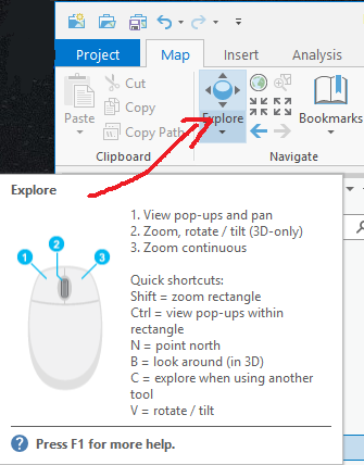
In the ribbon under the Map tab at the top of the screen are a series of navigation icons in the Navigate group. These icons perform several functions common to multiple graphical applications (zoom, pan, etc.). Also, ArcGIS Pro depends a lot on your mouse buttons for navigation. Hover your cursor over the “Explore” button and you’ll be shown some shortcuts.
Hover the cursor over the other icons in the Navigate group shown here to learn their functions.

You can zoom in and out of the map using the mouse wheel or one of the icons in the Map tab that looks like 4 little arrows pointing towards (zoom in) or away (zoom out) from each other.
You can pan around the map by pressing and holding the mouse wheel while moving or by left clicking and dragging with the mouse hand when hovering over the map. Try this!

The button that looks like a globe (next to the “Explore” button) will make you zoom in or out so that your layers fully fill your window. This data display is called full extent. Try it!

The button with a blue arrow pointing left will bring you to the previous view (extent). Try it, to return to your previous view.
ArcGIS Pro also has several features that tell you what part and how much of the planet the view on your screen represents. On the bottom center, you will find coordinates. Move your mouse across a few states, and notice the coordinates changing to show you the location of the cursor. On the bottom left, there is a box that displays scale. It shows you how many units in the real world are represented by one map unit (e.g. a scale of 1:12,500,000 means 1 inch in the map represents 12,500,000 inches in the real world, or ~197 miles). We’ll cover those topics with more details in class.
Now, zoom in enough so you just see the states in the central plains. By studying the map and looking at the legend of the themes currently displayed in the CP, try to find a pattern of population distribution. Now answer the following question in Moodle:
Question 1. Where were the largest numbers of people living in the central plains states in 1930?
a. Western part of Nebraska, Kansas, Oklahoma, and Texas
b. Southern New Mexico
c. South part of Colorado
d. Eastern part of Nebraska, Kansas, Oklahoma, and Texas
In 1909, the US Dept. of Agriculture Bureau of Soils published in its “Soils of the United States” bulletin that “the soil … is the one resource that cannot be exhausted; that cannot be used up.” This idea was a popular belief in the early years of the 20th century. Therefore, a great proportion of agricultural land was over tilled and left fallow for long periods. These uncultivated lands were a major source of soil loss during these years. Let’s see now where the agricultural fields were located.
- In the Contents pane turn off (uncheck the tick box next to the theme) “Population 1930” theme and turn on the “% Of Counties In Farms 1930” theme. The map now shows the proportion (in discrete classes) of the area of each county that is dedicated to farming. Study the legend in the CP and answer the following question in Moodle:
Question 2. Which are the four states with the most counties with the highest percentage of land in farming?
Now let’s study some of the factors that contributed to the Dust Bowl.
- Check the rainfall images provided in the X:\ex2\Images folder. Using Windows Explorer, double click the images for Kansas, Oklahoma, Colorado, and Nebraska. Study carefully the information presented in each graph.
Question 3. What was the trend for precipitation for those states in the 12-year period between 1930 and 1941? (Hint: count how many years are above or below average)
a. At least 8 of the 12 years had lower than average precipitation
b. Half the years had lower than average precipitation
c. All years on the graph had lower than average precipitation
What was the precipitation like in the other states of the study areas?
Check the rainfall images for Texas and New Mexico and you’ll notice that they had a lightly better precipitations during those years.
The Plain states referred to in question 3 have been under severe drought for over a decade. In addition, strong winds have always been present in the plains. These factors, along with large-scale farming and prevalent agricultural practices in the Great Plains states, were responsible for the dust storms. It is estimated that over 800 million tons of topsoil were lost from the affected area in 1935 alone. These dust storms traveled as far as Chicago and New York, even making it out onto ships in the Atlantic Ocean.
Referring to what you have studied so far (readings and GIS), do you think people stayed or left their farms because of the dust storms?
Let’s now study what happened to the population of the plain states as a result of the dust storms.
- Go back to ArcGIS Pro and turn off “% Of Counties In Farms 1930” and turn on the “% Growth In Number Of Farms From 1930–1940” theme. This layer shows the percent increase/decrease in the number of farms between 1930 and 1940. Notice that the legend says “less than 100% is a reduction in farms”.

- Click on the down arrow under the Explore tool , located in the Navigate group of the Map tab at the top of your screen, and check Visible Layers. Then click a county, in the dust bowl area, that had a reduction in farms. In the popup window, you will see, in the upper part, the themes USA States (outline & areas), ignore those.
- Click on the arrow pointing to the right of the theme “% Growth in Number of Farms from 1930 – 1940” and click on the 1930 right below it. Scroll down in the lower windows to see the population of the county in 1930 and 1940 (Pop_1930 and Pop_1940).
Question 4. In average, for the county(s) you chose, did the population increase or decrease from 1930 to 1940? Click on several counties to get the general trend.
- Now, do the same for several counties in California.
Question 5. Did the population in those California counties increase or decrease?
- Turn off “% Growth In Number Of Farms” and turn on the “% Population Change 1930 To 1940” theme. Also turn on the USA Major Cities layer.
Take a look at the legend of the population change and notice which counties increase (more than 100%) or decrease in population between those 2 years. Pay attention to the counties around the major cities in California (San Francisco, in the northernmost group of cities, and Los Angeles in the southernmost group).
Question 6. As illustrated in the map, graphs and readings: What were the farmers’ options when their land became unproductive and was destroyed by the dust?
a. Stay in the same place
b. To move west to California or another area where there was farming
c. Move to New York or another area towards the east
d. Move to cities (California) to look for work
Finally, now that you have observed that many people moved to California from the plain states, imagine the conditions they experienced and the distance that they had to travel. Just to have an idea let us measure some of the distances involved in this migration.
- Close any pop up window, if still open, and zoom in and pan the map such that you can see the easternmost of the plain states AND California in the map view. You can use the mouse buttons or the tools in the Map tab on top.
- IMPORTANT: Right click on the label of USA_Major_Cities in the CP and choose Label. Now you can zoom in around the cities and see their names.

- Click on the measure tool located in the Inquiry group of the Map tab.
- In the dialogue box that opens, click the second drop down arrow (the box farthest on the right) and select Miles as the units for distance.
- Make sure you have the measure distance tool (ruler) selected on the leftmost down arrow (first from left). Notice how the cursor changes shape.
- In order to draw a straight line from one point to another (click the first point then the last one, and double click to stop the measurement and double click again to erase the line). In the window distance section, pay attention to the Segment (mi) column for the distance of your current measurement. Also, in the dialog box, click the tool that looks like a pink eraser to clear your results.
Question 7. What is the approximate straight-line distance between Wichita, Kansas to San Francisco, CA in miles? Of course, only birds and insects could fly in straight lines, and this measurement doesn’t consider the terrain roughness. So the actual distance that people traveled over land was even longer! ______ miles
When you are done answering the questions, you can close ArcGIS Pro. No need to save the project if you want to start from the beginning again.
Part 2: The Basics of ArcGIS and Thematic Mapping
Objective: In this part of the exercise, you will learn how to display and analyze data, using the US Census as an example.
Preliminary task
The data for this part is contained inside a geodatabase (it looks like a windows folder) called US.gdb inside the \ex2 folder. It consists of the following themes of the United States:
- “States” (polygons) with 2010 and 2013 census data of the U.S
- “Cities” (points) with 2010 and 2013 census data of the U.S
- “Rivers” (lines) major US rivers
Task 1: Create a new Map
Begin by launching the ArcGIS Pro program:
- If ArcGIS Pro is closed, launch it again from the ArcGIS group in Windows (or desktop). If open from the previous part, click on the Project tab and choose New.
- Choose the Map icon to create a new blank map. In the pop-up window, name the project (i.e. Ex2_Part2),
- Choose the folder where the data will be located by clicking on the folder icon and navigating to the X: drive and selecting your working folder (X:\ex2) (see note in blue box) and
- Uncheck the tick box “Create a new folder for this local project” (we don’t need a new folder since we already have the folder \x2).
NOTE: It is VERY important to tell the software where you want to save your data. By default, it will try to save them in the C:\Users folder, which is the worst place possible to do so. ALWAYS save in your X: drive.
A “blank” map will be displayed in the center pane by default, which includes two background layers, a topographic map and a hill-shaded DEM (digital elevation model). For this exercise, you can turn off the background layers by unchecking their tick boxes in the CP.
Task 2: Adding/Displaying Themes
Explore the data for this project:

- Go to the Map tab, and click on the Plus icon with yellow background in the Layer group to add data.
- Locate the data provided by double clicking on the root directory of your working folder X:\ and navigate to the \ex2 folder then go inside the geodatabase US.gdb.
- Select/OK the theme called States inside US.gdb to add it to the map.
- Repeat this procedure 2 more times to add the themes: Rivers, and Cities (you can select multiple layers at a time, like any other Windows program by clicking on their names while holding the Ctrl key)
- Explore each theme one by one.
Note that “checked” themes are displayed in the order they are listed in the CP. So, if you display two themes at one time, the one closer to the top of the list will display on top of the theme that is lower on the list. It is always a good idea to display polygons on the bottom of the CP, lines above polygons, and points on top. You can change the order of the themes by clicking on the theme name in the CP and dragging it to another position in the list (this list is the Legend!).
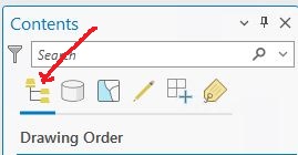
NOTE: if you can’t change the order of the themes by dragging them, make sure the “List by drawing order” button is selected at the top of the CP, right below the Contents label and the search bar.
- Practice changing the drawing order of the layers and also practice zooming in and out, using the 4 arrow icons (or the mouse wheel), and other options in the Map tab. Please experiment.
Before proceeding, let’s save our map. When you save a map (ArcGIS Pro project file) the file preserves the current arrangement of layers (loaded layers, order, colors, etc.), and pointers to the data, but it doesn’t save the data; those files are still located in their original place, in this case inside the geodatabase US.gdb.
It’s also useful to establish a default place to save any data (not project files) that we create. This is done automatically when you create/open the project. In our case we’ll use the US.gdb geodatabase as our default storage place.
- Click the Project tab then select Options
- You’ll be shown the Current Settings which you selected when the map was created. These options can be changed here but they should be OK now. Close it and don’t change anything.

- Just push the Save Project button on the top bar and it’ll be saved as the project file (ex2_part2.aprx) in the folder that you selected at the beginning.
- You could use, in the Project Tab\Save Project as … and navigate to another folder/drive if you want to make a copy for whatever reason.
From now on, save your map FREQUENTLY to prevent a software crash from trashing your work.
Task 3: Customizing the Legend (Qualitative legend)
The theme States is displayed using only one color even though it consists of several different “states”. It would be better to create a legend that displays the names of each class/category within this theme and then assigns a unique color to each. To do this you use the LEGEND EDITOR.
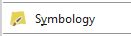
- Turn off the Cities and Rivers themes in the Contents Pane and turn on States, then right-click on the theme States in the CP and click on the yellow square with the paint brush labeled Symbology
NOTE: Many things can be done in this software with a right-click of the mouse.
- A Symbology pane will open on the right side of the map. At the top of the pane there are several icons with various functions. Click on each of the icons to see the options they offer.
Alternatively, click once on the theme States in the CP and notice how the ribbon highlights a new Feature Layer tab. You can find the Symbology button here.
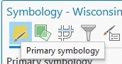
- After exploring around the Symbology pane, click on the Primary Symbology icon
- On the Primary Symbology bar, where it says Single Symbol, click the drop down arrow and select Unique Values.
- Next, click on the Field 1 drop down-arrow. Note that there are several fields (attributes) you could choose to display in the legend. These are attributes, stored in a separate table, linked to each state polygon (feature). The field with the names of each state is called STATE_NAME. Change Field 1 (the field with the values that you wish to display) to STATE_NAME for this legend.
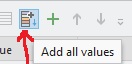
- Click on the “Add All Values” button located at the top of the Classes tab in the pane under the Color scheme bar
- In the same Classes tab, click the down arrow next to More and uncheck “Include all other values”
- Change the Color scheme to a palette of your choice by clicking the drop down arrow on the Color scheme bar. All of the choices are qualitative palettes, i.e. contrasting adjacent colors vs continuously changing color ramps (ArcGIS Pro gives these choices because you set the legend type to Unique Values).
- Try different palettes until you find one you like. When you are done, close the Symbology pane.
You could also change the appearance (color, fill, outlines, etc.) of each individual legend category by clicking the colored square for each object in the CP and opening the Symbology pane. Alternatively, if you just want to change the color of each legend category, right click on the colored square for the object in the CP and select the color you like. Experiment!
In the case of the Rivers and Cities layers you can change the symbols/colors by clicking on the actual symbols in the Contents pane and selecting a suitable style (color/shape). To change the shape left-click on the symbol in the CP and select the shape you like from the Symbology pane. To change the color, right click on the on the symbol in the CP. Try it.
Task 4: Customizing the Legend (Quantitative legend)
- Go back to Symbology pane\Primary Symbology for the States theme and notice in Field 1 that there are several “numerical” attributes with census/population data (like POP2010, POP2013, etc.).
A choropleth map is a good symbolization for this type of data. This is a form of thematic map that uses colors or shades to represent numerical variables (such as population, income, etc.) over entire areas.
- To make a choropleth map go to the Symbology pane for the States theme and under the Primary Symbology tab ( ) click the drop down arrow and select “Graduated Colors”. Choose POP10_SQMI (population in 2010 per square mile) in the Field drop down bar, and select an appropriate Color scheme.
Question 8. How many color classes (ranges of values) did ArcGIS Pro create by default for States legend using Primary Symbology\Graduated Colors? (Hint: Look at the legend in the CP)
Compare a thematic map using just POP2010 vs the previous one using POP10_SQMI (you can add two copies of the theme States, one for each case). Make sure you understand the difference between those two values: total population vs population density.
Question 9. The state of Texas is shown in the largest category (largest pop range in the CP) when using POP2010 but in the lowest category when using POP10_SQMI. True – False.
Practice mapping several of these numerical fields. You can also add the States theme multiple times and have each one represent a different variable (attribute).
- Represent the Cities theme using Symbology\Primary Symbology\Graduated Symbols and choose the variable to display HISPANIC (change the Field to HISPANIC) in the lower pane in Symbology and accept the default number of classes)
Question 10. How many cities fall in the top category (largest # of Hispanics i.e. the biggest circles)? (Hint: you can change individual symbol colors by right-clicking each symbol in the CP. Make this top category a contrasting color. Be sure to pan around and zoom in and out as necessary.)
Question 11. What are the names of the cities in top category? (Hint: use the Explore tool in the Map tab to click the cities in the map )
You may show the attributes of areas (like States) as graduated symbols instead of just graduated colors. Experiment.
Task 5: Exploring the “Quantities” symbology
- Turn off Cities and open the Symbology pane for States again and select, if not selected already, Primary Symbology\Graduated Color. Notice the Method bar and click on the drop down arrow.
Method is used to alter the groupings according to the following classification methods:
- Equal interval divides the range of attribute values into equal-sized subranges. This allows you to specify the number of intervals, and ArcGIS will automatically determine the class breaks based on the value range.
- Defined interval allows you to specify an interval size used to define a series of classes with the same value range. For example, each interval will span 75 units.
- With Quantiles each class contains an equal number of features. A quantile classification is well suited to linearly distributed data. Quantile assigns the same number of data values to each class.
- Natural Breaks classes are based on natural groupings inherent in the data. Class breaks are identified that best group similar values and that maximize the differences between classes.
- The Geometrical Interval classification scheme creates class breaks based on class intervals that have a geometrical series.
- Standard deviation classification method shows you how much a feature’s attribute value varies from the mean.
- Manual Interval allows you to create class breaks manually or modify one of the preset classification methods so it is appropriate for your data
Experiment with the classification method by looking at different ones. Take note of the ways in which classification influences the appearance of the map AND the ranges of each category.
Note that you can manually change the number of classes using the Classes drop down bar. Also, you can define the range of each data class by clicking on the Upper Value of each class, shown in the Classes tab in the Symbology pane under the Color scheme bar, and typing in your own values. This may be a well-justified thing to do if the data have obvious cut-points like zero (for a value that ranges from positive to negative) or a meaningful overall average (if you want to show whether a given place has a value above or below the average).
Task 6: Customizing the Legend
You can alter the way a legend is labeled on a map by changing the label in the Contents pane. Altering the label field does not alter the data, it only changes the way it appears in the CP and in the final layout. You can change the name of a layer (e.g. ‘states’ to ‘STATES’) or a variable (‘POP2010’ to ‘Population in the year 2010’). This is done by slowly double left-clicking (once to highlight, a second time to modify) on the layer name or variable. OR, right-click on the theme in the CP and choose Properties and under General you can rename it.
Always use meaningful names for the legend, as files and attribute names are usually shortened or codified.
Task 7: Exploring the Attributes (descriptions)
You can get information about the objects displayed by using the Explore tool (located in the Navigate group of the Map tab). Using this tool, click on the different states to see what info is available about them.
Question 12. What is the population in 2010 of the northeastern most state, Maine? (HINT: North is up and east is right; make sure you click inside the state, and not on a city point, if the city theme is turned on. Also careful when copying this number to Moodle, count the digits; don’t use commas)
Question 13. What is the sub region for the state of Texas?
But using the Explore tool is not practical when you have to explore lots of objects. In this case we usually like to see the table that contains the description of all objects in the theme. This is called the “Attribute Table”.
- Right click on the States layer and select Attribute Table. (Or, click on States in the CP and under the Feature Layer/Data tab choose Attribute table).
When the attribute table opens, it will likely open docked below your map. If you want to undock it and move the table around, right-click on the states tab at the top of the attribute table and click float.) You will see the description (attribute table) of the geographic objects “States”. Explore this table, and the table of the other two layers (cities and rivers). You can right click on the heading of the column and choose to sort the column (and many other things, which we’ll learn later).
- With the States table open, click on the leftmost square next to each line in the attribute table and notice how the whole row turns blue AND the corresponding polygon in the map also turns blue.
Question 14. Which is the state with the largest Hispanic population? (Hint: You have to study the different columns in the table and right click on the column that contains this information and sort it)
- Save your project file (.aprx) in case you need to return to this exercise.