Geog 210 – Exercise 5 – Census & joins
Census Data and Join Operations
Contents
- Part 1: Tutorial – Learning Data Manipulation and Join Operations
- Objective: Use census data and map population at different levels, perform table operations and spatial queries, and execute attribute and spatial joins.
- Part 2: Case Study – Addressing maintenance problems in the city of Chicago
- Objective: Practice joining and manipulating tables
Part 1: Data Manipulation and Join Operations
In this exercise, you will be working with US census data. To understand this data, read the short document “US Census and GIS” AND the section “The main geographical hierarchy” in pages 21-24 of the book “Unlocking the Census with GIS – Chapter 1” (the rest of the document is recommended but optional). Copies of both documents are also available in Moodle.
The data provided in this exercise IS NOT in geodatabase format but in a common open format called “shapefile” which consists of a group of files (from 3 to >10) with the same name (e.g. US_cities) but different extensions (shp, dbj, sbn, prj, shx, etc.). A shapefile in ArcGIS Pro looks like only one file (not multiple files). With Windows Explorer, you can see all the files associated with each respective shapefile.
- CENSUS2010_TOWNS_POLY.shp, shapefile of 2010 census town data for Massachusetts. Obtained from the Office of Geographic Information of Mass., MassGIS (link in Moodle – Exercise 5 resources)
- CENSUS2010_BG_POLY.shp, shapefile of the 2010 census bureau Block Group data for Massachusetts.
- CENSUS2010_BG_SF1_POP_RACE.dbf, databasetable (dBase format) of the 2010 census containing race information of the Block Groups in Massachusetts.
- Mass_outline.shp, this is the outline of the state of Massachusetts, used for display purposes.
- patients_zipcode.shp, patients of hospital in Worcester, geocoded according to zipcodes.
- US_cities, a point layer of cities and towns, in NAD83 geographic coordinates.
Unless noted, data are in Mass. State Plane Coordinate System – NAD83 – meters, coordinates. This means that the data is not in Geographic Coordinate System (lat-long) but in a projected (lineal) system. (This doesn’t mean much to you now, but it’ll come later in the semester).
Task 1: Census data representation
- Copy the data folder, create a new map and add the census data CENSUS2010_BG_POLY.shp to your new empty map frame.
Each polygon is a block group, a unit of aggregation in collecting census data.
- Open the attribute table and inspect the values for the column labeled POP100_Re. This is the total population (100%) for each block group (RE stands for redistricting) in Massachusetts.
- Next, right click on the column name (POP100_RE), and select Explore Statistics (or Visualize Statistics).
Question 1. What is the total population (Sum) in Massachusetts, reported in this dataset, in 2010?
Along with the Statistics pane, a new pane should have appeared in the attribute table window showing the Frequency Distribution chart. Looking at this chart, note that the data has many small values (tall bar = many entities), and a few very large values (the histogram has a tail to the right). This “long-tailed” distribution is common in some types of data, and often displays better with a non-uniform set of symbol ranges. We will demonstrate here by example.
- Close the table and chart, and open the Symbology tool (click in the theme in the CP and find Symbology under “Feature Layer” tab in the ribbon interface; or find this tool by right clicking on the CENSUS2010_BG_POLY layer in the CP and selecting the tool )
Since POP100_RE is a numeric field, what kind of palette (primary symbology or color scheme) would you use to represent it? (Unique value? Graduated colors/symbols?)
- Display the POP100_RE field with a graduated color palette. Keep the default number of classes (5), natural breaks, and select a single color gradient color scheme. Study the result.
Notice how little information this map shows (it’s rather messy). Total population values are commonly not too informative, as usually large units (block groups, towns, states, and countries) tend to have larger total population than smaller ones. Population density is usually a more informative parameter. To create a map of population density you need to divide the total pop of each unit by its corresponding area. Our shapefile contains a column with the number of acres for each block group, so we’ll use this.
NOTE: Generally, it’s a bad idea to use an “area” column that you have not calculated yourself, especially with shapefiles.
There are two ways to do this. First, creating a new column in the attribute table and calculating new values for this column, and the other is using “Normalization” in the Symbology dialog for quantitative data (normalization divides the value field by the normalization field, in this case total pop divided by area is equivalent to pop density or people per acre). You know how to do the first method from the previous exercise.
- To use the first method open the attribute table of the census block groups:
- Add a field called “Popdensity”
- For “Data Type” choose Double (this is a Real Number)
- Close the Fields pane in the attribute table and select “yes” in the pop-up window that asks to save all changes
- Use the Calculate Field tool to calculate values for the Popdensity column
- First, select Popdensity in the Field Name bar. Then, in the list of Fields (columns of the table), double click on POP100_RE,
- then click on the division symbol / (you can enter it using the keyboard as well),
- then double click on the field AREA_ACRES.
- Click OK. Make sure that there is nothing selected before doing the calculation. Your expression should look like:
!POP100_RE! / !AREA_ACRES!
Now you have a calculated column that shows population density in number of people per acre (remember this unit, it is important for the legend).
- Now use this new field to plot the block group shapefile using this column instead of POP100_RE. Keep the same color scheme as before.
Zoom in around Boston and notice the rather useless selection of classes: it doesn’t show much contrast; also the grey outlines of the polygons obscure the colors for the small units.
- In the Symbology pane, change Methods to Geometrical Interval and change the value in the Classes bar to 10.
Notice how this improves color contrast somewhat, but polygon outlines still obscure the small polygons.
- To remove the outlines, return to the Symbology pane, click on Color scheme options tool (looks like a gear) located next to the Color scheme bar and check “Apply to fill and outline”.
NOTE: When representing layers don’t necessarily accept the default representation by the software. Make sure you represent the map the way you want it.
While we’re working with the symbology, let’s fix the number of decimal places that ArcGIS Pro uses by default.

- In the Symbology pane, go to the “Advanced symbology options” tab and open Format Labels. Next to Decimal places, change value to 2. From now on, always use a sensible and logical number of decimal places.
Now the map should be displayed with no lines separating the polygons and with more reasonable legend labels. This symbology provides a clearer view of the variation in the data, due to removal of the borderlines, and using a geometric interval in the classification method of the data representation.
- Add the shapefile Mass_outline on top of the table of content and adjust its color to a medium gray to show a light outline of the state (for better looks only).
Task 2: Data extraction and map preparation
- Add the US_cities.shp point theme to the current data frame.

This shapefile contains data on cities for the entire U.S. and territories. Use the Zoom to Full Extent button to view the entire dataset, and then Zoom to Previous Extent button to return to Massachusetts.
It is burdensome to work with a large data set when we only want a small portion or subset. Now we will select just the cities data that correspond to our census data set.
- In the Select by Location dialog box, make US_cities the Input Feature and the block groups the Selecting Feature. Set the Relationship to intersect and click OK.
- Create a new theme from this selection (right-clicking Data\Export Features). Save it as Mass_cities.
Question 2 – How many census block groups are there in Massachusetts?
Question 3 – What is the average pop. density per census block groups in Massachusetts?
Question 4 – How many cities are within the state?
- Make a map suitable for a report showing the population density of the block groups of Massachusetts and the cities of the state.
- Make sure to show the whole state and to fix the labels, decimal places, and units in the legend.
- Insert all the required components of the map that you know (Title, author, scale bar with reasonable units, legend, north arrow)
Before you finish, let’s learn how to add another component, a Grid.
- While looking at your layout, in the Insert tab of the ribbon, look in the Map Frames group for the “Grid” button.
- Select a Measured Grid. Notice that the Grid is added in the CP (Don’t use a Graticule; that’s for Lat Long, and we want to use the local Mass State Plane Coordinate System
- Right click on the Grid in the CP and get the Properties and you’ll see a “Format Map Grid” pane on the right
- Observe that the coordinate system is “NAD 1983 StatePlane Massachusetts Mainland” (you’ll learn about this later)
- Uncheck the tick box under “Interval – Automatically adjust”

- Go to the Component page of the pane by clicking the second icon on top of the pane
- Click Gridlines in the Components field and enter 50,000 (no commas) for intervals in X and Y
- Now click Labels and, again, enter 50000 in both X and Y
Now you have a correct map with all the required components.
NOTE: From now on, always include a grid (or Graticule if Lat-Long is more appropriate) with your maps, along with the other necessary components.
Question 5 – Upload ex5_map1_yourname.pdf (in PDF format) to Moodle.
Task 3: Joining Tables – Attribute Join
Sometimes the information we want to map is not available in the attribute table of the spatial data we have. This information can be found in external tables (like census tables) that don’t have the spatial component. To visualize that particular data we have to “join” the information from the table into the attribute table of the spatial data. Tabular joins use a common unique identifier to attach an attribute table to a spatial layer.
- Return to the Map windows by closing the Layout tab.
- If not loaded in your view, load the shapefile containing the Census Block Groups (BG) plus the corresponding table containing Population and Race (CEN2010_BG_SF1_POP_RACE.dbf).
- Open this latter table and study its fields. It should contain total population and races.
Notice that this dbf file is just a table, it doesn’t have spatial information. .
Identifying a Key
To join tables, you must identify a field that is common to both tables (attribute and data table). This field is known as a key because it uniquely identifies each record in a table. The values must be formatted in an identical way (i.e. numerical, string, date).
The attribute table of the block group layer (shapefile) contains multiple fields that uniquely identify each record. This table has attributes of census block groups but no actual population data (other than POP100_RE, which is a total value). Therefore, we cannot map the different races from a census dataset until we bring the information from the other table. If you read the information from the MassGIS website about this dataset you would find that there is one field that uniquely identifies records and, thus, it can be used to match fields in the census Block Group shapefile: LOGSF1. The corresponding field in the population table is called LOGRECNO. Fields do not need to have same names in table and layer in order to join them; they must be formatted in the same way.
Keep in mind that ArcGIS Pro does not check to make sure that the key fields or their formats match, so you should double check them (by opening both tables and getting the properties of the corresponding columns by hovering your cursor over the headings; they should be the same) before performing the join.
What type of field is LOGRECNO in the census table?
What type of field is LOGSF1 in the block group layer table?
- Right click on the Block Groups shapefile in CP and select Joins and Relates\Add Join.
- In the “Add Join” window: the Input Table should be CENSUS2010_BG_POLY
- Under Input Field, use the drop down box to select the key field in your shapefile, LOGSF1 (careful, there is another field with similar name).
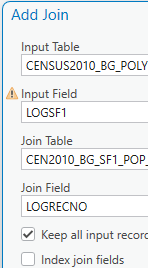
NOTE: You might get a little yellow warning triangle on the Input Field. If you click it, it tells you that “the join field LOGSF1 is no indexed…” You don’t need to worry about this. It’s an internal procedure for the database part of the software.
- Under Join Table, use the drop down box to select CEN2010_BG_SF1_POP_RACE (the table doesn’t have to be added to the CP)
- Under Join Field (of the Join Table), use the drop down box to select the key field in your table that you wish to join, LOGRECNO
- Leave the “Keep all input records” box checked
- Click on Validate Join. Read the validation results window, it should indicate how many records would be joined, this is important! It can’t be “0”! Then close it, and click OK to proceed with the Join.
- Open the attribute table of the shapefile and notice that the columns of the population table have been added at the end. Make sure there are numbers in these extra columns and not all cells with value of zero or . It you find empty fields, make sure no objects are selected before the join, and then repeat the join
When you perform an attribute join the data is dynamically joined together. Nothing is written to disk and the join is not permanent. To make the join permanent (JUST FOR INFO, NO NEED TO DO IT), export the theme (right-click\Data\Export) in the Contents Pane. It can be exported as a new shapefile or into our default GeoDB, and it will include attributes from both (or all) joined tables.
NOTE: Several tables or layers can be joined to a single table or layer.
DON’T DO THIS, but explore: Joins only exist within the confines of project file (Map). They can be “removed” by right-clicking the layer name in the CP and selecting “Joins and Relates” and clicking “Remove Join”. You have the option of removing a specific join or all joins.
- Prepare a map layout showing the distribution of Hispanics (HISP) in the state. Choose a single color ramp and remove the outlines from the polygons, and add the outline of the state. DO NOT include Mass_cities. Use a Geometric Interval classification and 10 classes (like map 1); these are No. of people so make sure labels are integer numbers (no decimal places). The map should be a good composition with all the necessary components. Save as ex5_map2_yourname.pdf
Note that geometric interval will show “decimals” even though it’s a count variable; We should probably use a different classification, but here we’re just trying to be consistent with the previous map.
Question 6 – Upload ex5_map2_yourname.pdf (in PDF format) to Moodle.
Task 4: Table joining with aggregation
The map you previously made suffers from too much “granularity”. Sometimes we want to show the data (i.e. Number of Hispanics) in a more general way. Let’s map the population data by towns (instead of block groups).
- Add the CENSUS2010_TOWNS_POLY theme to your map and familiarize yourself with the content of its attribute table.
- Open the table of the census block groups shapefile and check the existing columns.
The Towns shapefile contains a column called “TOWN” which is unique (also TOWN_ID, and TOWN2). The block group shapefile also contains one column called “TOWN” which is unique to each town, but since there are multiple block groups in each town, they have to be summarized before they get joined to the town theme. We need the total number of people or races, etc. in each town; therefore, we need to add up all the block groups in the town, first. If we don’t summarize the block groups before joining this would be a case of a “many to one” join, where there are multiple options to join to the one town/city and ArcGIS Pro would just pick the first one it finds. Since we want the population race data for each town, we need a join, with data summarized by town.
- In the table of the block group shapefile with the joined data (from previous task), right click on TOWN and choose Summarize. Summarize the SUM for the variables:
- POP_2010 (notice that for a “joined” column its name is preceded by the name of the table it comes from. So this is called CEN2010_BG_SF1_POP_RACE. POP_2010)
- POP_WHITE, POP_BLACK, HISP (make sure Not to pick _NOT_HISP), and any other race that might interest you
- The table will be save in your default GeoDB. Call it something like “Race_Town_Summary”. It will be added to the map (if not, you can add it yourself).
- Open the table (it should be at the bottom of the CP) and familiarize yourself with its contents. Notice that now there is only one line per town with the corresponding totals for POP_2010 and the totals of the different races.
Now answer the following questions:
Hint: Calculate the total population of Massachusetts using this table; it should be equal to the answer of question 1. (Hint of a hint: Statistics)
Question 7- How many towns contain no Hispanics?
Question 8- How many towns have a white population larger than the sum of the Black and Hispanic populations? (Hint: you might need to add/calculate fields and select by attributes) (Hint 2: you can select by attribute using the table menus)
Question 9- How many towns have a total population over 10,000 that is, at least, one quarter Hispanic (Hint: use “Double” to create a column with decimals)?
Question 10- Of the above towns (Q. 9), how many are also at least one quarter Black?
Now we’re going to join the summary data to the town polygons. Notice that the TOWNS shapefile has two fields with town names, written in different ways (one UPPERCASE, the other with Capitals). Fields to be joined must be written/spelled the same way. Which column in the Town shapefile would you use? TOWN or TOWN2? What would you do if one of the tables doesn’t have the names spelled the same way?
- Clear all selections before proceeding.
- Join the summary table you just created (Race_Town_Summary) to the towns theme, NOT the block group (BG) theme.
- Prepare a map layout showing the distribution of Hispanics (or Blacks, etc.) in the state (no cities!). Choose the same color ramp, classification, and number of classes used in Question 6 (Map2). DO NOT remove the outlines of the towns. The map should be a good composition with all the necessary components (don’t forget the grid). Save as ex5_map3_yourname.pdf.
NOTE: some towns might show up empty. Don’t worry about this but, can you guess why?
Question 11 – Upload ex5_map3_yourname.pdf (in PDF format) to Moodle.
Task 5: Spatial joins
Spatial joins use common geography (location) to append fields from one layer to another layer. This allows you to assign the characteristics of an area—such as a census tract or school district—to individual houses, individuals, or events as well as to aggregate points by areas.
Aggregating Points to Polygons
Using a spatial join, you can determine how many points fall in each polygon feature. For example, you might need to determine how many crimes occurred within each police district. You must have a point layer and a polygon layer in ArcGIS in order to do this.
- Load the patients_zipcode.shp into your view. This layer contains the zip codes of patients of a Worcester hospital that participated in one particular study.
- Open the attribute table and notice that the only location information is the zip code. The location of the points have been “geocoded” using the zip codes and placed in a geographic context.
IMPORTANT: Multiple patients share the same zip codes, therefore, their points will fall one on top of another. E.g. in Worcester you can only see a few points, but if you examine the table you’ll see there are many more patients than points visible.
We want to create a map of patient distribution in the towns of Massachusetts. For this we have to “join” the data based on their location rather than on some common field, i.e. we want to produce a map that shows the number of patients per town (notice that some patients are outside Massachusetts. Don’t worry about those, they won’t be counted).
Note: Always make sure there are no objects selected before doing any operation, unless you’re working with the selected subset.
- In the Contents Pane right-click the census TOWNS layer (NOT the block groups!), select “Joins and Relates” and click “Remove all joins” (we don’t need the race data anymore; if in doubt, then create a new project and add the two previous layer and continue).
- Go, again, to “Joins and Relates” and click “Add Spatial Join”
- Under Target Features choose CENSUS2010_TOWNS_POLY
- Under Join Features choose patients_zipcode
- Under Match Option study the different options and select “Contains”
- Click OK
- Open the attribute table of the towns theme and study it. Notice that there is a new column called “Join_Count”; this is the number of patients per town.
NOTE: This join, as in the case of attribute join, is also temporary and can be removed. There is another way of doing Spatial Join, under the Geoprocessing toolbox that create a new output theme thus making the join permanent. We will not use that method here.
NOTE 2: if you ever want to make the join permanent, all you have to do is to export the joined data into a new theme.
Question 12 – How many towns/cities contain one or more patients in Massachusetts?
Question 13 – Which town/city has the most patients?
Question 14 – How many towns/cities have a patient-to-population (2010) ratio greater than the town chosen in question 13? (Hint: Add a “Double” field to the table and expand the column to see all decimal places)
Assigning Area Characteristics to Points
Using a spatial join, you can identify in which area a point falls. For example, you might need to determine in what town each of your participants live. You must have a point layer and a polygon layer in ArcGIS Pro in order to do this. So let’s add the town information to the patient data:
- From the Contents Pane:
- Right-click the Patients_zipcode theme (NOT the towns!), select “Joins and Relates” and click “Add Spatial Join”
- Under Target Features select patients_zipcode
- Under Join Features select CENSUS2010_TOWNS_POLY
- Under Match Option select “Within”
- Click OK, open the attribute layer of the patient’s layer, and notice that the town information has been joined to each patient record.
Notice that only the points that fell inside a polygon will have information. Study the attribute table and notice the rows with no data or <Null>.
Question 15 – How many patients live outside Massachusetts (i.e. didn’t get any town data joined)? ____ (Hint: there is an option to query for “is null”)
Part 2: Case Study: Practicing Joins in Chicago
Now that you have learned how to do attribute/spatial joins, it is time to practice the skills you have learned so far. Say that you are a city employee in Chicago and it is your job to decide where to direct maintenance funds. Your supervisor has asked you to choose a zip code in particular need of attention as part of an effort to equalize public resources across all neighborhoods.
How will you pick a place, without taking to the sidewalks and looking yourself? Chicago has a 311 system, where residents can call and make complaints or requests about maintenance problems. Rather than examining all 311 complaints, you have chosen a few to study:
- Street Lights (all lights on pole out)
- Pot Holes
- Sanitation Code Complaints
NOTE: The city of Chicago GIS data website, the source of data for this part, has many more GIS themes about Chicago, in case you’re interested.
To begin, add the shapefile and tables (in dbf format) in the folder for Part 2 to a new ArcGIS Pro map and explore the information they contain. Notice that the shapefile shows the boundaries of each zip code in Illinois, while each of the tables contains the “311” complaints, in the three categories above, for the city of Chicago
Your goal is to find out which zip code has the greatest number of open (unresolved) complaints.
A few hints before you get started:
- As you learned in Part 1, you will need to summarize the complaints by zip code before joining them to the shapefile.
- Not all zip codes will have values.
- Once all three tables are joined to the shapefile, you can create a new field in the attribute table to add up the complaints from all three categories. (Note: you will get some error messages because not all zip codes will be included in all tables. That’s fine—these zip codes’ sums will turn into zeros and you can ignore them.) This process should give you the zip code with the most open complaints!
Question 16. What zip code did you select for special maintenance attention?
Question 17. How many complaints were located in the selected zip code?
Featured image on top of page fromTerrible Maps