Geog 210 – Exercise 6 – Geoprocessing
Geoprocessing in ArcGIS
Contents
- Part 1: Tutorial – Crime Analysis (Buffers and Clipping)
- Objective: To quantify the incidence of crimes happening around the areas of the colleges within the limits of the city of Worcester.
- Part 2: Case Study – Land Suitability (Overlays)
- Objective: Locate a suitable site to build a new luxury retirement home in South Hadley.
Part 1: Tutorial – Crime Analysis (Buffers and Clipping)
The dataset is in the folder \ex6 in class drive. The geodatabase Worcester.gdb contains the following themes:
- Worcester_City – An outline of the city limits (used for display)
- Worcester_Streets – Importantstreets centerlines (used for display)
- Worcester_Colleges– Polygons of the campus of the different colleges
- Geocoded_Crimes – location of crimes in the city of Worcester for the 6 month time period of May-Nov 2014 (compiled from crimereports.com)
Preliminary Task – Catalog
- Copy the corresponding dataset to your X:\ drive and create a new ArcGIS Pro project in that data folder (X:\ex6). Don’t make a new folder.
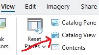
- In the ribbon go to the View tab and click the icon for Catalog View.
Notice that a new tab with a new ribbon is added to the project as well as a new pane. Also notice that the CP looks different, similar to a “file explorer”
The “Catalog” is the tool that you must use to copy, move, rename, delete, etc. GIS layers, especially when dealing with GeoDBs.

- In the Catalog ribbon click the down arrow under the Add button in the Create group and choose Add Folder Connection
- Navigate to your X drive: under “This PC” select the X drive on the right and choose OK
- On the CP, while looking at the Catalog window, open Folders, navigate to your X drive, and explore the content of the folders inside.
- Go inside Ex6 folder and explore the content of the Worcester GDB: You should be able to click on the GDB on the left (CP) and in the middle window, you will see its content. It should have the layers described above.
- Right click on one of the layers and choose Add to Map. Verify that it is added to the map by going to the Map tab.
- Add the rest of the layers by Ctrl clicking them, then right click and Add to Map
Task 1: Buffering
- Go to the Map window and make sure that all the layers are there.
- Turn off Worcester_Streets and Geocoded_Crimes and leave on Worcester_City and the Worcester_Colleges. Arrange the layers so you can see the colleges about the city limits.
- Before we begin our analysis, we will label the college polygons to make our work easier to interpret.
- Study the attribute table of the college theme and notice that there is a column with the names of the colleges.
- Right click on the College theme in the CP and choose Label.
- It should be fine now, but if the wrong names are being shown: with the theme selected in the CP go to the “Labeling” tab in the ribbon. Here you can change the column with the right label in the Field box, type (font, size, and placement) of the label, label placement, etc. but let’s just accept the default
Notice that both Clark University and MCPHS (Massachusetts College of Pharmacy and Health Sciences), have two locations, so there are 11 polygons, but only 9 colleges.
Since we want to study the crimes that happen only around the colleges we could do a “Selection by Location” and extract the selected crimes. You know how to do this already, but we’ll learn another way by first making buffers around the college campus, then we’ll use these buffers to clip the crimes.
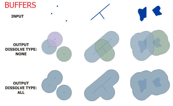

- Look at the “Tools” group in the Analysis tab of the ribbon. Find and click on Pairwise Buffer
- In the Geoprocessing Pane that opened, set Input Features Worcester_Colleges.
- Specify the Output Feature Class as collegebuffer_dissolved.
- Enter the Distance as 0.25, and set the units to Statute Miles.
- Set the Dissolve Type to “Dissolve all output features to a single feature”
- Click Run (below).
The resulting layer is added automatically to the CP, if not, you have to add it. Examine the result. Open the table of the college buffer. Does it look strange?
Question 1. How many objects (buffers) are present?
This result is a consequence of the “Dissolve all output” we chose. With this option, “all buffers are dissolved together into a single feature, removing any overlap” (ArcGIS Help). This polygon is called a “Multipart” polygon.
In our case, we want one polygon for each college campus, so we are not going to “Dissolve” the boundaries of the buffers.
- Redo the buffer operation. This time leave the default Dissolve Type to “No Dissolve”. Save it as collegebuffer_undissolved. Study the result and compare it with the previous buffer theme.
Question 2. How many buffers are there now? ______. (Hint: always check in the table)
Now each college polygon should have its own buffer. However, there is still a problem with the new buffer theme. There are two different buffer polygons for both Clark University and MCPHS, and we want to have just one buffer for those (i.e. one buffer region per college).
- Redo the buffer operation.
- This time choose the Dissolve Type to “Dissolve features using the listed fields …” and right below there, select the “Name” column as “Dissolve Field”. With the LISTED Fields dissolve type “Any buffers sharing attribute values in the listed are dissolved” (ArcGIS Help).
NOTE: make sure you are making the buffers of the original college polygons.
- Save it as collegebuffer_final.
- Study the result and compare it with the previous buffer themes. As you can see now there is only one polygon as buffer for both Clark U. and MCPHS.
HINT: you should end up with 9 buffers, which is the number of colleges in Worcester. If you didn’t get this number, do it again as this is critical for the rest of the exercise.
- This final buffer theme represents the areas you will consider in your analysis of crimes near Worcester colleges. Remove collegebuffer_undisolved and collegebuffer_dissolved from the CP to avoid confusion with the rest of the analysis.
Task 2: Clipping and Summarizing
- Turn on the Geocoded_Crimes theme (or add it to your map if not there) and study its attributes. Notice that there is a column called “Crime_Type” that we will use to summarize, at the end, and a column called Address with the location of the crime. In a later exercise, we will learn how to create a GIS layer using this address information by a process called Geocoding.
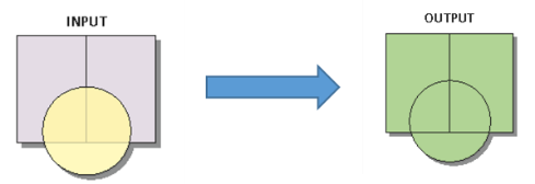
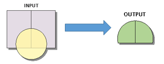
Now let’s extract the crimes inside the college buffers using the Geoprocessing function “Clip”. Clipping cuts features in one layer using the boundaries of polygon features from another layer. It’s like using a cookie cutter on a mass of cookie dough.
- In the Analysis tab, under the Tools group click the PairwiseClip tool.
- For Input Features choose Geocoded_Crimes (or drag and drop from the CP). This is the cookie dough.
- Choose collegebuffer_final as the Clip Features. This is the cookie cutter.
- Call the output Clipped_crimes (make sure to NOT leave blank spaces in theme names, use underscores).
- Click Run. Wait for it to finish and study the result.
- Remove Geocoded_Crimes to avoid confusion
Question 3. How many crimes are there in Clipped_Crimes (after the clip)?
We now want to summarize the resulting table, but first, we want to add, to each crime, the name of the closest college. For this let’s do a spatial join of Clipped_Crimes with collegebuffer_final.
- Right click on Clipped_Crimes and select Join and Relates and choose to do a spatial join.
- Clipped_crimes should be entered as Target Features.
- Choose collegebuffer_final as the Join Features.
- Choose to Keep All Features.
- Match Option = Intersect
- Click OK
- Verify that Clipped_crimes now contains a column with the name of the college around which the crimes happened.
- Summarize the column Name in Clipped_crimes
- Right click on the Names column in the new layer and choose Summarize
- Input Table = Clipped_crimes
- Output Table Crimes_summary (or something appropriate)
- Statistics Field = Name (this will have the name of the joined table)
- Statistics Type = Count
Question 4. Which college has the largest number of crimes around its campus?
Question 5. How many crimes happened near Clark University?
This result made the president of Clark University a little nervous, so let’s prepare a report for Clark University summarizing the types of crimes that happened around the campus for this time period. You can do the following analysis with any college that you want to use; I’m using Clark U. as an example, if you choose another college, just change the name accordingly in the following instructions and make sure to use the correct labels in the reports.
- On Clipped_crimes theme select the ones that happened around Clark University (you should know how to do this AND you should get the same number of items selected as question 5, above).
- Summarize the column Crime_Type for Count (Notice that the summary will be done ONLY in the selected items)
- Save it as Clark_Summary.
- Open Clark_Summary table and study it.
Question 6. What is the most common crime around Clark University?
Let’s plot the results as a bar chart (you could use other types, but now let’s use a bar chart).
- With the Clark_Summary table open, click on Standalone Table in the ribbon and click on Visualize\Create Chart button to the right and Choose Bar chart
- In the Chart Properties pane that opens
- Choose Category = Crime_Type
- Numeric Field(s): add Frequency
- Data Labels: Tick the Label bars box
- In the Sort field choose Y-axis Descending
- On top of the Chart pane go to General and enter a Chart Title: e.g. “Crimes around Clark University, May-Nov 2014” (or whatever college you chose)
- In General also fix the X axis title to remove the underscore “_”
- On top of the Chart pane go to Axes and increase the Label character limit to 30
Experiment with some of the options in Chart Properties to make a nice chart. Brownie points to whomever can figure out how to change the bars’ colors and/or find a better placement for the labels.
- Create the best layout (Insert tab) that you can make showing city limits and a background layer, streets, clipped_crimes, college polygons (NOT the buffers) with labels. Make sure the full city of Worcester is visible.
- Insert the bar chart you just made: In the Insert tab, AFTER you insert the Map frame in the upper part of the page, enter a Chart Frame (Map Surrounds group) in the lower part (Hint: click the down arrow in the Chart Frame and select the chart you just made).
- Add all the required ancillary objects (including your name, date, data source, legend, north arrow, scale bar, etc.). For this map DON’T INCLUDE the Grid, since we know where it is.
- Be conscious of the aesthetics of the layout. Make me proud!
Question 7. Upload your map to Moodle in PDF format as Ex6_yourname_part1.pdf
Question 8. Create a cartographic model of the procedures you just did. Add a title and your name, and save it as PDF or graphic format (make sure I can read it). Save as Ex6_yourname_cartoModel1.pdf. Upload to Moodle
Hint: For the cartographic model remember to list the layers you actually used for the analysis (e.g. we only used one out of the 3 buffers we did), the procedures, and the child layers. Use colors/shape consistently and make sure you connect the boxes correctly.
Part 2: Case Study – Land Suitability (Overlays)
You have to find a suitable site to build a new luxury retirement home in South Hadley. The optimum place for this building complex must meet the following criteria:
- Surface water – site must be located at least 500 feet away from lakes, streams, swamps and above the Connecticut River’s 100-yr flood zone.
- Land-use – consider the use of “undeveloped land” (crop, pasture, forest, open land, recreation, transitional, brush land/successional, orchard, and nursery).
- Topography – no steep slopes (less than 5% slope).
- Transportation – only heavy and medium roads can be used for site access but it must be at least 250 feet away from the road.
- Size – available site should have an area of least 50 acres (~ 20.2 hectares).
Data set description:
All data in the GeoDB Land_Suitability.gdb came from MassGIS and are in Massachusetts State Plane Coordinate System, datum NAD83, unit meter (MASPCS83 meters). The files have been clipped (you know how to do this now) to the outline of the town of South Hadley. The included themes are:
- South Hadley – A polygon with the town limits
- Hydro_arc – rivers/creeks, and lake/pond/wetland outlines
- Hydro_poly – lake/pond/wetland areas, used for final map production (outlines of this are in Hydro_arc; we won’t be using this layer; here, only, for completeness)
- Roads – according to classes of the Dept. of Transportation. Only use roads classes 1-4
- Floods – flood zones according to the EPA
- Slope – slopes, classified into discrete ranges (steep & flat).
- Landuse_2005 – land use classes from 2005 aerial photographs
NOTE: At the end, you’ll be asked, again, to create a cartographic model. So, as you go through the exercise, sketch the steps. Start with the original data, the different operations (selections/extractions/ unions, etc.) and the results.
Task 1 – Buffers
We’re creating some buffers, or areas of protection/exclusion, around water bodies and major roads. Our final selection must exclude these areas.
Note: Always study the results, both spatial and attributes.
- Create a new project and explore the content of the GeoDB Land_Suitability as instructed in part 1
- Create a buffer layer of the Hydro_arc using a linear distance of 500 US Survey feet (CHECK THE UNIT!). Save the results as Hydro_arc_Buffer.
- Extract Roads class 1-4 and save as Major_Roads.
- Create a buffer of Major_Roads using 250 feet. Save the output as Major_Roads_Buffer.
Task 2 – Overlay-Union
Now let’s put those two buffers (exclusion zone) together using a geoprocessing operation called UNION.
- In the Tools group in the Analysis tab get the UNION (Overlay Features).
- Add both buffers as input (drag & drop or pick from down arrow at Input Features)
- Call the output Buffers
- Click RUN
- Study the resulting theme Buffers and represent it using Single Symbol
These polygons represent areas that have to be excluded for the final site selection. It should show all the buffers together. We could have selected to dissolve some of those extra lines (remember how?), but it is not necessary now.
ALSO, notice that the Union operation is equivalent to a selection with the OR operator when making a selection: everything is included.
(HINT: You should have around 20,487 polygons in Buffers, if you haven’t dissolved any polygon).
Task 3 –Selection of suitable land
- Turn off all themes in the CP and add the Landuse_2005. Study its attribute table. The column called LU05_DESC has the names of the different types of land use.
- Display this layer using Unique values for each class in LU05_DESC. Pick a palette you like.
- If all the classes look the same gray color, click the button (on top of the symbols in the classes tab) that says “Add all values”
You know by now that ArcGIS uses the ugliest combinations of colors possible when displaying layers. So let’s represent this layer a little better with a previously made color/symbol selection that has been saved in a “Layer” file.
- In the Symbology Pane of Landuse_2005 theme.
- Click on the hamburger (3 horizontal lines) button on the upper right and choose Import Symbology
- In the new pane enter Symbology Layer by going to \ex6 folder and pick a file called landuse_2005.lyr.
- Verify that Source Field and Target Field is LUCODE
- Click RUN and close the side Panes (except CP!). The theme should look nicer now.
This “layer” file (.lyr), source of the new symbology, is a special kind of file that saves the representation (legend) that you have designed, and allows it to be saved and reused.
- Select in this theme the available land-use classes. You should select the following classes considered “open” or “available”: Cropland, pasture, forest, orchard, open land, brushland, transitional. These categories correspond to the classes “Y” in the column named “Available” of the attribute table (I’ve done this part of the job for you). You can select by attribute using: LU05_DESC = ‘Cropland’ OR LU05_DESC = ‘Forest’ OR LU05_DESC = ‘Open Land’ OR …… or just do available = ‘y’.
- Export the selected features as Good_Landuse.
- Load to the CP the theme Flood
- Study the attribute table and notice the field “Flooded”.
- Represent it with unique values using the field Flooded”.
- Select the areas for FLOODED=N and save the selected areas as Good_Flood (areas that don’t flood).
- Do the same for the theme Slope. (This layer was vectorized from a raster dataset, notice its appearance)
- Select the areas where Slope=flat. Export and save the selected features as Good_Slope.
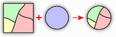
Task 4 – Overlay-Intersection
If you study your “Good” themes one by one, you will notice that they are all over the place. However, we need to find areas that fulfill ALL the requirements at the same time, i.e. the piece of land has to be flat AND open land use AND not flooded. We’ll accomplish this with a geoprocessing tool called INTERSECTION.
- In the Tools group in the Analysis tab get the Pairwise Intersect (Overlay Features).
- Add two “Good” layers as input
- Call the output Good_temp
- Click RUN
- Repeat the intersection using Good_temp and the other “Good” area (make sure it’s the right one)
- .Call the output Good_areas
- Study the result and represent it using Single Symbol.
NOTE: The tool input makes you believe that you may enter more than two input, but it won’t work.
These polygons represent areas where the three conditions (not flooded, flat slope, suitable land use) are concurrently satisfied. Notice that since this is equivalent to the AND operator and the result is more restricted than if we had used a Union. (HINT: you should get 1014 features)
Task 5 – Putting it all together
We’re almost there!
- Turn off all layers. Put Buffers on top of Good_Areas in the CP and turn on and off Buffers several times to get an idea of what’s going to happen next.
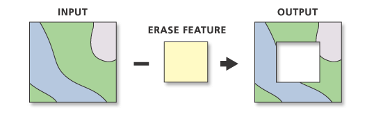
We need to “Erase” Buffers from Good_Areas. Do you remember what the buffers stand for? Therefore, we’re going to use the buffers as “erasers” to remove the areas too close to roads and water from the good areas. The ERASE function does the opposite to CLIP. It uses one polygon feature to erase objects from another layer. Everything inside the Erase polygon will be eliminated leaving only what is outside of the erase polygon (again, opposite to Clip).
- In the Analysis tab click the red Tools icon (this function is NOT in the Tools group menu).
- On top of the Geoprocessing pane that opens on the right click on Toolboxes and go to Analysis Tools\Overlay\Erase
- Input Features Good_areas.
- Erase Features (i.e. the eraser) Buffers.
- For the output call it “All_areas”.
- Click RUN
Take a look at the resulting layer (All_areas) and compare it with Good_areas. Can you explain the differences? These are all the areas that meet all the requirements. You’ll notice that some areas are too tiny, and that other areas are made up of multiple polygons (probably different land use types). We have to “Dissolve” those extra lines in order to calculate the correct area of each parcel (a parcel is a contiguous piece of land).
(Hint: you should have now 503 features)
- From the Toolboxes go to Data Management\Generalization\Dissolve
- Input Feature All_areas
- Output Feature Final
- Under Dissolve Field make sure nothing is selected
- VERY IMPORTANT: At the bottom of the Dissolve pane uncheck the box where it says Create multipart features (we want individual polygons, not multipart). Click RUN.
Study the new layer and open its attribute table and see how many parcels are available.
Question 9. How many parcels (total) are available?
(Hint1: between 500-600)
(Hint 2: if you got only 1 item, you forgot to uncheck the “Create multipart features” tick box)
- In the attribute table of Final notice the area values for each parcel in the last column called Shape_Area. These values are in square meters (meter is the original map unit for these layers). This is a property of GeoDB, areas and lengths ARE calculated automatically, unlike in Shapefiles.
You need to select only the parcels larger than ______ acres (see requirements at beginning of part 2).
We could do a unit transformation now (from square meters to acres), but let’s learn another method.
- Add a new Field to Final’s table. Make it Double and call it Acres.
- Make sure there’s nothing selected, and then right click on the column Acres and choose Calculate Geometry.
- Property should be Area
- Area Units: pick US Survey Acres and click OK
- We shouldn’t have to pick Coordinate System as these layers are already in MASPCS83 meters (see layer descriptions)
- Click OK
- Select parcels larger than your area requirement and export them as Best_Parcels.
Question 10. How many parcels meet the minimum area requirement? (Hint: <10)
- In the attribute table of Best_parcels add an integer column called “Parcel”
- In the Parcel column, name the parcels with sequential numbers (1, 2, 3, 4…)
- Right click on the heading of the other columns (Shape, OID, length, area, etc.) and choose “Hide field”. Leave only Parcel and Acres columns visible
- Save your changes to the table
Finally, prepare a suitable layout with ONLY the parcels that satisfy ALL requirements (Best_parcels), add the South Hadley town outline, major roads, hydro arcs and hydro poly. You may use, or not, the background layers (your choice, but I think this time it looks nice). Again, make the best map that you can make and make me proud. Before you finish the layout, do the following changes to it:
- Label the parcels with the corresponding labels created in the previous step (#21).
- Click on the theme in the CP then click the labeling tab on top and choose the corresponding Field (Parcel)
- Insert the attribute table in the layout
- In the CP, select the layer you want to use (Best_parcels) to create the table
- On the Insert tab, in the Map Surrounds group, click Table Frame
- On the layout, draw a rectangle to define the limits of the table frame
- If the Table Frame is empty: remember to select (highlight) the theme in the CP before drawing the frame
- If nothing, or no rows, is shown in the table frame, maybe only the column headings, double click on the table frame inserted in the layout and in the “Element” pane on the right, under Source\Table make sure that Final_Parcels is selected and/or Source\Query select “All rows”
- If you see a red symbol […] it means that it’s not showing the full table, expand the table
- Place the table in a suitable position in the map (it may go inside the map, near the parcels or just outside next to the legend, etc.
- Save layout as PDF.
Question 11. Upload map layout in PDF to Moodle as Ex6 _yourname_part2.pdf.
Question 12. Create a cartographic model for part 2. Add a title and your name, and save it as PDF or graphic format (make sure I can read it). Save as Ex6_yourname_cartoModel2.pdf. Upload to Moodle.
Hint: remember to list only the layers you actually used for the analysis, the procedures, and the child layers. Use colors/shape consistently and make sure you connect the boxes correctly.