Geog 210 – Exercise 8 – DB Creation
Digital Database Creation
Contents
- Part 1: Georeferencing – digitizing historical map
- Objective: Map the distribution of slaves and free people in the Washington D.C. area in 1820 using data from the fourth decennial census.
Part 1: Georeferencing & digitizing a historical map
This exercise was inspired by the work of E.S. professor Lauret Savoy. Read the following article for background of her work “Placing Washington, D.C” before starting to work.
Historic maps provide a wealth of information about life in the “older” years. Unfortunately, like all paper maps, it is hard to compare the information they contain with other data, as they usually do not have georeferenced information (Lat-Long or other system). Another common problem with historic maps lies in the lack of accuracy with respect to the objects they represent.
Data: For this exercise you will be using the following layers
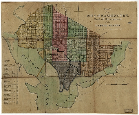
- Scanned historic map of 1822 Washington D.C. showing census wards of the time, from the Library of Congress
- OpenStreetMap basemap in ArcGIS Pro as the source of coordinates (Reference map) for the previous scanned image
- Tabular data from the 1820 decennial census
Task 1 – Georeferencing
You need an accurate base map that is already georeferenced and covers the same area as your historic map. Street centerlines or aerial photos can make great base maps. We’ll use an OpenStreetMap basemap in ArcGIS Pro.
- Copy the corresponding data folder to your X:\drive
- Using Windows Explorer go to your working and double click on the image file called “1822 Detailed Map of D.C.png”. Wait for Windows to load the file. This is a plan (i.e. not the real thing) of the design of D.C. Familiarize yourself with this image. Close this window when done.
This file is only a picture (scanned map) and it contains no coordinates so we can’t use it with any other GIS data as it is.
- Launch ArcGIS Pro and create a new map in your working folder.
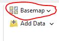
- Change the Basemap (next to the “add data” icon) from Topographic to OpenStreetMap.
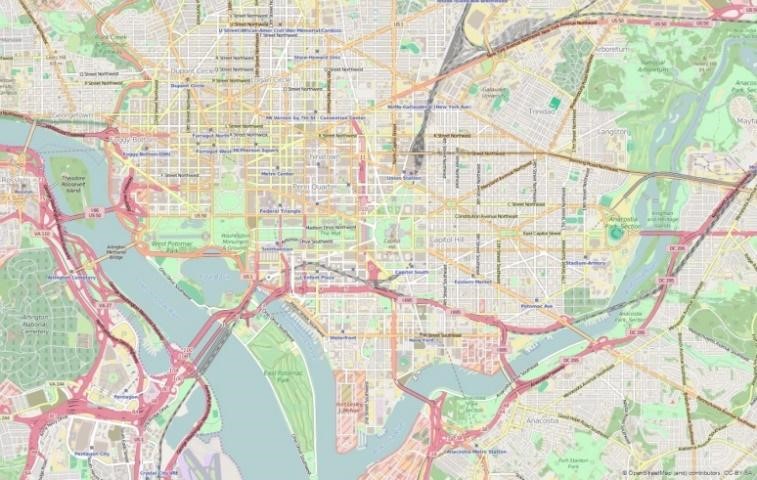
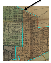
- Zoom in in the area of Washington D.C. Keep zooming in until you can see the Capitol Hill in the center, part of Arlington National Cemetery on the left and the National Arboretum on the upper right (see picture; your view might look different). This is roughly the same extent as the scanned map.
- Right click on Map in the CP, go to its properties and click on the Coordinate System tab. It should say “WGS 1984 Web Mercator (auxiliary sphere)”. This is the Coordinate Reference System (CRS), inherited from the OpenStreetMap basemap. This will be the CRS of the layer that we’ll be creating.
- Hover the mouse over the window and notice how the coordinates change in the lower part. Click the down arrow in this coordinate window and select Decimal Degrees, if not already there. The coordinates around the Capitol Hill dome should be around longitude 77.01°W, latitude 38.89°N.
- With the map centered in the right position, add the scanned map (1822 Detailed Map of D.C.png) to your project. You might get a message saying “Unknown Spatial Reference” (the map has no coordinates) or “Build Pyramids and Calculate”, click OK or disregard.
- If it’s not there, drag the scanned map to the top of the CP.

- Initially the scanned map will not show. You can right click on the image name in the CP and choose Zoom to layer. Notice the coordinates on the bottom of the screen. Click the “Go back to the previous extent” button on the toolbar.
- To georeference the scanned map:
- Click the scanned map in the CP
- In the Imagery tab, on the ribbon, click the Georeference button

- With the scanned map still selected in the CP, push the Fit to Display button in the “Prepare” group of the Georeference tab
At this moment, if the image were upside down, sideways, flipped, or tilted, you would use the other tools in the Prepare group. You want to get the image as close as possible to how it should look. In our case, we should not have to do any of these.
- Adding control points
The following steps involve creating “Control Points”. These are points that you can see in both maps (scanned and base map). You’re going to click on both maps: ALWAYS click on the scanned map first, then on the reference map. In general, this is what you do next:
Find a location that’s easy to spot on the historic map and click it. Turn off (press letter “L”) your historic map then find and click that same location on the base map. When you turn on your historic map again, you’ll see these two points automatically snapped into alignment. This requires some patience and skill (but it’s fun!).
Hint: It helps if you only use the mouse wheel to zoom in and out and pressing and holding the mouse wheel to pan around. You have to avoid deselecting the Add Control Points tool once you start the process.

- Back on the Georeference tab click the “Add Control Points” tool in the Adjust group. Notice the change in the cursor.
- Find, on the historic map, the center of the Capitol dome and click it (no need to be extremely precise, after all, the map is not that accurate). Ask the instructor/T.A. if you need help finding the Capitol.
- Press the letter L in the keyboard to make the map transparent
- Making sure you don’t click anywhere else, find and click that same location (Capitol dome) on the base map.
- Push the letter L in the keyboard to get the scanned map back.
Notice that this first control point places the scanned map in the “sort of” right position. Turn the map on and off (letter L) to see what’s happening after every step!).
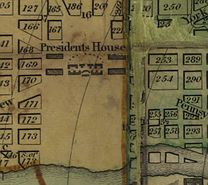
- Add another control point on the center of the White House (called President’s house) to the west and slightly north of the Capitol (in the yellow section of old map).
After adding the second control point, the map should now be roughly the right size. It doesn’t matter if these first couple of control points are rather uncertain, we can discard them later as we add more and better points.
- Keep adding at least 10 control points distributed throughout the whole area of interest.
- With each point added turn the scanned map off and on (L key) to make sure the operation is going well. Make sure that streets line up as best as you can.

You’ll see the historic map move into better alignment with each new control point. If you make a mistake, use the Control Point Table button in the Review group of the Georeference tab, to show all your control points and choose one or more to turn off or just delete.
Pay attention to the last “Residual” column. After you’ve entered more than 4 control points the link table will show Residual values for each point. These numbers must be as little as possible. A high residual, for a particular point, usually means that there is something strange with that point. Generally, more control points with wide distribution = better alignment. However, as you enter more and more control points, the errors, inevitable, will start to get higher and you’ll get higher residual values.
If a point has a residual value much higher than the rest turn it off by clicking the tick box on the left, pay attention to the map to see if it improves. In addition, the rest of the Residual values should decrease.
Technical stuff (for reference): “For each control point, the residual is the difference between where the From point displays in the map and the actual location that was specified. The total error is computed by taking the root mean square (RMS) sum of all the residuals to compute the RMS error. The value describes how accurately the selected transformation method is able to fit all of the control points to their specified location. When the error is particularly large, you can remove and add control points to adjust the error. However, a large error may also mean that the selected transformation method is unable to accurately fit the points to their specified location. However, if the points are all properly selected and a large error is reported, it typically means that a different transformation is required”. – ESRI – Georeference Historical Imagery in ArcGIS Pro
Hint: If the first two points, Capitol and White House have very high residuals, you can turn them off or delete them, they are not needed after you have more, better distributed, points.
- When you have at least 6 points do the following:
- Zoom out to see the entire historical map.
- Notice the range of residual values that you currently have.
- Next to the Add Control Points button there is one called Transformation. Click the down arrow on this and select 2nd Order Polynomial. Notice the change that it causes on the historic map. (Note: this can also be done in the Control Point Table)
- Also pay attention to the Residual values: they should have come down
This will “warp” the map like a rubber sheet (this procedure is actually called “rubber-sheeting”). The “distortion” will be larger in areas with no control points. The area of interest is the most critical and it must be adjusted to real positions, according to the base map, as good as possible. Make sure that the census wards have limits oriented north-south, not weird curves.
If you’re happy with the results of the 2nd order transformation you may proceed, if not, return it to 1st order in the same Transformation tool. Evaluate the quality of the control points.
- After adding at least 10 control points and you’re satisfied with the way things look:
- Save your map document.
- In the Georeference tab ribbon, in the Save group click the Export Control Points and export the controls points as a text file in your working folder (in case we need them, if something goes south).
- Also, in that same group click the “Save” button and it will save the georeferenced information together with the image file, so every time that you load this image, in ArcGIS it will show up “georeferenced”.
At this moment, ArcGIS creates a couple of extra little files and they’re saved with the original image file. Use Windows explorer to verify that there are extra files in addition to the original “1822 Detailed Map of D.C.png”. Keep all these files always together in one folder and your GIS software will know how to align your historic map with other georeferenced layers. These files contain the “transformation” that must be applied to the original image to georeference it.
- Close the Georeference tab (push the button at the end) and turn off the OpenStreetMap layer and save the map document, again.
Task 2 – Digitizing
Now that we have a georeferenced map image, we can use it in conjunction with other GIS layers or get georeferenced information from it. In our case, we’ll draw the limits of the census wards of D.C. in 1822. The process we’ll be doing next is called “Heads Up” digitizing.
Beware that you’ll be creating vector data derived from a scanned map (raster). The quality and accuracy of the vector will depend on the quality of the original map, how well georeferenced it is, and how good you are at digitizing. Sometimes, old maps are just too inaccurate or wrinkled/distorted to be used as base maps for vector layers.
The first step is to create an “empty” feature class (theme) of the right type (point, line, or polygon) then we “edit” it to add features.
- Go to the View tab and click on Catalog Pane (in the Windows group)
- In the panel on the right, find, under Folders, your working folder and notice the default GeoDB (e.g. ex8.gdb) created when we made the map project. This is the “default” GeoDB.
- Inside the default GeoDB, create a new feature class:
- Right click on this GeoDB in the Catalog panel then New\Feature Class
- Name the feature class DCWards. For “Feature Type” make sure to use “Polygon”
- Uncheck both tick boxes under Geometric Properties (read what they’re for, but we won’t use them). Click Next
- In the Fields dialog enter a Short Integer field called “Wards”. Click Next
- Under Spatial Reference choose the coordinate system under Layers: since there is only one layer in the CP (the scanned map) it only gives you one option. Choose the WGS 1984 Web Mercator of the scanned map. Click Next
- Accept the defaults for the next three screens (Tolerance, Resolution, Storage) and click Finish to create the feature class.
You should now see a new polygon layer in the CP. Examine the attribute table to verify that it is empty and it must have a Wards column.
- Represent the polygon in the CP using a hollow symbol and a thick bright color outline. This will make the drawing easier to work with.
The next steps describe how to digitize the polygons (wards). It’s the same process as if you were drawing with your mouse in a drawing software.
You’ll be clicking around the borders of your object until you go all the way around. Every time you click, ArcGIS introduces a vertex in the line. In straight edges, you can click once at the beginning and click at the end of the straight edge. In curved or ragged edges, you’ll have to click more frequently to represent the edge correctly. A matter of cost/benefits determines how dense your vertices are going to be, the more vertices the nicer it will look but the longer it’ll take you to finish. Do your best.
You’ll be drawing the outside perimeter of the area of interest, and then you’ll split that polygon into the different wards. This way we avoid having to draw the same border lines between wards twice and make sure that all the edges and nodes match perfectly. The same techniques that you used in the previous step for panning and zooming in/out will apply this time (use the mouse wheel). Once you have the digitizing tool selected avoid clicking anywhere but where you intend to. If you do click in the wrong place click on the keyboard Ctrl+Z (Control and “Z” keys together) to “undo” the last click(s).
- Click on the layer name (DCWards) in the CP and click the Edit tab in the ribbon,
- Click on Snapping (it’ll turn blue) to turn on snapping. This makes sure that nodes snaps together as you are digitizing
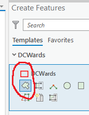
- Click the Create button. A Create Features panel opens on the right side of the screen
- Click on the new feature class (DCWards) and then the Polygon tool (the mouse cursor will turn into a cross hair)
- Zoom in into an area of the map and draw the big polygon encompassing all the wards by clicking with the mouse around the outline
- Follow the colored outline
- This step will require a lot of zooming in/out and panning. Be careful
- Make sure to add a vertex at intersections of two wards (for a later task)
- Once you go around, double click to close the polygon. The recently made polygon should be selected and its outline should be shown in light blue
Now that the outline has been drawn, let’s split it into the multiple wards.

- Make sure the outline polygon is highlighted (selected). If not, pick the Select tool in the Edit tab and click inside the polygon (you can find the Select tool in the Map tab, also).

- Select the Split tool under the Tools group in the Edit tab. This tool works like scissors.
- Zoom in to a section around the edge where the line that separates two wards intersects the edge. Hover the cut polygon tool close to this point and it will show you a special symbol when the cursor snaps to the edge (it will say “DCWards:edge” or DCWards:vertex”). Click there and then draw the rest of the line inside the polygon until you reach the other edge (remember to use the mouse to navigate)
NOTE: if you don’t see the split cursor “snapping” to the edge of the line see steps 20, 20a above.
NOTE: The polygon to be split has to be selected first.
- Make sure the snap symbol appears at the other edge, and then double click there and the polygon will split in two. If you get an error it’s because you didn’t snap the end of the lines to the edge of the polygon to be cut.
- If you make a mistake, at any moment, you can always use the Undo button on top (or Ctrl Z)
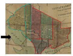
- Repeat this procedure until you split all the polygons into the 6 wards. The final result should look like the image to the right.
- You should end up with 6 polygons. Open the attribute table to verify this
- While the table is open add the number of each ward to its respective polygon using the “Wards” field you created earlier. To find out the ward numbers zoom in and pan around the edges of the polygons and look for the tiny numbers.
NOTE: Ward numbers have nothing to do with the arbitrary OBJECTID column, created by the software as the polygons were being digitized
- When you finish entering the wards numbers, push the Save button on the Edit ribbon to save your edits
At this moment, you can turn off the historic map and you should have 6 polygons. The next step is to populate the table with the attribute values.
- Save the map document.
Task 3 – Building the attribute table
The census tabular data of the Washington D.C. area in 1820 comes from the Census Bureau (link in Moodle). A copy of the printed material published in 1821 is in your data folder and in Moodle (D.C. Pages from 1820a-02.pdf). Because your instructor is so nice 😉 you are already provided with an Excel spreadsheet with the compiled data (1820_data.xlsx). Your job is to join this tabular data in the spreadsheet to the layer you just created. Note: ArcGIS can access Excel tables with no problem.
- Add the “1820” table inside the Excel spreadsheet to your map.
- Verify that both “Wards” columns, in the feature class and in the Excel spreadsheet at both integer numbers.
- Join 1820_data.xlsx to the polygon layer using the Ward columns as common fields
- Open the theme’s attribute table to verify that the join was successful.
Task 4 –Making the Layout
We want to create one layout that shows 3 maps with the 3 populations (slaves, free colored people, and white people) plus one “location” map. For this you need to create 4 separate maps (3 census + location) and add them to the same layout.
- In the same project insert 3 extra maps (Insert tab \New Map); you should have 4 in total
- In map 1 add one copy of the joined DCWards (this first map can be the same you have been working with).
- Right click on the joined DCWards feature class, choose Copy, and paste it on the other maps. Now you have 4 maps with the same theme.
- Use each map to represent each of the “Total” columns from the table (Free White Total, Slaves Total, and Free Colored Total).
- Rename the maps accordingly. Right click on the word Map (or Map frame) in the CP and get the properties.
- Represent the data using Graduated Colors with 4 classes and Method Quantile
- Use the same color palette for the 3 population maps
- In the extra map (#4), turn on the default basemap (World Topographic Map) with one copy of DCWards. Use a Single symbol in a bright color for DCWards to show in your layout as a “location map”. Adjust the colors and order of these layers to get a suitable background. Make sure to zoom out around DCWards enough to show the location of the area of interest with the current limits of D.C. and surrounding areas.
- Create a nice layout containing:
- Your 4 maps correctly labeled (3 with census data and one with location information). Because of this last, we’ll not use a grid.
- Make sure the census images are the same size/scale (scale can be entered manually in the menu bar).
- Each map must have its own legend and scale inserted, but only the location frame needs to have a north arrow (no scale bar on this).
- Make sure to add a meaningful title for the whole layout (don’t forget to add your name to the layout).
- When your layout is ready, export it as a graphic file PNG (NOT JPG nor PDF) and save it in your working folder. Then open your word processor and insert the graphic file in the first page (make the map as big as a whole page).
- In a second page of the same document, describe your three maps: similarities or differences in the distribution of slaves, whites, or free colored, and any possible explanation for this distribution.
- Upload the document with your name (yourname_ex8_part1.docx) to Moodle.
Question 1. Upload a PDF with your D.C. map to Moodle.