Exercise 8 – RS Part 1
Getting started with imagery
Adapted from ESRI training*
Landsat is the longest-running satellite imagery program, capturing images globally since 1972. These images are multispectral, meaning that they cover many wavelength ranges across the electromagnetic spectrum, emphasizing features otherwise invisible to the human eye.
Objectives
In this tutorial, you’ll explore Landsat imagery with the Esri Landsat Explorer web app and learn essential concepts about multispectral imagery by completing the following tasks. (It should take you ~40 mins to complete them all)
- Task 0 – Start exploring imagery
- Task 1 – Monitor vegetation in the Sundarbans mangrove forest,
- Task 2 – Visualize the urban heat island effect around Washington, D.C.
- Task 3 – Inspect an oasis in Egypt
The following two tasks are optional but fun:
- Task 4 – Visualize the growth of a city in China (Optional)
- Task 5 –Delineate flooded areas in Chad (Optional)
When you finish, you’ll have a better understanding of the vast applications of multispectral imagery and be ready to explore the world on your own.
Task 0 – Start exploring imagery
First, you’ll open the Landsat Explorer app and become familiar with the basics of multispectral imagery and spectral bands.
1- Open the Landsat Explorer app in your web browser.
NOTE: To learn more about the Landsat Explorer app and the data it contains, click the About this app button in the top left corner of the app.
You can also learn more about the Landsat program, jointly run by the United States Geological Survey (USGS) and NASA, on the program’s web pages.
On the map, you can see the small city of Redlands, California, in the United States. The landscape does not appear in colors that look natural, the way they would appear to the human eye. The urban areas are light purple, while some of the vegetated areas are bright green. Why is that so?
The Landsat program produces multispectral imagery, which means that it captures information for several wavelength ranges, including some that are invisible to the human eye. Each of these ranges is called a spectral band and is particularly good at highlighting a type of landscape feature or property. Landsat imagery collected since 2013 by the Landsat 8 and Landsat 9 sensors contains 11 spectral bands; earlier versions of the sensors collected slightly fewer bands. The following table describes the main bands for Landsat 8 and 9:
| Band number | Band name | What this band shows best |
| 1 | Coastal Aerosol | Shallow water, fine dust particles |
| 2 | Blue | Deep water, atmosphere |
| 3 | Green | Vegetation |
| 4 | Red | Manufactured objects, soil, vegetation |
| 5 | Near Infrared (NIR) | Shorelines, vegetation |
| 6 | Shortwave Infrared 1 (SWIR 1) | Improved cloud penetration, soil and vegetation moisture |
| 7 | Shortwave Infrared 2 (SWIR 2) | Improved cloud penetration, soil and vegetation moisture |
| 9 | Surface Temperature | Measures the land surface temperature |
NOTE: The Landsat imagery used in the app was processed into Level-2 science products, meaning that various corrections were applied to the original spectral bands to ensure they provide the most reliable information and are ready to be used by analysts.
When working with multispectral imagery, it is not possible to view all available spectral bands simultaneously. However, it is possible to choose up to three bands and combine them into a single composite image. Different band combinations can dramatically change how the features on the ground appear in the imagery, and they can be used to highlight specific features or properties. You’ll compare two such band combinations in the app.
2- In the bottom toolbar of the app, under Renderer, point to the Agriculture tile. More information appears.

The imagery on the map is currently displayed with the Agriculture band combination, composed of the bands Shortwave Infrared 1, Near Infrared, and Blue (or bands 6, 5, and 2). That combination highlights healthy vegetation in bright green and distinguishes it from other land cover types, such as bare earth or urban areas. You’ll switch to the Natural Color band combination for comparison.
3- Under Renderer, click Natural Color
.
With this new Natural Color band combination (bands Red, Green, and Blue—or 4, 3, and 2), the imagery is dominated by earth-colored tones. Together, the Red, Green, and Blue bands make up the spectrum of light visible to the human eye. Combining these three bands approximates how the landscape would look to a person.

The Natural Color band combination can be useful for some applications, but analysts often choose other band combinations based on the specific features they want to highlight.
4- Switch between the Natural Color and Agriculture band combinations a few times to better observe the differences between them.
Question1. Which area on the map has the least proportion of healthy vegetation? (Hint: You can check Map Labels on the top right corner to turn on the labels for the places; you can also “search” for places in that tool)
(Hint 2: Healthy vegetation will look bright green in Agriculture band combination)
a. Highland
b. San Bernardino
c. Grand Terrace
d. Smiley Park, Redlands
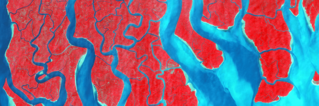
Task 1 – Monitor mangroves in the Sundarbans
Your next destination will be the Sundarbans mangrove forest on the border of India and Bangladesh. You’ll use Landsat imagery to monitor the health of the mangroves in an ecosystem highly susceptible to change. You’ll also learn about a new band combination: Color Infrared.
1- In the Landsat Explorer go to the Sundarbans region in India using the following link Landsat Explorer Sundarbans

Since satellites can’t capture the entire world in one picture, they take multiple pictures that are then stitched together into a patchwork image called a mosaic. Because you are currently looking at a fairly large region, you can see this patchwork effect on the map. Also, the images displayed were taken at different dates and times, so they may differ in color intensity.
NOTE: This view of stitched images is named the Dynamic mode in the Landsat Explorer app. This dynamic mosaic automatically shows the most recent and most cloud-free images stitched together on the fly. Later in the tutorial, you’ll learn to select and display specific images of your choice.
The Sundarbans spreads north of the Bay of Bengal. Just from observing the area with the current Natural Color band combination, you can see a distinction between the heavily forested Sundarbans region and the highly urbanized city of Kolkata to the northwest. Much of the original mangrove forest was cut down, but what remains is protected by the Indian and Bangladeshi governments.

To distinguish the mangrove vegetation more clearly, you’ll use the Color Infrared band combination, which combines the bands Near Infrared (NIR), Red, and Green (or 5, 4, and 3). The NIR band clearly distinguishes between vegetation and nonvegetation features. In the Color Infrared band combination, healthy vegetation appears bright red.
2- Under Renderer, click Color IR (for Color Infrared).
The imagery updates. The Sundarbans mangrove forest now appears bright red, signifying dense, overall healthy vegetation. The water bodies going through the mangrove—devoid of vegetation but high in sediments—appear turquoise blue. Built-up areas, such as the city of Kolkata, appear grayish or beige. Areas with agriculture appear as a lighter shade of red, signifying some vegetation presence, but less dense than in the mangrove forest. Finally, the waters of the Bay of Bengal display in deep blue tones.

3- In the upper left corner of the app, click the Zoom In button a few times to zoom into the heart of the mangrove forest.

Tip:You can also zoom in or out using the mouse’s wheel button.
4- If necessary, pan with the mouse to center the map on the mangrove forest.

Tip: Since Landsat imagery is refreshed on a regular basis with more recent images, the most current image for some areas of the Sundarbans may be cloudy or hazy. If so, pan with the mouse to another area of the mangrove forest that appears clearer. Alternatively, you can use this map, which displays a single Landsat image without any clouds.
Over the broad delta region, the forest is broken up by several rivers and complex tidal waterways. Many of its small islands are accessible only by boat, which hinders on-the-ground observation and intensifies the need for satellite imagery to monitor the forest. Healthier vegetation appears brighter red, but some areas appear in a lighter shade of red or beige. As an analyst, you could identify these areas as containing potentially less healthy vegetation and needing further investigation.
5- Zoom in and out and pan to explore the mangrove forest.
6- Go to the east side of the mangrove forest, where the color changes dramatically from mostly red to mostly beige.

There is a sharp contrast where the protected mangrove area ends. The land in the unprotected area was formerly covered with mangrove forest but has now been entirely deforested. It shows as mostly beige or light pink, signifying an absence of vegetation. As an analyst, you could use these differences in color to detect illegal tree logging activity in the protected areas.
Mangrove forests are highly susceptible to changes in sea level and water salinity, as well as pollution, illegal logging, and other factors. Loss of mangroves would not only compromise the habitat of the diverse species of flora and fauna that live there (including many endangered species, such as the Bengal tiger), but also remove an important shield against monsoons for the neighboring localities. It is important to maintain the health of the forest, and imagery can help do that.
NOTE: What is the difference between the Color Infrared and the Agriculture band combinations? Both are good at highlighting healthy vegetation (in bright red for Color Infrared and bright green for Agriculture). Color Infrared is a more common band combination that is available for many types of satellite and aerial imagery, since it only requires a Near Infrared (NIR) band, besides the Green and Red visible light bands. The Agriculture band combination is less common, because it requires not only a NIR band but also a Shortwave Infrared (SWIR) band. NIR is good for highlighting plant health, as healthy green vegetation reflects more NIR light. SWIR also helps detect the actual water content of the vegetation. The Agriculture band combination is versatile and clearly shows several land cover types.
Task 2 – Visualize the urban heat island effect
Some of the Landsat sensors have the capability of capturing information about temperatures on the Earth’s surface. That information is then used along with other data sources to produce the Surface Temperature band, which can be visualized in the app through one of the renderer options.
You’ll use this capability to visualize the urban heat island effect in Washington, D.C., in the United States. Heat islands are places that experience sustained elevated temperatures compared to surrounding areas. They generally occur in urban spaces with a concentration of impervious surfaces (such as sidewalks, rooftops, and buildings) and few trees or other forms of vegetation coverage. With extreme temperatures on the rise due to climate change, urban heat islands threaten the health and quality of life of local residents.
(Remember this reading from week 4 in Moodle: As Rising Heat Bakes U.S. Cities, The Poor Often Feel It Most?)
You’ll highlight the urban heat island effect on a hot summer day during a heat wave. You’ll create a swipe map to compare a Landsat image rendered in two different ways, highlighting the land cover types on one side and the surface temperature on the other side. First, you’ll focus the map on your area of interest.
1- In the Find address or place search box, type Washington, DC and press Enter.

The map updates to show the Washington, D.C., area.
2- On the bottom toolbar, click Swipe. Confirm that the Left button is selected.

The map updates to the swipe mode, where it is divided into two sections. You’ll choose a specific image (or scene) to display on the left side of the map. In the bottom toolbar, a calendar displays to let you choose scenes captured at specific dates.
3- Under Scene Selection, in the year drop-down menu (it might say PAST 12 MONTHS), choose 2024.
The calendar updates to list the images available for the current map extent in 2024, indicating them as small light gray boxes.
4- In the calendar, click the box for July 16, 2024.

NOTE: Some Landsat images include clouds that obstruct the ground. The Cloud slider lets you decide the maximum percentage of cloud cover that images should contain.

In the calendar, the solid light gray boxes indicate the images that fit this cloud cover criteria. The boxes outlined in light gray indicate images that are higher in cloud cover.
You might see more scenes available than in the example images, as new images are constantly added to the Landsat dataset.
The left side of the swipe map updates with the Landsat scene that was captured on July 16, 2024. You’ll display it with the Agriculture rendering to highlight the different land cover types in the area.
5- Under Renderer, click Agriculture
.
The left side of the swipe map updates to show the vegetation areas in bright green, the urban built-up areas in purple and pink tones, and water bodies, such as rivers, in dark blue.

Tip: In this view, the roads are traced on top of the imagery, as part of the Map Labels layer. The Map Labels checkbox enables you to turn the layer on or off.

You’ll pick the same picture to display on the right side of the map and render it to show surface temperatures.
6- Click the Right button.

7- Under Scene Selection, in the year drop-down menu, choose 2024. In the calendar, click the July 16, 2024 date (yes, the same date as before).
8- Under Renderer, click Surface Temp (for Surface Temperature).

The Surface Temperature renderer represents temperatures on the ground. Different values are symbolized with different colors.
9- Point to the Surface Temp tile to see the legend.

Colors from white to blue symbolize cold temperatures, while orange to dark red symbolize hot temperatures and green to yellow symbolize medium temperatures. The swipe map is now complete. It shows the same image with the Agriculture rendering on the left and the Surface Temperature rendering on the right
.
Drag the swipe cursor left to right to compare the renderings.

While the entire area reached high temperatures, the built-up areas had more extreme temperatures (dark red) and the vegetation-covered spaces and water bodies had relatively cooler temperatures (lighter red or orange).
11- Click different points on the map to see their surface temperature value displayed in pop-ups.

The swipe map you built illustrates the urban heat island effect. Multispectral imagery is a powerful tool to understand and address this phenomenon. On average, a city center can be over 10 degrees warmer than the surrounding countryside. Once the heat islands are identified, it is crucial to plan for cooling strategies, such as planting more trees, switching to cool pavement materials, and creating green roofs.
Question 2. The highest surface temperature around the city of Arlington, VA is around 100 °F according to the Surface Temperature band.
True or False
Question 3. The temperature of the water in the Chesapeake Bay (the body of water east of D.C. is in the 80’s °F
True or False
Tip: You can copy the URL of your swipe map, or any other map you produce with the Landsat Explorer map, to share it with people in your community.
Task 3 – Inspect an oasis with spectral profiles
To further understand multispectral imagery, you’ll travel to the El Fayoum oasis in Egypt and learn about spectral profiles, spectral signatures, and spectral indices.
1- Use this Landsat Explorer link to go to the El Fayoum oasis area., south of Cairo, Egypt.

The Landsat imagery displays, rendered with the Agriculture band combination. El Fayoum is a large heart-shaped oasis that has existed since ancient Egyptian times. It is a trove of vegetation and water in the midst of the Sahara Desert. On the east side, the Nile valley crosses the map diagonally. Water is brought to the oasis from the Nile River through human-made canals.
When working with multispectral imagery, it can be useful to plot spectral profiles for specific points of interest. A spectral profile is a chart that shows the value for all the spectral bands for a specific imagery pixel. You’ll generate spectral profiles for several points in the El Fayoum area.
2- In the bottom toolbar, click Analyze and choose Spectral profile.

To use this option, you need to choose a specific Landsat image.
3- Under Scene Selection, in the year drop-down menu, choose 2023. In the calendar, click the February 19, 2023 date.
The image appears on the map. The El Fayoum oasis displays in the northeast corner of the image.

You’ll start by examining a pixel representing vegetation. Typical vegetation in the El Fayoum oasis is mostly composed of cultivated fields of crops such as cotton, clover, and cereals, with some palm and fruit trees interspersed in the landscape.
4- On the map, use the crosshair pointer to click a location in the oasis that seems covered with vegetation (bright green).

In the bottom toolbar, under Profile, the spectral profile chart for that specific pixel appears. The chart is titled Healthy Vegetation.

Tip: If your pixel was not identified as Healthy Vegetation, you may have chosen a pixel that included some buildings, bare earth, or other features. In that case, click one or two more locations with vegetation until you get a Healthy Vegetation identification.
In the chart, the x-axis (horizontal) represents the different spectral bands: Coastal, Blue, Green, Red, NIR, SWIR 1, and SWIR 2. The y-axis (vertical) shows the band values for the pixel you selected. The curve formed by connecting the band values displays in light gray.
There is a green dotted line traced on the chart. Its legend is labeled Spectral profile of Healthy Vegetation. Each type of land cover, such as healthy vegetation, water, or sand, will tend to have a typical, recognizable spectral profile, called a spectral signature. By comparing the spectral profile from any imagery pixel to typical spectral signatures, it is possible to automatically identify the land cover type of that pixel. In this chart, the pixel’s spectral profile was found to be most similar to the Healthy Vegetation spectral signature.
5- On the map, click locations that seem to represent:
- A lake (dark blue) (Clear water)
- The desert (yellow beige) (Sand)
The spectral profile charts identify these points as Clear Water and Sand, respectively.

The spectral profiles are very different from each other. Most imagery analysis techniques take advantage of these spectral profile variations to automatically detect information about the land cover types in the image. One such technique is to compute spectral indices. A spectral index applies a mathematical formula to compute a ratio between different bands for every pixel in the imagery, with the goal of highlighting a specific phenomenon. You’ll try out two of them now.
6- Under Renderer, click MNDWI
.
MNDWI stands for Modified Normalized Difference Water Index. It computes a ratio between the Shortwave Infrared 1 and Green bands to highlight water. With this index applied, the water bodies appear highlighted in blue. On the current map, these are primarily lakes that are part of the El Fayoum oasis.

7- Under Renderer, click NDVI Colorized.

NDVI stands for Normalized Difference Vegetation Index. It computes a ratio between the Near Infrared and Red bands to highlight vegetation. Thick healthy vegetation is highlighted in dark green and sparse vegetation in brown.

You’re now familiar with spectral profiles, spectral signatures, and spectral indices. You learned that imagery analysis techniques take advantage of spectral profile variations to automatically detect information about the land cover types in imagery. As an analyst for the El Fayoum region, you could use these techniques to monitor crop health, drought conditions, the impact of wildfires, and other phenomena. With multispectral imagery, it is possible to perform such monitoring across large regions, entire countries, or even the whole world.
Question 4. Which spectral signature has the highest band values through out most bands in the spectral profile? (Hint: Look at the y-axis value of the spectral profile)
a. Spectral profile of Sand
b. Spectral profile of Clear Water
c. Spectral profile of Dry Vegetation
d. Spectral profile of Trees
Go to optional tasks 4 & 5
Go to start page Mapping & Spatial analysis
Source
This tutorial was originally developed by the Esri Tutorials Team.
You can find the official maintained version at this location https://learn.arcgis.com/en/projects/get-started-with-imagery/
You can find other tutorials in the tutorial gallery [https://learn.arcgis.com/en/gallery/].