Exercise 11 – Intro to QGIS
Introduction to QGIS

- Overview of QGIS
- Objective: To locate new sites for farmer markets near lower income communities with limited access to fresh fruits and vegetables
Overview of QGIS
Adapted from Geospatial Innovation Facility (GIF) at UC Berkeley’s College of Natural Resources http://gif.berkeley.edu/
This exercise is designed to familiarize you with some basic concepts and capabilities of QGIS. You will explore the abilities of QGIS to visualize, navigate, manipulate, and analyze geographic datasets. You already know the GIS basis of the procedures used here.
Objectives
Dataset
Preliminary tasks
Task 1 – Adding Data
Task 2 – Symbology
Task 3 – Navigation
Task 4 – Working with Attribute Data
Task 5 – Basic Spatial Analysis
Task 6 – Exporting Data and Print Layouts
Objectives
In this exercise you will learn how to:
- Create a map project
- Add layers to your project
- Display data to your specifications (e.g. colors, symbols, line weights)
- Navigate the data using the zoom, pan, and full extent tools
- Identify features and their attribute data
- Query the map based on your criteria
- Perform some geoprocessing operations
- Create a map layout
To do this, we will use the data provided to select the best locations for community sponsored produce stands.
In our imagined scenario, the City of Berkeley, CA has assigned you the task of identifying lower income communities with limited access to fresh fruits and vegetables. The City would like to identify five civic buildings that are in close proximity to these neighborhoods and place weekly produce stands on their property. Therefore, your final product will be a map depicting the location of these potential sites and their service areas.
Dataset
The dataset contains several shapefiles from different sources. Note that a shapefile is composed of several files with the same name and different extensions. All these files of the same name must be in a folder together for the software to read them.
- Berkeley_dem.tif – a raster “digital elevation model” displaying elevation for the City of Berkeley and surrounding areas.
- Berkeley_shd.tif – a raster grid file displaying shaded relief based on elevation.
- BerkeleyBlockGroups.shp – polygons containing demographic information for census block groups
- BerkeleyLimits.shp – polygon of city boundary
- County.shp – polygon of Alameda and Contra Costa Boundaries.
- Fruit_Vegetable_and_FarmersMarkets.shp – shows point locations for fruit and vegetable markets, as well as Farmers Markets
- PublicSites.shp – point locations of public buildings, institutions, and churches.
All layers are in the following coordinate reference system (CRS): Universal Transverse Mercator (UTM) Zone 10 North, North American Datum 1983 (NAD83)
NOTE: If you choose to work on your own computer download the ex11.zip file from the Exercise 11 resources folder in Canvas and expand the zip file into a suitable folder BEFORE using the data. If you’re working in the GPL just copy the \ex11 folder to your X:\user working folder.
Preliminary tasks
- Download the appropriate version (Mac or Windows) of the software from the official website. In the GPL we have installed the current version 4.0.1 and these instructions are based on that version.
- Download the appropriate dataset from Canvas (Ex11 resources) or from the N:\Geog205 drive. The data is provided as a zip file. It’s important that you extract (unzip) that file into your working folder (X:\user\ex11 folder) if working in the GPL or into a suitable folder if working in your computer.
Please note that QGIS can work with data inside zip file giving you the impression that the data is available for editing/changing/saving/etc. It is NOT. Make sure to extract it first.
Task 1 – Adding Data
- Launch QGIS (Windows Start QGIS group QGIS Desktop). If you get a prompt to load previous version data/settings, choose to start fresh. You should now have a new map window, similar to ArcGIS Pro: there’s a place for displaying data and a list of layers or Layers Panel (the CP in Arcgis). You may close any signs and extra panels other than Layers and the Map view.
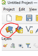
- Click the Open Data Source Manager button on the left of the second toolbar.
- In the dialog box (called Data Source Manager) make sure you’re in the Browser tab, on the left, and navigate to the working folder (X:\user\ex11)
- Highlight all shapefiles (5 files ending in .shp) and TIF files (2 files ending in .tif). Select the files by holding the Ctrl or Shift keys.
- Right click on the selected files and choose “Add selected layers to project” (disregard/cancel any message about coordinate system for the raster images)
- Close the Data Source Manager window.
DON’T DO THIS: You could have added individual Vector or Raster layers by using corresponding tabs (Raster and Vector tabs) in the Data Source Manager.
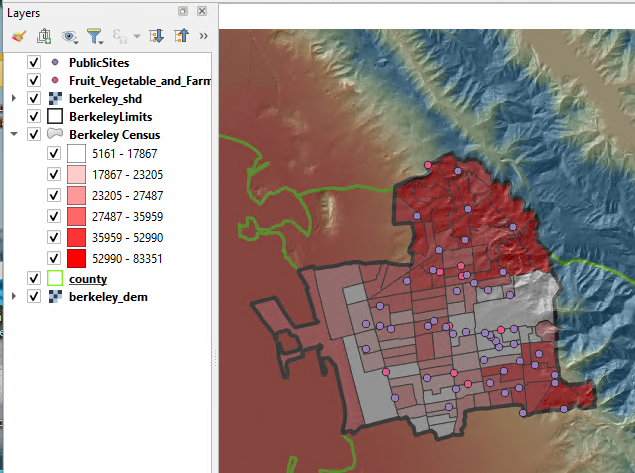
- In the Layers panel, check the boxes to the left of the layer name off and on. This makes the layer visible or not visible in the data frame. Click and drag the layers in the layers panel to rearrange their order in this way, from top to bottom:
- PublicSites
- Fruit_Vegetable_and_FarmersMarkets
- BerkeleyLimits
- BerkeleyBlockGroups
- County
- Berkeley_shd
- Berkeley_dem

- Click on the Save Project button on the top toolbar.
- Save the map in your working folder (e.g. X:\user\ex11) and call it basic_map.qgz (or qgs, they’re equivalent; the “z” is a zipped version of the other; they both work the same way).
Save your work frequently throughout this project. Remember that a project file (.qgs or .qpz), like an ArcGIS Pro project (.aprx), will save your display and layers, however it only points to the selected data files. Data files are separate from the map (or project) file.
Task 2 – Symbology
- Change the BerkeleyLimits polygon to an outline by double clicking its name in the Layers panel (or right click properties).
- Select the Symbology tab on the left
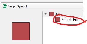
- Click on the “Simple fill” color sample
- On the Fill style, pick “No Brush”
- Choose a dark blue for Stroke color
- Increase the Stroke width to about 1 millimeter
- Click OK
- Right-click BerkeleyLimits and select Zoom to Layer.
- Get the properties of BerkeleyBlockGroups (R-click-properties, or double click).
- Click on the Source tab. Change the “Layer Name” to Berkeley Census
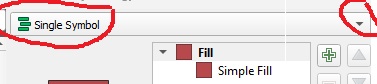
- Click on the Symbology tab, click on Single symbol drop down arrow, and change it to Graduated
- Make sure the color ramp is a monocolor ramp (any color, from light to darker)
- Select PERCAPITAI (Per Capita Income) in the Value field (on top, below “Graduated”)
- In the lower part of the Layer Properties window, set the number of classes to “6”, and Mode Equal Count (Quantile)
- Click OK, and you will see the census blocks vary in color according to Per Capita Income.
- Using the same steps as before, set the County layers’ Fill style to No Brush so that you can see the surrounding topography
- To adjust the Style for the raster layers, access the layer properties menu for berkeley_dem
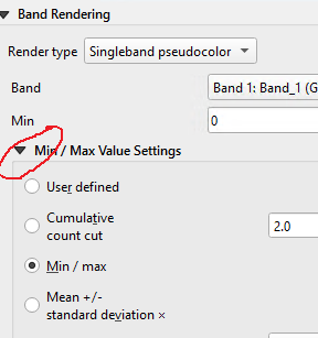
- In the Symbology tab set Band Rendering Render type to Single band pseudocolor
- Choose a 2 or 3 color ramp (click the down arrow, not the color bar itself; experiment to something of your liking)
- Click the arrow next to Min/Max Value settings section and choose Mean +/- standard deviation to 1 (this setting is only to improve the contrast)
- Click Apply and close the dialog.
- Lastly, open the Layer Properties for Berkeley_shd. In the Symbology tab on the left change
a. Render type to Single band pseudocolor
b. Color ramp to Grays
c. Go to the Transparency tab on the left and set Global Opacity to 60%, which will create a 3D effect with the DEM. You can adjust transparency on any layer to maximize viewing. Also, try moving the semi-transparent Berkeley_shd layer above the polygon layers.
- Remember to save the project frequently.
Task 3 – Navigation
- Explore the data using some of the navigation tools in the Toolbar:
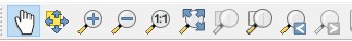

- Click on the full extent button to see your entire dataset and experiment with the other navigation tools to see what they do. The mouse wheel is also very useful, try it.
- You can turn on and off the different toolbars by right clicking on an empty space in the toolbar. Familiarize yourself with the toolbars that are on (or off).
Task 4 – Working with Attribute Data
Every spatial unit, such as a polygon, point, or pixel may be assigned several values that are associated with relevant attributes. These values are stored in the database file (.dbf) and may be viewed in an attribute table or using the identify tool. This section explores attribute tables and some tools to query them.
Attribute Tables

- Right-click on Berkeley Census and select “Open Attribute Table.” Alternatively, click on the layer name in the Layers panel and push the table button on the toolbar.
- Explore the table. Each row corresponds to a spatial feature and each column represents an attribute.
- The total number of items is located on the top of the table (you should see 95 features)
- Click on the numbered grey box at the beginning of a row and the corresponding feature is highlighted in yellow on the map.

- Click the Zoom to selection button in the attribute table toolbar and the map zooms in to the selected feature.
- Click the Deselect all button on the top of the attribute table’s window to clear selection. Close the attribute table.
Selecting Features
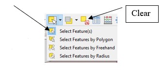
- You can also select features directly on the map. Zoom to Berkeley Census then choose the Select Features button from the Selection Toolbar.
- Click inside of a polygon. Hold the Ctrl key to make multiple selections, or drag over a large area (hold the shift key to add to the selection). You will notice that features are highlighted both on the map and in the attribute table. Check the different tools for selection that you can try from this menu.
- Clear the selected values.
Alternatively, you can also select features based on their attribute values.
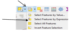
- Click on Select by Expression tool, type the expression
PERCAPITAI < 20000 in the left window (spaces are optional), and push the Select Features button on the bottom of the dialog.
Notice the number of selected items (you should see 25) on top of the attribute table.
- The selected items can be exported/extracted to a new layer, by right clicking on the layer name in the Layers panel and “Export \ Save selected features as”. But we’ll look at this later.
- Another way to extract a set of selected items as a new data set is to apply a feature filter by using the Query Builder located in the layer’s properties.
- Clear the selection
- Go to the Berkeley Census Layer Properties \ Source Tab, and push the Query Builder button on the lower right corner.
- Enter the expression PERCAPITAI < 20000 (this time you can pick the field name)
- Click OK and OK.
- Notice how the result is very different from before: Now it shows you only the 25 selected polygons.
- Now export the selected polygons and create a new shapefile with only these areas: Right-click Berkeley Census in the Layer pane, and click Export \ Save features as. Set the Format to ESRI Shapefile and browse to your working folder and name the new shapefile low_income_areas.shp, and accept the default CRS. You can add this new file to your map. These are the low-income neighborhoods that the city wants to explore (verify that you have only 25).
- If you want to see all the census polygons in the original Census layer and remove the filter you applied (properties \source query builder)
Task 5 –Basic Spatial Analysis
In order to find the low-income areas that are being under-served by the current fruit/vegetable markets and Farmers Markets, we’ll make a buffer around them. The areas inside the buffer are already served by the current market, so we need to find the areas outside the buffers.
Buffers
- From the menu, choose Vector \ Geoprocessing Tools \ Buffer
- Select Fruit_Vegetable_and_FarmersMarkets as the input vector layer.
- Set a buffer distance of 1000 meters (1 km).
- In the field Buffered (this is the output; you might need to scroll downs in the dialog window to see this), click the browse button (3 dots) and choose Save to File. Go to your working folder (X\user\ex11), choose shapefile (SHP) as type and enter MarketsBuffer.shp as file name.
- Leave all the other parameters as is and click Run.
- Notice the new layer (Buffered) in the Layers pane. Rename it to “Markets 1000 m buffer”.
Difference
To identify low-income areas that are greater than 1km from a fruit and vegetable or farmers market we’ll use the Difference function (This is equivalent to ERASE in ArcGIS) to get, out of the “low income areas”, the sections that are beyond 1km from existing markets.
- Choose Vector \ Geoprocessing Tools \ Difference
- Set low_income_areas as the Input layer, and Markets 1000 m buffer as the Overlay Layer.
- Where it says Difference click the browse button (3 dots) and choose Save to File. Go to your working folder (X:\user\ex11), choose shapefile (SHP) as type and enter Underserved_Areas.shp as file name. Click Run.
- Turn off the buffer and low-income areas. Your new layer should show only low-income areas that are farther than 1km from markets (11 polygons).
Final selection
Since the city is asking you to choose the suitable public buildings for possible sites, we can’t let the GIS do all of the work. So, you’ll choose the final selection of five sites.
- Select five sites of your preference from the public building layer based on their service areas.
- Make sure that PublicSites and Underserved_Areas are both visible on your map (Turn off Fruit_Vegetable_and_FarmersMarket).
- Click on PublicSites layer in the Layers panel to highlight its name

- Choose the Selection tool
- Use the Select feature tool and highlight five Public Sites that could represent good sites for community produce stands, based on their proximity to under-served areas. Hold the Ctrl key to select multiple features.
- Right click PublicSites in the table of contents and “ExportSave selected features as” to create a new file, in your working folder, of your five selected points. Name the file ProposedSites.shp.
- Hide the other public sites, and create 1km buffer around ProposedSites using the steps described in the previous buffer section.
Task 6 – Exporting Data and Print Layouts
Now you will export your data to other formats while emphasizing quality map design.
- Adjust your layers’ symbology AND labels to create a compelling map layout in your viewer BEFORE entering the QGIS print composer.
- Adjust the map so that you can see all of Berkely limits in your map view
- Make sure to show the proposed sites, the 1km buffers as empty circles (visible borders), the full census data (per capita income), the current farmer markets (different symbol/color from the proposed sites), county outline, and the two elevation rasters
- Rename the layers in the Layers Panel to show nice descriptive names.
- Enter the Print Composer by selecting, from the menu, Project \ new Print layout. Enter a name you like for the new layout.
- In the new window that opens you should see a blank white page ready to accept your map.
- Click the Add Item \ Add Map tool from the menu, and drag a box over the blank workspace.
- Add a scale bar to the map using Add Item \ Add scale bar and drag a box on the map.
- You can adjust the style and numbering by clicking on the bar and a panel should open on the right side (or right click the object and get properties)
- Change the Units to kilometers
- Change Label unit multiplier to 2
- Change Style to something you like
- Add a title to the map using the Add Item \ Add label tool. You can adjust the text under the item tab (on the right pane; or item properties), and size and position by dragging the squares on the map. It can be edited on the right pane. Suggested title: Proposed Fruit and Vegetable Markets. Fix the appearance (font/size).
- Add a North Arrow and your name. Fix the appearance.
- Add a legend to the map by using the Add Item \ Add legend tool and drag a box on the layout. Use the options in the panel on the right to adjust the legend to your liking. You can move items up and down and edit their names here (you might need to scroll down in the lower window to see the list of layers under Legend Items).
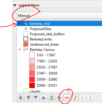
- Right under “Legend Items” click the down arrow and choose “Manual”. This activates some buttons below the layers
- Remove the legend items from the two rasters (they’re only there to make the map look good) and the vectors that are not being used using the red minus symbol “–“ below the legend items
- Spend some time adjusting the map (layer colors and textures). Make a good map composition.
- Export the map as PDF (Your_name_ex11.pdf) under the Layout menu. Save and close the project
Question 1. Upload your map as PDF to Canvas.