Thematic Mapping in ArcGIS
Contents
- Part 1: Tutorial – Creating Map and Data Classification
- Objective: To learn more about how to produce a map (layout) in ArcGIS Pro through preparing a map showing the geology and the range of the groundwater salinity in the Azraq basin.
- Part 2: Dr. John Snow and the cholera epidemic of London
- Objective: To analyze the spatial distribution of points and do basic table statistics.
Part 1: Tutorial – Creating Map and Data Classification
(Adapted from W. Bajjali. 2023. ArcGIS Pro and ArcGIS Online & ESRI ArcGIS Pro Help)
When you add data to ArcGIS Pro, the program assigns random colors for the layer symbols. You can change the colors and assign a color of your choice to make the map easy to view & understand. Features can also be symbolized based on attributes. Maps on which features have been symbolized based on an attribute often convey more detail and clarification. For instance, road lines could be symbolized by a type attribute to indicate types of roads, such as highways, interstates, or major roads. Individual well locations could be symbolized by a yield attribute to show the capacity of wells by discharge in m3/h.
The type of symbology depends on whether an attribute’s values are text or numbers. Numbers represent counts, amounts, rates, or measures. Texts represent a descriptive property of the feature. Exactly how the symbols differ from one another depends on what you are mapping. For instance, if you were symbolizing geology according to the outcrop formations, you might use polygon symbols with different shades or color to represent the different formations. However, if you were mapping streams according to base flow, you might show streams with permanent base flow as a solid line and the intermittent stream as a dashed line.
Feature quantities are typically represented on a map by creating groups of features with classes and assigning a special symbol to each class. The most common ways to symbolize quantities are graduated symbols and graduated colors. Displaying features in a graduated sequence allows the map to visualize the distribution patterns in quantity data.
Your task: You are a geologist working for the Ministry of Water and Irrigation in the Azraq Basin in Jordan. You have the task to prepare a map showing the geology and the range of the groundwater salinity in the basin.
Task 1: Data Integration
- Copy the data folder \ex3 to your X:\user\ and only work in that folder
- Launch ArcGIS Pro
- Create a new project (“ex3_part1”) using X:\user\ex3 as your working folder (don’t create a new folder)
- In the Content Pane (CP) on the left, right-click on “Map” and click on Properties.
- Click on the General tab
- In the Name box, change it to Azraq Basin
- Then, click OK
- In the top menu Map – Add Data and go to you working folder in the X:\user\ex3 and load the feature classes Fault, Geology, and Well inside the Geodatabase Azraq.gdb (you can select multiple themes by using Ctrl and clicking on each theme)
- In CP, right-click Azraq Basin map, click Properties and select the Extent tab, and click “Use a custom extent”
- Under Extent of a layer: click Geology (notice how the coordinate values change), then press OK (the Extent defines the limits of your map, without this your map extent would be the whole planet as that’s the default extent from the World Topographic Map added by default to the CP
- Save the Project by clicking the Save button on the Quick Access toolbar (3rd from the left, it has a little floppy disk; or go to the Project tab and choose Save Project). Get in the habit of saving the project frequently.
Task 2: Classify the Geology Layer Using the Lithology Field
Vector spatial data exist as points, lines, and areas. Representing these features, combined with their attributes, often means encoding something more complex than just geographic location. In this section, you will symbolize the Geology layer based on the Lithology field in the attribute table.
- In the CP, right click (r-click) on the Geology theme, select Attribute Table. The table will open below the map. Study the columns (fields) and notice the Lithology field and its values, we’ll use these to symbolize the geological layer.
- Close the table after you have done looking at the attribute table, by clicking on the “X” in the left-hand corner.
- Highlight the Geology layer in the CP, click Feature Layer tab, in the Drawing group, click on the Symbology (or r-click Geology layer in the CP and select Symbology)
- The Symbology – Geology pane displays on the right.
- Under Primary symbology, select from drop-down arrow and choose Unique Values and in the Field 1, choose “Lithology”
- In the lower pane part of the symbology pane, click the drop-down arrow in More (on the right) and uncheck “Include all other values”
- Notice the changes in the map and the CP
The default palette of colors and symbols used by ArcGIS Pro is very lame, as you can see in this representation of Lithology. There are multiple options for palettes and styles of symbols which can be selected under Color scheme in the Symbology pane. We’ll next used an already existing symbology saved in what is called a Layer file which is just the set of instructions to represent a particular layer. The layer file does not contain any data, only representation so it must be “attached” to a data file with the appropriate attribute, in our case Geology with the “Lithology” field.
- In the Symbology pane click the hamburger (3 horizontal lines) icon on the upper right and choose Import symbology
- Input layer:Geology
- Symbology layer:click folder icon & go to working folder (outside of Azraq GeoDB) and choose Geo_layer.lyrx
- Type: Value field
- Source Field: Lithology
- Target Field: Lithology
- Push Run at the bottom and notice the changes
- Save the project
Task 3: Creating a Salinity Map Using Numeric Attributes
ArcGIS Pro provides many types of classification and color ramps, which can be used to highlight different aspects of the data. When classifying the data, you can use one of many standard classification methods provided in ArcGIS Pro, or you can manually define your own custom class ranges. This section uses the following classification:
- Natural Break
- Quantile
- Equal Interval (optional)
- Manual (optional)
A- Create a New Map and Call It Salinity Using the Natural Break
A Map in ArcGIS Pro represents a collection of tabular and symbolized geographic layers and presents information such as the coordinate system and various other metadata.
- Click Insert tab on the top ribbon, in the Project group, click New Map. Notice the new tab added on top of the map window and its corresponding CP.
- In the new Contents Pane rename the Map and call it Salinity Natural Breaks
- Click on the Azraq Basin map and in its CP shift click on Geology, Fault, and Well themes then right click and choose Copy (Ctrl+C)
- Go to the Salinity Natural Breaks map, right click on the name in the CP and choose Paste (Ctrl+V).
B- Classify the Salinity of Groundwater Using the Natural Break Method
With natural breaks classification (Jenks), classes are based on natural groupings inherent in the data. Class breaks are created in a way that best groups similar values together and maximizes the differences between classes. The features are divided into classes whose boundaries are set where there are relatively big differences in the data values. The advantage of this classification, in this case, is that it identifies actual classes within the dataset, which is useful to create true representations of the actual salinity of the groundwater wells.
Natural breaks are data-specific classifications and not useful for comparing multiple maps built from different underlying information.
- In the CP of the new map, r-click on the Well theme, open “Attribute Table”.
- The “SALINITY” field in the attribute table will be used to classify the Well theme.
- Right click the heading of the “SALINITY” field and select “Sort Ascending”
Question 1 – What is the highest salinity value? _____________
Question 2 – What is the lowest salinity value? ____________
- Close the attribute table of the Well theme.
- In the CP, r-click on the Well theme, click the Symbology.
- Under Primary symbology, select Graduate Symbols and fill it as follows:
- Field: SALINITY
- Method: Natural Breaks (Jenks)
- Classes 5
- Minimum size: 6 pt
- Maximum size: 16 pt
- To the right of “Template” click the symbol, and choose “Circle 1” (under ArcGIS 2D)
- Click the back arrow on top of the pane (Symbology-Well)
- In the lower part of the Symbology pane there is a Classes tab, under Symbol, right-click the biggest symbol (bottom), change the color to red, r-click the 2nd symbol from bottom and change the color to pink, change the 3rd to green, the 4th into blue and the top into cyan
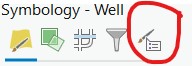
- On top of the the Symbology – Well pane, click the Advanced symbology options (5th icon from left)
- Open the Format labels, under Alignment, check “Show thousands separators”
(NOTE: We don’t need it here but notice that here we can also customize the number of decimal places used in labels)
- Save your project.
C- Classify the Salinity of Groundwater Using the Quantile Method
In the quantile method, each class contains an equal number of features, and this method is mainly used in homogenous linearly distributed data. This method is useful when you want to emphasize the relative location of highly saline wells among other low salinity wells. Quantile assigns the same number of data values to each class. There are no empty classes or classes with too few or too many values. Because features are grouped in equal numbers in each class using quantile classification, the resulting map can often be misleading. Similar features can be placed in adjacent classes, or features with widely different values can be put in the same class. You can minimize this distortion by increasing the number of classes.
- Repeat the procedures in the previous section (Natural Breaks):
- Add new map and name it correctly
- Add Geology symbol layer and Fault and Well themes (copy/paste or Add Data)
- Change symbology of Wells using Graduated Symbols with the field SALINITY
- This time use the Method: Quantile
- Classes 5
- Minimum size: 6 pt
- Maximum size: 16 pt
- To the right of the Template, click the symbol, and choose “Circle 1” (under ArcGIS 2D)
- Click the back arrow in the Symbology-Well pane
- In Classes tab, under the Symbol, r-click the biggest symbol (bottom), change the color to red, r-click the 2nd symbol from bottom and change the color to pink, change the 3rd to green, the 4th into blue and the top into cyan
- In the Symbology – Well pane, click the Advanced symbology options (5th icon)
- Open the Format labels, under Alignment, check “Show thousands separators”
- Save your project.
Please study the difference between these two maps. Click on each map tab on top of the map window to switch back and forth. Notice how the ranges of values for each category are different. It’s important to notice this as you will need to choose one representation method every time you make a map. ArcGIS Pro uses Natural Breaks as default but you should make your own decision as to what you need/want to represent.
Now that you know how to represent quantitative data using natural breaks and quantiles, the following two maps (D & E) are optional but highly recommended.
D- Classify the Salinity of Groundwater Using the Equal Intervals Method (Optional)
The equal interval method generates classes that have equal ranges. This allows you to specify the number of intervals, and the class breaks based on the value range are automatically determined. For example, if you specify three classes for a field whose values range from 0 to 300, three classes with ranges of 0–100, 101–200, and 201–300 are created. The equal interval method is best used in recognizable data ranges, such as percentages and temperature but not for heterogeneous data such as in our case of groundwater salinity.
- Repeat the procedures in the previous sections (Natural Breaks/Quantiles)
- Symbology – Graduated Symbols
- Method: Equal Interval
- Everything else same as before
- Save project
E- Classify the Salinity of Groundwater Using a Manual Method (Optional)
This method allows users to use their own classes manually by setting the class ranges that are appropriate for the dataset. This method allows us to classify the water salinity based on the known drinking water quality standard or the water–rock interaction standard. The method is appropriate for classifying the salinity of groundwater because it allows us to emphasize features with specific values; for example, wells that are highly saline at certain locations can be excluded as sources for drinking or irrigation.
- Repeat the procedures in the previous sections (you might want to create a new Map and copy the Well theme from Natural Breaks)
- Symbology – Graduated Symbols
- Method: Manual Interval
- Everything else same as before
- In the Symbology – Well pane, in the Classes tab below, under the Upper value, delete the number shown (in my screen it says ≤ 1574) in the lowest value and type 1000 and change the color of its symbol to cyan
- Continue by changing the number as in the table below
| Symbol color | Upper value |
| Cyan | ≤ 1000 |
| Blue | ≤ 2000 |
| Green | ≤ 3000 |
| Pink | ≤ 4000 |
| Red | ≤ 80,000 |
- Save project
Task 4: Create Page Layout for Groundwater Classification
A layout is a collection of map elements organized on a virtual page designed for map printing. Common map elements include one or more map frames, scale bar, north arrow, map title, descriptive text, legend, etc. For geographic reference, you can also add grids or graticules (we’ll do that at a later exercise).
Your boss asked you to create an 8.5 by 11” page map that includes the 2 types of classifications: Jenks & quantiles (or whichever you prefer, but pick only two this time). The layout page should be a landscape orientation in PDF format. The map document will be distributed to the shareholder of Azraq Basing during the annual briefing about the groundwater quality for discussion.
- Insert tab on the ribbon, in the Project group, click New Layout drop-down arrow, under ANSI-Landscape, select Letter 8.5” x 11” template
- The Layout is added to the CP and above the Map View.
- Rename the Layout ”Groundwater Classification Layout”
A- Add the Salinity Natural Break Map to the Layout
- On the top ribbon go to the Insert tab – the Map Frames group, open the Map Frame drop-down arrow and choose the map with the image of “Salinity Natural Break”
- Draw a box for the frame in the left-top side of the layout (leave healthy margin) to place other items
- The Map Frame added to CP and includes the Salinity Natural Break Map
- In the CP, r-click the Geology layer and Zoom To Layer
- Click on the map in the Layout, and you can use the selection handles to resize the map.
- In the CP, rename the Map Frame “Natural Break Frame”
- Save the project
B- Add the Salinity Quantile to the Layout
Repeat the procedure shown in previous section (Natural break map). Try to draw a similar sized box.
NOTE: you may use any 2 maps that you created. You need to label them carefully (we’ll show you how later).
Task 5: Insert Layout Elements
The layout can include many elements. Some elements such as legend, scale bar, and north arrow are associated with map frame. Text and graphics are elements are not associated with a map frame. First you are going to insert a title for the whole Groundwater Classification layout and the author to reflect the purpose of the layout, and it will be placed at the top of the layout. A text title will be created for each map frame inside the layout. In this situation, each map frame will have its own title. Place your title at any location inside the Map Frame, as you will arrange all your layout elements (legend, scale, north arrow), after you integrate all of them later.
A – Insert Title/Author for the Layout
- In the CP of the layout highlight Groundwater Classification Layout
- In the Insert tab on the ribbon, in the Graphics and Text group, select Straight Text (plain A)
- Draw a box for the frame at the top right (if you placed the little maps on the left) of the layout to place the text
- Type Groundwater Classification (it might look very small or too big, don’t worry)
- Hit Enter to add a new line and type by yourname (Note: ALWAYS add your name)
- In the CP, a Text title displays, rename the text to Layout Title (so we know what it is)
- In the CP, highlight the Layout Title and right click/properties (or double click it);
- An Element pane opens on the right
- In the Text tab in this new pane adjust the text if you need to
- Click on Text Symbol in this pane and change the font to Times New Roman and size 24 and center it. You may choose other font/size combination that you like better
- Push the Apply button at the bottom
B – Insert Title for the Natural Break Frame
- In the CP highlight the Natural Break Frame
- Insert tab, Graphics and Text group, select Straight Text and click on the top of the Natural Break Frame in the layout
- Type Natural Break Classification
- Click Text tab on the ribbon, click Text Symbol group, change the font to Times New Roman and the size 14 (or anything you like that looks good)
- Place the Natural Break Frame in the Layout in the upper left corner (if it’s not there already)
- In the CP rename the Text to Natural Break Classification Title
- Repeat the previous steps and place the corresponding title to the second map you added according to these suggestions (remember to only include 2 maps):
| Data frame | Title in the data frame | Change the text in the CP |
| Natural break frame | Natural break classification | Natural break classification title |
| Quantile frame | Quantile classification | Quantile classification Title |
| Equal interval frame | Equal interval classification | Equal interval classification Title |
| Manual frame | Manual classification | Manual classification Title |
- Save the project
C – Add a Legend
A legend tells the meaning of the symbols used to represent features. Legends always display the legend patch set for each feature layer. You are going to add legend for the two data frames. To add the legend, do the following:
- In the CP, highlight the Natural Break Frame or click inside the Natural Break Frame in the layout
- Insert tab on the ribbon, in the Map Surrounds group, click Legend button
- Draw a box inside Natural Break Frame at any location to place the legend (or outside on the side)
- Repeat the previous steps and place the corresponding legend for the second map
Notice that each map frame needs its own legend since the ranges of values and symbology can be different.
There are lots of customizations possible for the legends, we’ll take the basic one for now, but you’re welcome to explore.
- Save the project
D – Add a Scale Bar
Scale bars provide a visual indication of the size of features and the distance between features on the map. ArcGIS Pro has different types of scales, and the scale can be a line or bar divided into parts. When a scale bar is added to the layout, it is associated with a map frame and maintains a connection to the map inside the frame. If the map scale changes, the scale bar updates to remain correct.
- In the CP, select the Natural Break Frame or click it inside the layout.
- Click Insert tab on the ribbon, in the Map Surrounds group, and click Scale Bar drop-down arrow from under Metric choose “Double Alternating Scale Bar 2”
- Draw a box inside Natural Break Frame in the layout to place the scale
The Scale Bar added to the Natural Break Frame in the layout, and it was also added in the CP.
- In the CP, r-click Scale Bar, select Properties, the customizer opens on the right,
- Select Scale Bar tab, select the Option button, and fill it as follows:
- Name: Natural Break Scale Bar
- Map Units: Kilometers
- Label text: Kilometers
- Offset 2pt
- Label Position: Below center
NOTE: if you click the down arrow on the Scale Bar button on the ribbon you’ll be able to choose from many different styles.
- Repeat for the second map
- Save the project
E – Add a North Arrow
- Click Insert tab on the ribbon, in the Map Surround, click the North Arrow drop-down arrow and select any north arrow (i.e., ArcGIS North 2)
- Draw a box inside the Natural Break Frame in layout to place the North Arrow. Adjust the size.
- Repeat for the second map
- Save the project
Task 6: Export the Layout as PDF File
- Click the Share tab on the ribbon, in the Output group, click Export Layout and fill it as follows:
- File Type: PDF
- Name: Yourname_Groundwater_Salinity.pdf (Make sure to save in X:ex3)
- Under Compression, check “Compress vector graphics”
- Resolution: make it 300 DPI
- Click Export
Question 3 – Upload the PDF file to Canvas.
Part 2: Dr. John Snow and the cholera epidemic of London
In class we introduced you to the case of the cholera epidemic in London, mid 1800’s. Read the text provided in Canvas for a more complete introduction. In this part of the exercise, you will do a basic spatial analysis of point data by studying the distribution of cholera death cases and the water pumps in this sector of London.
NOTE: The dataset used in this part was obtained from Robin Wilson’s blog. More information about this interesting case of GIS and epidemiology history can be read in the Wikipedia article Dr. John Snow and the Cholera Outbreak
Task 1: Getting started and adding data
NOTE: Using the knowledge acquired in Part 1 you should be able to work more independently in this section; therefore instructions will be more limited.

- Create a blank map in ArcGIS Pro. If ArcGIS Pro is open with previous map click on the icon that looks like a blue box with a sun on the very top left of the window.
- Create a blank map in ArcGIS Pro with an appropriate name and location.
- Leave World Topographic Map on
- Add the image called SnowMap.tif in the ex3 folder to the CP
Take a minute to explore the image. Zoom in and move around so you can see the way Dr. Snow annotated the map. At each address, he placed a mark for each death (this map is a little fuzzy; check the original in Wikipedia for a better quality image). He also indicated the locations of water pumps. Notice how the map is not perfectly square, but it has some distortion, visible along the edges. This is because the original map was scanned, then “georeferenced” to give it real world coordinates.
- Turn off and on the two images to confirm that both are correctly aligned. Notice that some streets have changed.
- Turn off World Topographic Map and leave SnowMap on. Now add the Water_Pumps and Cholera_Deaths themes from inside Snow_Cholera_Data geodatabase. Change the default icons into something easier to see and put the water pumps on top of the cholera deaths in the CP.
Task 2: Exploring the data
Again, take a minute to explore the data. Zoom in so you can see that there is one point of cholera death for each address. Also check the points of the water pumps, make sure they are correctly placed.
- Using the Explore tool (Map tab in ribbon) click on one of the death points. Notice that there is an attribute called Count, can you guess what that is?
- Represent the theme Cholera_Deaths using graduated symbols with the Count column. Accept the default classification.
- Open the attribute table of Cholera_Deaths and sort the Count column (right click on the theme in the CP and choose Attribute Table, or click once in the theme in the CP and then the tab Data and push the Attribute Table button).
Question 4. How many addresses are listed in the table (Hint: Notice the number at bottom of the table)
Question 5. What is the largest number of deaths that happened at one address?
- Right click the heading of the column Count and choose Explore Statistics. Study the result in the new pane below. It contains statistical information about numerical variables. The “Count” value should be the same as your answer for question 4 and the Max value is your question 5.
Question 6. What is the total (Sum) number of cholera cases in the dataset?
- Close the Attribute Table and Stats panes and right click on Water_Pumps, in the CP, and choose “Zoom to Layer” to see them all in the Map pane. Make sure that you can see clearly all the points, including the water pumps. There is clearly one pump in the center of most of the death cases. Use the Explore tool to learn the name of that pump.
Question 7. What is the name of the water pump in the center of most casualties?
- READ THIS WHOLE INSTRUCTION FIRST, BEFORE DOING THE FOLLOWING

- Click on the Select tool located in the Selection group of the Map tab and select the water pump identified above. It should turn blue.
- Then, click on the Select by Location tool (also located in the Selection group of the Map tab).
- Once this tool opens, under Input Features click on the drop-down arrow and select Cholera_Deaths,
- under Relationship click on the drop down-arrow and choose Within a distance
- under Selecting Features click on the drop-down arrow and choose Water_Pumps (notice the “Use the selected records: 1”)
- and under Search Distance type in 100 and change the units to Meters using the drop-down arrow
- Click OK and notice that all of the death cases within a distance of 100 m of this dirty pump must now look bright light blue (it means that they are selected)
- Open the attribute table of the Cholera_Deaths theme, notice some lines/addresses selected in blue. Open Visualize Statistics on the Count variable (column). This time the stats are calculated also on the selected features.
Question 8. How many deaths occurred within 100 m of this water pump?
(HINT 1: Get the “Sum”, not just the “Count” )
(HINT 2: notice that there are two columns of results in the Statistics pane: Dataset & Selection; pick accordingly)
Of course, this assumes linear distances from the water pump. People will travel through the streets. Using an advanced GIS technique called Network Analysis, you can determine the area around the pump that represents a particular walking or time distance.
You could repeat this analysis around the other pumps to verify if there are more or less casualties within their corresponding areas.

- Clear the previously selected features by clicking on the icon to the far right in the Selection group (white square)
Task 3: Preparing layout
- Prepare a good layout containing Snow’s map as background, the death cases as graduated symbols and the pumps clearly visible. Make sure to zoom in to the important area (cholera cases), no need to include the whole city! Insert title (with your name), legend, scale bar, north arrow, and use the tools in the Graphics and Text group under the Insert tab of the ribbon interface to annotate the map indicating the “guilty” water pump and label it with its name. Save the layout as PDF (Snow_map_yourname.pdf, part2_map_yourname.pdf, or something suitable). Refer to the grading criteria given previously.
HINT: The “Graphics and Text group under the Insert tab” appears only while you have the layout active
Question 9. Upload map to Canvas.