Get started with imagery
Adapted from ESRI training*
Landsat is the longest-running satellite imagery program, capturing images globally since 1972. These images are multispectral, meaning that they cover many wavelength ranges across the electromagnetic spectrum, emphasizing features otherwise invisible to the human eye. In this tutorial, you’ll explore Landsat imagery with the Esri Landsat Explorer web app and learn essential concepts about multispectral imagery by completing the following tasks:
Optional tasks
- Task 4 – Visualize the growth of a city in China (Optional)
- Task 5 –Delineate flooded areas in Chad (Optional)
Task 4 – Visualize urban growth with an animation
Until now, you’ve explored imagery that represents a single moment in time, and you focused on Landsat images captured over the last few years. But what if you wanted to track trends over time? What if you wanted to compare the Sundarbans mangrove health today and 10 years ago, or see how the lakes in the El Fayoum oasis may have expanded or shrunk over the last few decades? Since the first Landsat satellite was launched in 1972, over 50 years of Landsat imagery is available for comparison.
NOTE: While older satellites were not equipped with all of the capabilities of more recent satellites, including the ability to detect certain spectral bands, their imagery can still be important for seeing how the world has changed.
To illustrate this use of Landsat imagery, you’ll create an animation to visualize how Hefei, one of the fastest growing cities in China, has evolved from 1995 to now.
1- Click this Landsat Explorer link to go to Hefei, China.
The Landsat imagery displays, set to the Dynamic view. It shows recent imagery and is rendered with the Color Infrared band combination. The urban areas appear as brown or gray, the vegetation surrounding the city appears as bright red, and the water bodies appear as dark blue.

NOTE: Color Infrared is not always the best rendering to display urban areas, but in this specific use case, it was found through trial and error that it provides a clear delineation of the city over time.
2- In the bottom toolbar, click Animate and choose Add a Scene.

A slot for the first image is added
.
You’ll add a scene from the year 1995 to the animation.
3- Under Scene Selection, in the year drop-down menu, choose the year 1995. In the calendar, click the September 02, 1995 date.

The image captured on September 2, 1995, appears on the map. Hefei appears as a small town at the center of the image.

Next, you’ll add a scene from the year 2000.
4- Click Add a Scene to add a second image slot.

Under Scene Selection, in the year drop-down menu, choose the year 2000. In the calendar, click the September 15, 2000 date.
The image appears on the map. You want to build an animation that will contain a total of eight scenes, with a selection of about one scene every three to five years. Here is a complete list:
- September 02, 1995 (already added)
- September 15, 2000 (already added)
- August 12, 2005
- May 03, 2009
- August 02, 2013
- July 25, 2016
- May 17, 2020
- April 16, 2023
To expedite this workflow, you’ll open a new map where the eight scenes were already added for you.
6- Click this Landsat Explorer link to load all eight scenes.Next, you’ll run the animation.
7- Next to Add a Scene, click the Play animation button.

The images start displaying one after the other in chronological order, creating an animation. The animation is quite fast, so you’ll slow it down.
8- Move the speed slider to its minimum level.

As the animation displays at a slower pace, you can observe that the city of Hefei has expanded considerably since 1995.
NOTE: Optionally, you can click the Copy animation link button to share the animation with others. You can also export it to an MP4 video by clicking the Download animation button.

9- When you are done watching the animation, click the Stop animation button.

Task 5 – Delineate flooded areas
Another way to take advantage of Landsat images captured at different points in time is to use them for change detection. Change detection involves comparing images collected at different times in a single area to determine the type, magnitude, and location of change. Change can occur because of human activity, abrupt natural disturbances, or long-term climatological or environmental trends.
You’ll perform your own change detection analysis applied to an inundation event. Due to heavy rains in July 2022, several areas located in the Léré and Guegou regions in Chad suffered severe inundations. As an analyst, you want to identify the areas most impacted.
1- Click this Landsat Explorer link to the Léré area.
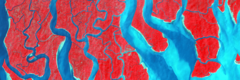
The Landsat imagery displays, set to the Dynamic view. It shows recent imagery and rendered with the Agriculture band combination. The Map Labels layer is turned on and includes a depiction of the main roads. There are two lakes and several towns and villages around them, such as Léré, Lao, and Kebi.

2- In the bottom toolbar, click Analyze and choose Change detection. Confirm that choose Scene A is selected.

You’ll need to choose two images, one before the flood and one after the flood.
3- Under Scene Selection, in the year drop-down menu, choose the year 2022. In the calendar, click the May 8, 2022 date.

The imagery updates to show a Landsat scene captured on May 8, 2022, before the heavy rains. It displays with the previously selected Agriculture band combination. The two lakes, Lake Léré and Lake Tréné, have clearly defined contours. Thin blue lines correspond to the Mayo Kébbi and Bénoué rivers.

4- Click choose Scene B.

5- Under Scene Selection, in the year drop-down menu, choose the year 2022. In the calendar, click the July 11, 2022 date.
6- Under Renderer, click Agriculture to apply the same band combination to the second scene.

The imagery updates to display a Landsat scene captured on July 11, 2022, showing the situation as the flood is occurring. Large areas that were dry land in the previous scene are now covered with water, making the lakes appear overextended and indistinguishable from the rivers.

Next, you’ll visualize the change between scene A and scene B.
7- Click the View Change button.

8- Next to Change, choose Water Index.

This change detection analysis applies the water index (MNDWI) that you learned about earlier in the tutorial to the before and after images, with the goal of identifying where the water pixels are located in each image. It then compares the water index values to determine for each pixel whether there was:
- An increase in MNDWI value (going from no water to water)
- A decrease in MNDWI value (going from water to no water)
- No change in MNDWI value (going from water to water, or going from no water to no water)
On the map, most land areas appear in yellow, indicating they were unchanged. However, areas all around the lakes appear in bright turquoise blue, indicating they became covered with water. This is where the floods happened.

NOTE: The pixels appearing light beige or light blue indicate a slight change in water index value. That’s not necessarily significant, since the before and after images may have slightly different value intensities due to the weather conditions and the time of the capture.
To make the map easier to interpret, you’ll only show the pixels that most clearly went from no water to water.
9- Under Water Index, slide the lower-bound handle until all the yellow, beige, and light blue pixels have disappeared.The pixels disappear when the water index value is about 0.65.

The map now shows the inundated areas in bright turquoise blue.

Under Water Index, the Estimated Change Area value indicates that the flooded areas displaying on the map cover about 10.79 square kilometers (the number you obtained may be slightly different).
NOTE:For reference, here is the final change detection map you should obtain.
In this analysis, you performed change detection to identify the areas impacted by a flood event. The resulting map could then be shared with the relief teams on the ground to help them best focus their efforts.
NOTE: Imagery is used more and more commonly to help with natural disaster management. However, you should be aware that Landsat imagery will only capture a given location at most once a week, and its spatial resolution is only 30 meters (per pixel), so it might not always provide the most timely and detailed images in the context of a catastrophic event. There are other satellite imagery types that provide more frequent images with a higher resolution and that may be preferred for disaster management, but these are beyond the scope of this tutorial.
Go to start page Mapping & Spatial Analysis
Source
This tutorial was originally developed by the Esri Tutorials Team.
You can find the official maintained version at this location https://learn.arcgis.com/en/projects/get-started-with-imagery/
You can find other tutorials in the tutorial gallery [https://learn.arcgis.com/en/gallery/].