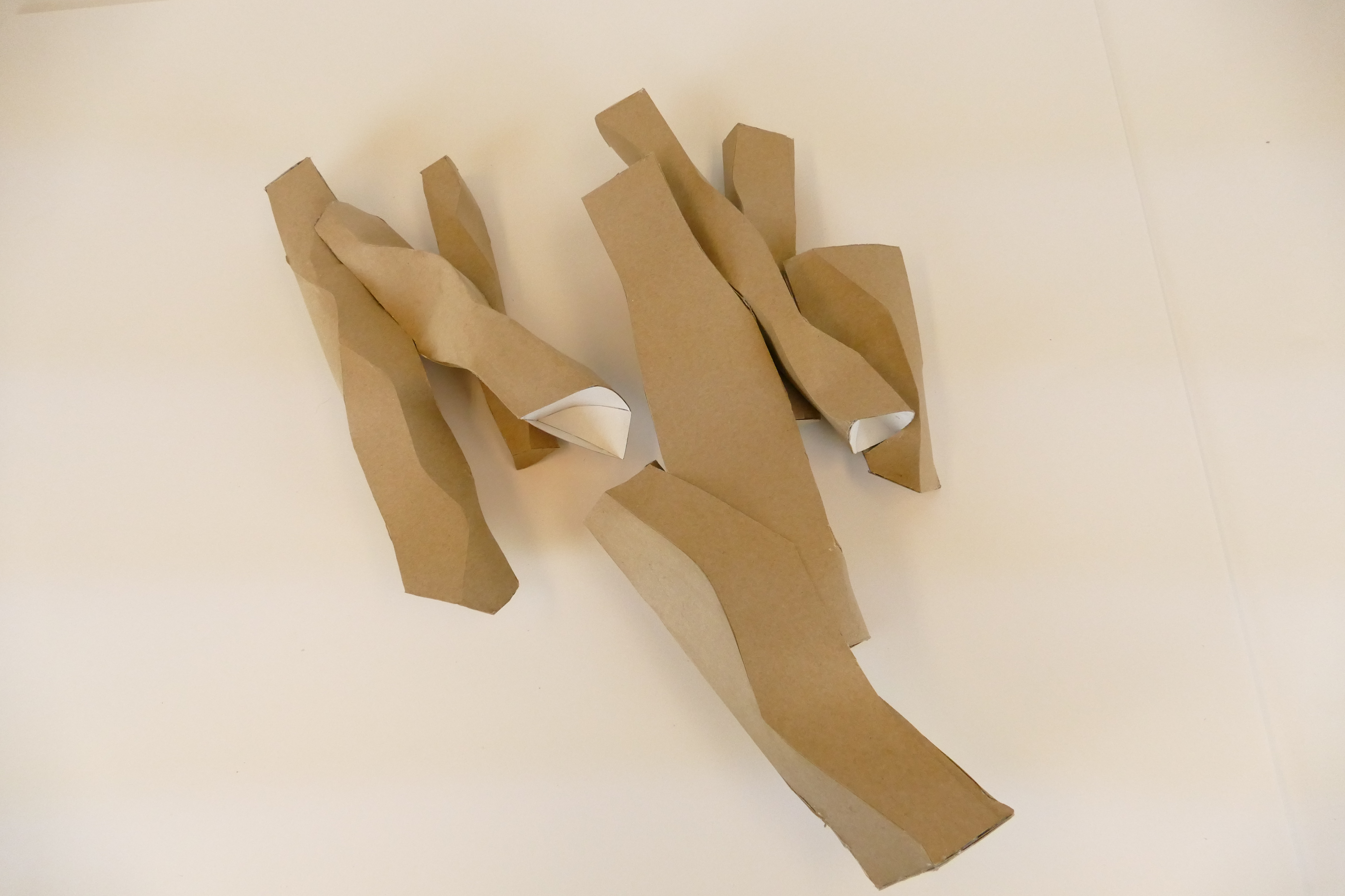
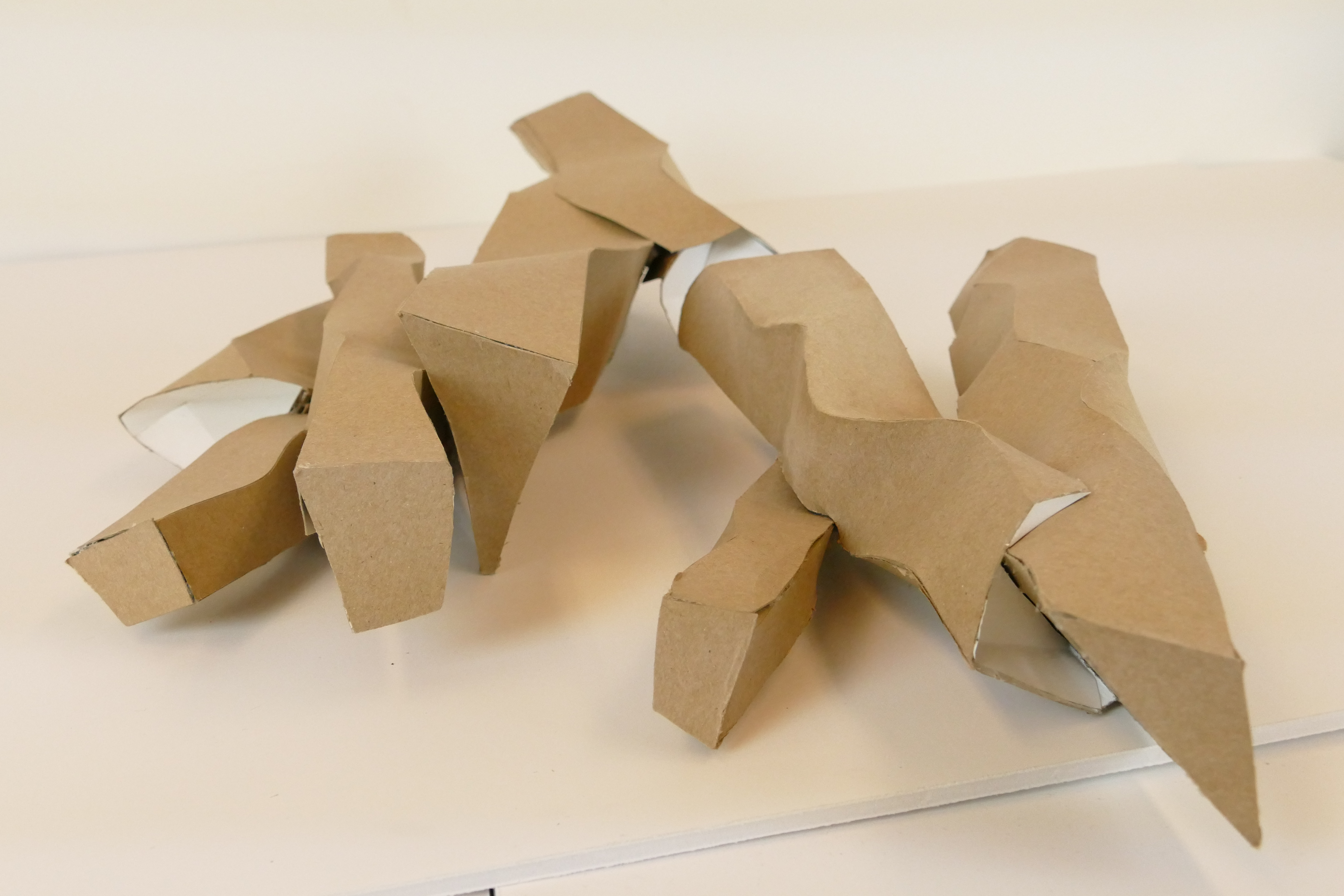
The construction of the mass model from chipboard enabled me to take the ideas about figure-field composition from the indexical diagram and generate a three-dimensional version . This allowed me to develop my spacial awareness and technical skill.
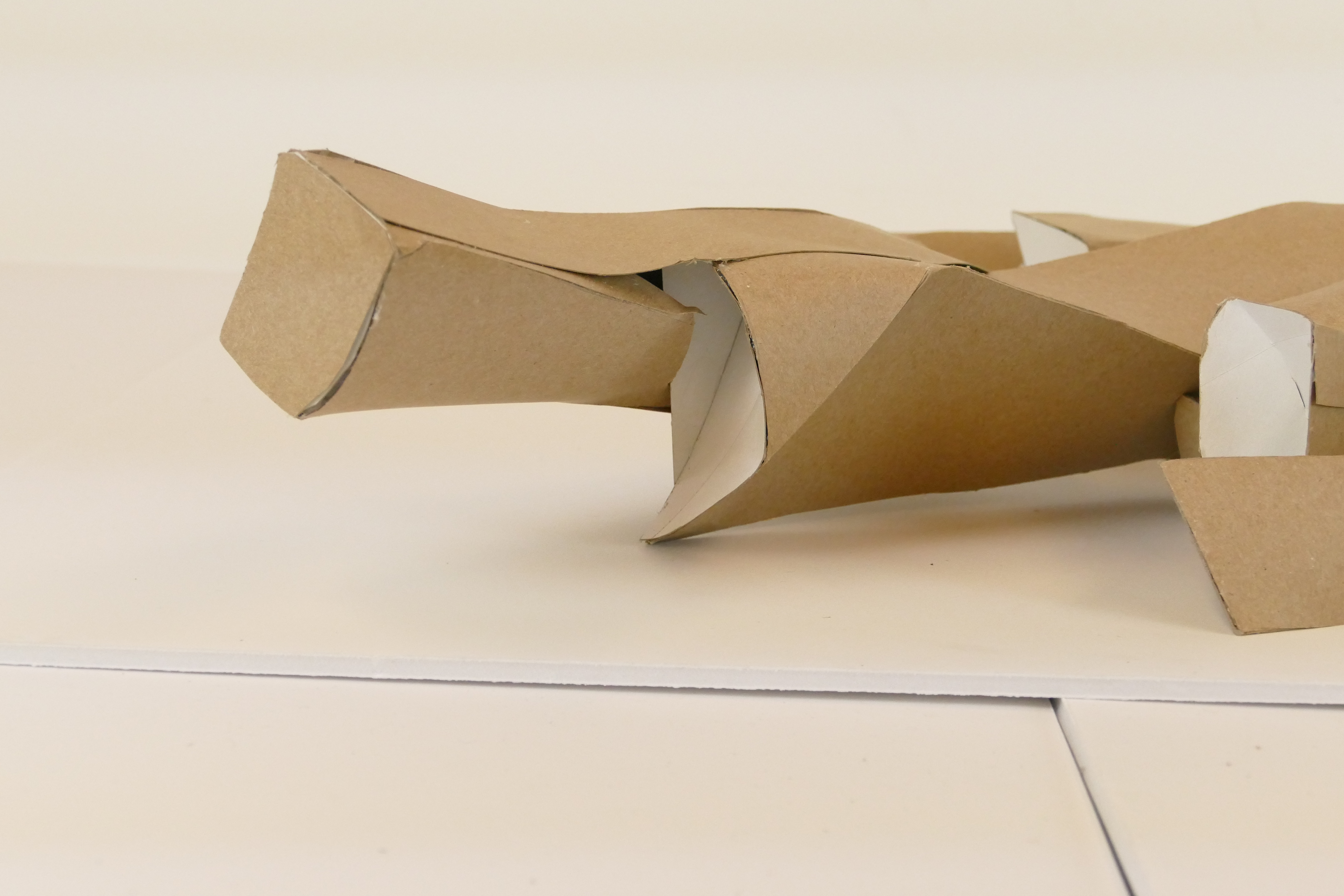
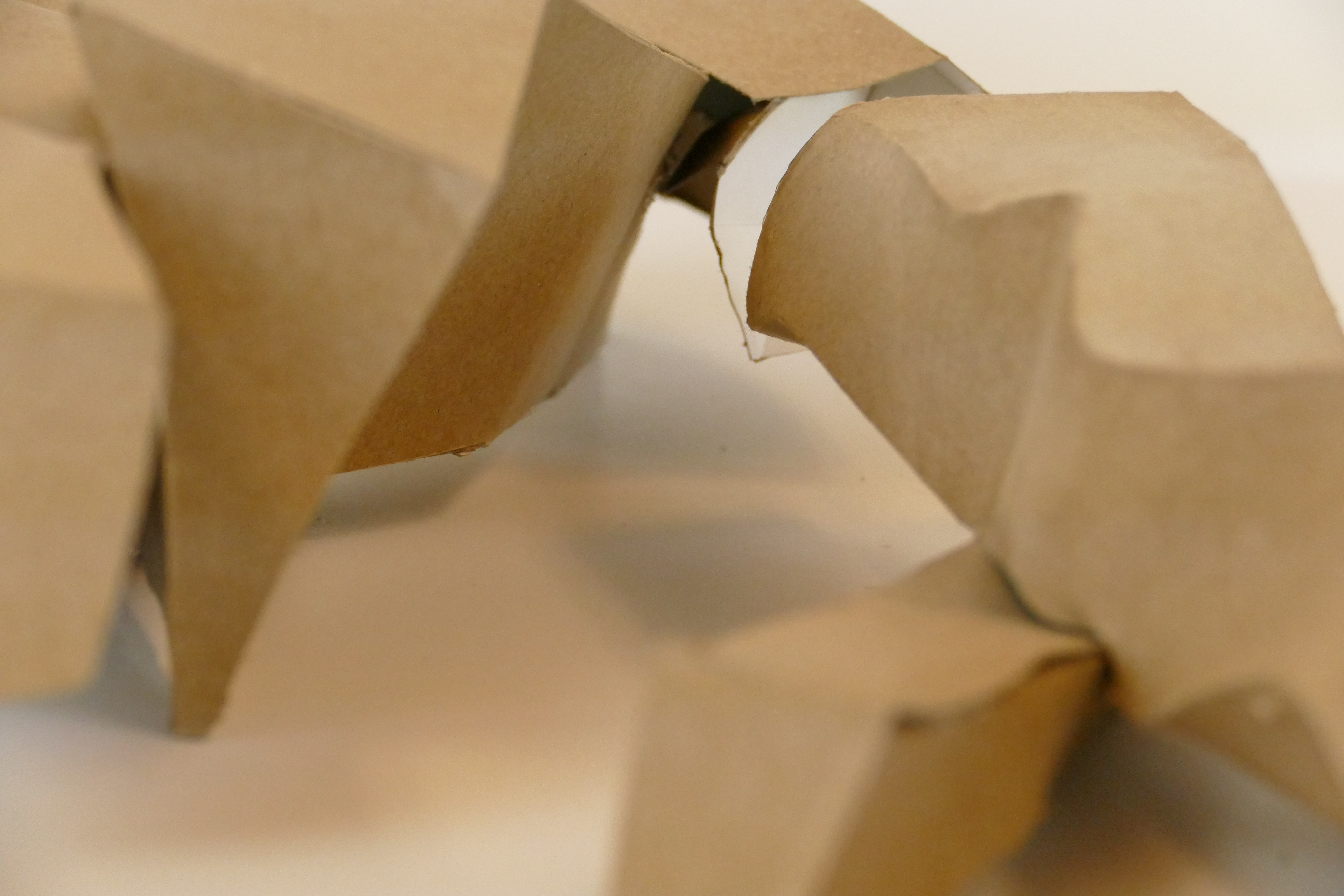
My mass is created from six interlocking bars of different sizes and curved edges. The massing is grouped and follows one axis. It lays on one plane varying slightly. Some of the bars hover while others intersect with the ground.
The mass hovers over the two voids creating an interstitial space. A bar also intersects the ground forming a flushed surface. The other bars either hover or sit on top of the ground. When the mass bars meet the flat-ground it allows an approach and entry way into the building. The entryway is perpendicular to the horizontal bars.
The horizontal bars of the massing create linear interiors that run parallel from each other. There are several places the bars intersect creating large interior communal spaces. The rest of the spaces are organized by a long corridor with separated rooms on the same axis.
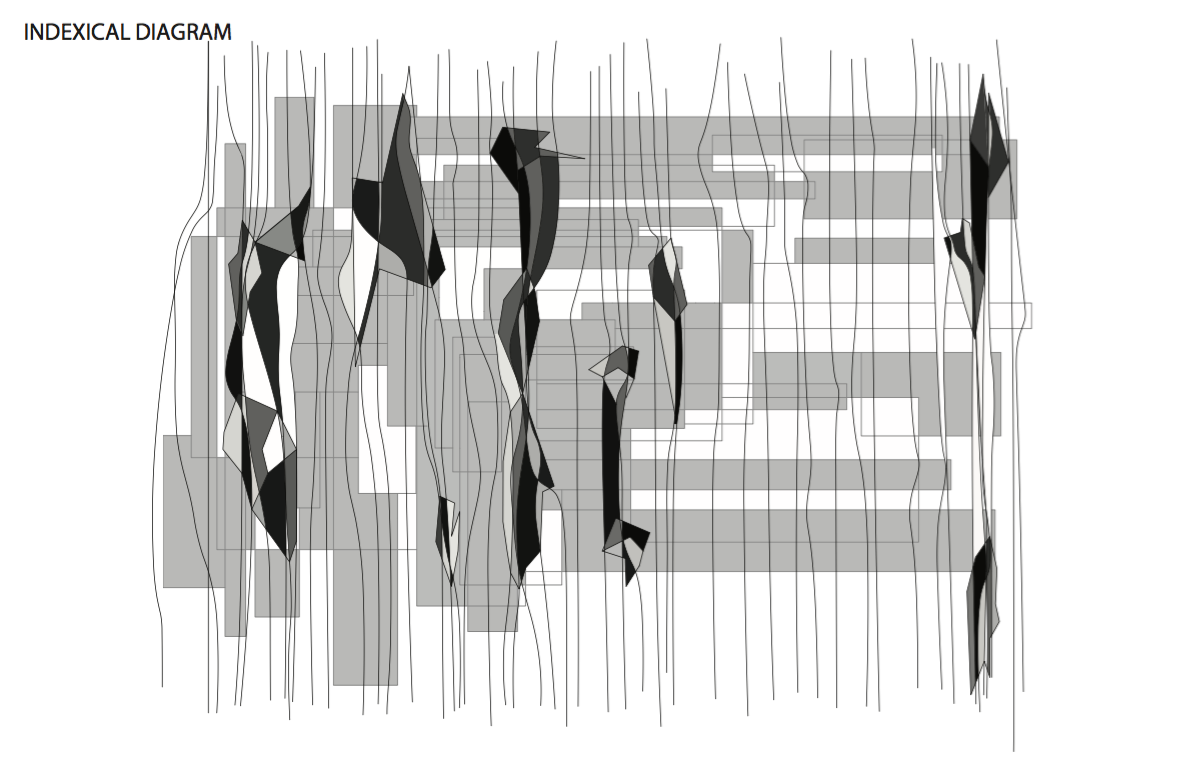
The intention of this indexical diagram was to take the original design of the Sea Lane House and distort and transform the house to create a new conceptual framework.
I expanded on my initial idea and created irregular forms every time a density or cluster formed where the two grids collided. I then shaded these irregular forms in different tones of grey to give a three demential aspect. I intentionally created large voids between the forms to create figure-field differentiation and hierarchy of space.
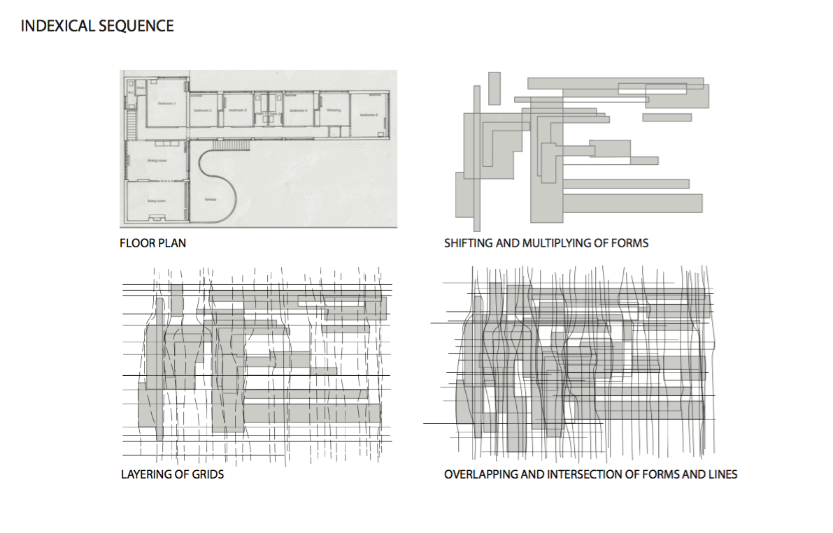
The next step was to create an indexical sequence which allowed me to expand on the organizing principles I discovered in my formal analysis. This was hand drawn and then rendered in Rhino.
I found that the irregular terrace compared to the regular rooms create two overlapping grids, one orthogonal and the other curvilinear. These two conflicting grids is what made the Sea Lane House interesting. I based my indexical sequence off of this idea.
In my indexical I expanded and multiplied the L forms of the precedent house both vertically and horizontally. This was used as a guide for the horizontal lines surrounding the forms creating a orthogonal grid. The curvilinear lines that form the other grid are vertical and are also based off the rectangular forms. These two intersecting grids were generated in the second diagram but then multiplied in the third.
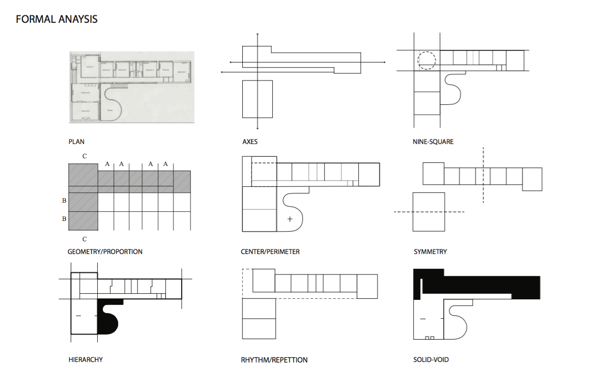
The first step was to take the original Sea Lane House and formally analyze it using the ordering principles of architecture. This was first hand drawn on trace paper and later rendered on Rhino and illustrator.
The first principle I noticed were the two axes that run both vertically and horizontally in the L-shaped plan. These create two directional elements guiding the organization in the house. There is also a third axis on the plan that is created by the hallway. This is a clear path that separates both the communal and private spheres of the house.
The plan also uses a 9-square arrangement. However, because of the intersection of the two bars, the center of the 9-squares is shifted into the top left corner. The 9-Squares form a grid organizing the house into different adjacent but separate spaces.
When analyzing I also noticed the geometry and proportion of the house. Many rooms are equal in both size and shape. The letters (A,B,C) represent the same dimensions of a room in the diagram. For example in the bedrooms there are 4 rooms that are the same size, separated by a smaller bathroom. The dining and living room, represented by letter B, are also the same dimensions. This systematic way of organizing creates regularity in the Sea Lane House.
The irregular terrace also displaces the center because of its hierarchal nature. Instead of the center being where the two wings intersect it is relocated to the terrace.
This plan is highly symmetrical without the terrace. When the two wings are split in the center the rooms are balanced on either side. This creates a predictable plan.
There are two spheres in which the Sea Lane House is organized. There is the private or the solid sphere and the public or void sphere. The private sphere consists of all the bedrooms whereas the public sphere is the living and dining room. The public sphere is considered void because of the limited seperation and parti’s and its openness to the outside terrace and environment, whereas the private sphere has confined closed off rooms.
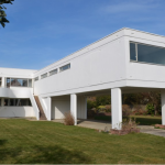
This is the Breuer house I chose to work on for the rest of the semester.
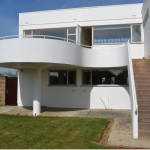
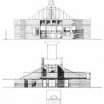
Front Facade
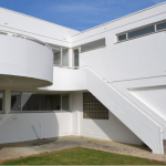
Front Elevation
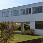
Facade View
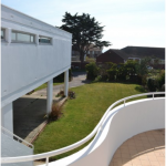
Terrace View
Side Elevation
The Sea Lane House is the only building in britain designed by renowned FRS Yorke and Marcel Breuer. It was constructed in 1937 with a T-shaped floor plan. The long wing forming the stem of the T contains six bedrooms that take full advantage of the ocean view. Due to its 50 meter proximity to the ocean, orientation was a key factor in its design. It’s most innovative feature is that the entire bedroom wing stands on concrete columns that ensures a ocean view from all bedrooms. The graceful curving sun terrace also provides a ocean view and breaks up the rigid rectilinear modern style of the main base of the house. This marks the shift from Breuer’s modern approach to a more expressive style.
There are two spheres to this house. The ground floor provides a service area. It contains a maid’s room, utility room, two garages, a kitchen, and storage spaces. While all the bedrooms and living spaces are located upstairs. Because it is a vacation home there is a distinct separation of the working corridors from the relaxing and living areas. It was designed so that the service world had little interactions with the inhabitants upstairs.
The first floor includes a open fireplace and a dining room with full access to the sun terrace and garden. The two bathrooms, that lay adjacent to each other, are centered between the six bedrooms. All the rooms are perfectly rectangular feeding to its modern and simplistic form of the entirety of the house.
The entrance way does not lead to the ground floor (where the house workers reside) but rather to the first floor. The entrance is marked by a staircase that is conveniently located next to the garage providing little walking distance for the owners.
This house is highly organized in plan, with two distinct wings, one a sleeping area and the other a living and dining area. This was often seen in Breuers designs. The dining and living area are equal in size and shape adding to the precision of layout. Bedrooms 2, 3, 4, and the dressing area all share similar closet spaces and layouts. Rectangular forms are a repetitive pattern and are seen in every aspect of the house except for the columns and sun terrace.
The two story house is built with 11 inch brick walls. The bedroom wing is supported by reinforced concrete columns and floors. A continuous reinforced concrete beam runs around and encases the window openings. The entire house, including the stairs, is painted with a thick layer of white adding to the purist and minimalist modern look.
The house sits on a corner plot of land comfortably surround by a garden and large lawn adding to the relaxing and vacation atmosphere. The gardens generate a barrier to the outside world creating an illusion of seclusion. Where the lawn meets the house there are rectangular pathways of concrete that create a clean line that is repeated in the structure of the house.
Both the inside and outside of the house reflect the modern simplistic design of crisp straight lines. When proceeding from the outside to the inside the organization of the layout is expected, rectangular shaped rooms with similar sizes. On the elevation facing the ocean The windows are large but symmetrical following a predictable pattern. However on the opposite elevation there are clearstory windows located at the top. This was done on purpose because when ascending the stairs to enter the first floor, large windows on that wall would provide a intimate view of the inside to all the bedrooms. However, this is the only elevation that has clearstory windows as the other sides have vast windows to take in the view.
The house sits atop of concrete which is surrounded by grassy lawn. The bedroom wing that is supported by columns creates a roof entry way to the main garage. The roof has no apex and strictly consists of a continuous horizontal line. The windows on the ground floor, which are unable to see the ocean view, have no visibility but allow light to filter in.
Overall the sea lane house is an excellent example of a 20th century modern Architecture. The space serves its purpose as a family vacation home that reaps the benefits of its ocean view. But no one says it better than Breur who stated in an article published in the 1930’s that its “a seaside house for contemporary living… that owes… nothing to period mannerisms”.
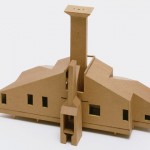
Finally, in 1959 a Beach House Project was rendered by Venturi. This house echoed the guiding principles of what Venturi believed architecture should represent whether in his own work of the Venturi house or in Le Corbusier’s design of the postmodern Villa Savoye.
Because of the ocean’s proximity to the beach house, location and orientation play an important role in how its’ design functions. Thehouse’s architecture is simple based on the expectation that the residents will spend most of their time outside. When inside, the house’s design also reflects minimalism so as not to distract from the beauty of the beach.
There is a terrace on the front facade to maximize access to beach views. Similarly to the Venturi house, there are many different sized windows on the back facade. The two houses also share a dominant chimney. In the beach house, the chimney is vertically aligned to the doorway and rises high compared to the relative height of the house. Both the chimney and the back facade pronounce this building as a house.
Venturi designed this keeping in mind that he wanted only two prominent elevations, the front and the back. The sides are negligible, with no windows or defining features. The front differs dramatically from the back to emphasize the direction towards the ocean.
Like the Villa Savoye, the house also stands on thin beams giving it a floating effect which highlights its’ purpose as a beach house with close proximity to the water. Also similarly to the Villa Savoye, asymmetrical proportions are displayed on the exterior frame.
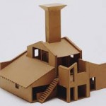
The chimney, for example, is off center. It also divides the roof, breaking it off at the highest point and creating the tension which Venturi keeps referring to. When you look at the roof your eye is usually directed to the apex, but the sudden intrusion of the chimney right above the doorway creates a more complex unexpected composition.
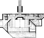
While the interior space is not elaborated on because the house was never actually constructed, the plan shows mostly open space with the largest area acting as the focal point facing the terrace looking out to the ocean.
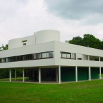
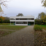
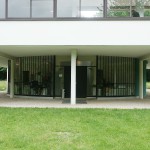
Le Corbusier’s Villa Savoye provides an entire accumulation of contradictions. Essentially, Le Corbusier’s plan of the Villa Savoye exemplifies crowded intricacies within a rigid frame. If we look at Villa Savoye from the outside, we can see thin beams supporting the box like structure.
This structure features a horizontal glass panel which encompasses the whole building. Irregular circular shaped structures lie on top of the geometrical box that forms the main body.
While the top structures on the exterior are the only hybrid forms that appear, the plan of the villa clearly shows asymmetry, flexibility, and most noticeably a ramp. The ramp rises straight ahead along the main axis of the building to the upper levels.
The ramp emerges on the first floor, the main living level of the house where the most formal and public spaces are situated. They stand around a roof terrace concealed from the exterior by a uniform strip window without glass. This catches the sun at any time during the day, which allows the house to be filled with light.
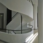
To the left of the ramp is a spiral staircase linking the servant zone to the world above. This architectural choice speaks to the hierarchy and the social relevance of the design. The servants are in a separate sphere than the owners of the house.
The top part of the villa savoye directs the eye towards an active dialogue with the sky, it is not a rigid straight roof. As a matter of fact, if you look at the Villa Savoye from above, you can observe that this structure on the top is not merely decorative but also functional. The two arched niches with the wall between encompass a space used by the owners. This space is connected to an interior staircase which leads to a sitting area that lacks a roof.
The spiral staircase and the curving structure located at the top of the building juxtaposes the rigid rectangular lines found in the main body of the building. Without these elements it would not have the contradiction Venturi looks for in Architecture.