


Abstract
We asked 4 first years and 3 seniors to complete a remote usability test in EDS, focusing on non-article search results (i.e., books, ebooks, archives, and e-resources). The test included an open exploration section, to gather insight on students’ research processes and mental models. We wanted to know about challenges with understanding and accessing archival materials, print books, e-books, and e-resources on and off-campus, as well as student preferences for campus display and willingness to travel.
Goal/Question
As an exploratory study, we were most interested in how students perceived and engaged with our campus-local and Five Colleges resources in EDS:
- What are common pain points?
- What is confusing?
- Where do students’ mental models and expectations not align with our systems?
- What are student preferences in regards to how results are displayed (by campus vs. all Five Colleges), and traveling to other campuses to access resources?
Methods
- Remote usability test with talk-aloud protocol
- Open-text questions about student preferences, campus travel habits, library experiences
Statistics/Data
Participants: 7 students (4 first years, 3 seniors)
Dates: Spring 2018
Campus/College: Amherst College
Contact: Kelly Dagan, Research & Instruction. kdagan(at)amherst.edu
Findings
Success rates
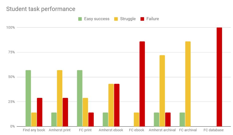
Student success rates for the tasks were low overall, even for simple tasks of finding a print book on our campus. Students often attempted to request books that we had on the shelf; these requests are always cancelled by library staff. Struggle and failure increased markedly with FC e-resources and archival resources.
At a glance
We uncovered seven main areas where student expectations, habits, and use of EDS caused problems and confusion:
- mental models conflict with FC re-resources
- nonfunctional options & buttons
- format signaling = too dim
- unintuitive language
- limiter confusion
- unclear system messages
- search habits
mental models conflict with FC e-resources
Students’ mental models of access and format didn’t match reality, and the system doesn’t offer explanations to bridge the gap. For students, an “online” resource means that it is either immediately available or requestable — ebooks and databases at other institutions did not fit this model, and students largely failed to figure out the correct rules of access on their own (travel to the other campus).
“Online” resources generally blur the lines for student understandings of ownership and access — some students also seemed to conflate library online resources and open web resources when looking at EDS results.
takeaways:
- Reconsider how you are displaying other institutions’ e-resources; if you lump them together with all other results and label them as “Internet” or “Online,” students will assume that they have immediate access, or that they can have it delivered digitally
nonfunctional options and buttons
To compound the e-resources problem, the Request Item option also appeared for non-requestable items, so students tried this option, often repeatedly. The Request error language was totally unclear to them, so they usually didn’t associate the failure with the format, but instead assumed a system glitch. Archival items were the exception; students were less likely to expect that they should be able to request these, so they were more likely to conclude that they would have to travel instead.
In the catalog, the “Go” button on the volume filter confounded some students — they expected it to get them access to the material (it did nothing).
Rather than planning out what option is best, students may “think through the links,” (figure out what something is/does by clicking and seeing what happens). They are more accustomed to having the system narrow their options automatically; if they see many options at once, they may assume that all are applicable (ex: in an SFX menu, students don’t look at the date information, because they assume all of the links are ‘equally good’).
takeaways:
- Remove the Request Item option from items that are not requestable from your campus
- If an option doesn’t do anything useful in that particular context, do not display it. Students will assume that any options they see will work
- Funnel request and access options from the system side, instead of relying on end users to evaluate and discard poor options
format signaling = too dim
Students consistently failed to notice format cues (icons, labels) or misinterpreted these. They also had very little sense of how format might impact access (ex: expecting email delivery of an ebook). “Electronic resources” is not an intuitive term, and ebook was conflated with “PDF.”
Students are most strongly cued to relevance, so they focus on title and summary fields, and they also look at access information — PDF icons unerringly drew their attention, and one student relied on the call number field to determine if something was an ebook or print.
takeaways:
- Develop stronger visuals for resource formats and test these with students
- Apply icons more granularly and consistently – ex: don’t apply a book icon to a book review
- Change the language of “electronic resources” to more specific terms
- Put format information in a consistent location, ideally closely associated with the title or access information
unintuitive language
Students consistently misunderstood availability and access information, including format (“electronic resources,” “online,”) and use (“Library Use Only”), as well as location/ownership (“UM”, “FC Libraries”). The Availability field for e-resources could be particularly misleading — two students concluded that they must have access to a UMass ebook, since the field said “Available.”
takeaways:
- Rewrite format and access information to be more intuitive, and spell out abbreviations (UM, FC ebook, etc.)
- Consider whether e-resources need to have an “available” status displayed (it confuses students in terms of access)
facet/limiter confusion
Facets/limiters currently operate in very confusing ways for students. Students use these in terms of both format and access — in both cases, the system failed to match their expectations. For example, they expected the “book” facet to limit to just print books, not: ebooks, book chapters, or book records for items we don’t have. Students struggled to limit their searches to just print books at Amherst, or limit to just what’s immediately accessible or guaranteed requestable.
Students, lacking insider knowledge about cataloging and systems practices, also tended to over-limit sometimes, or apply facets/limiters that (unknowingly) removed their desired result. One student, looking for scholarly print books, applied the “Scholarly (Peer Reviewed)” Limiter — and got only three results, none in English.
takeaways:
- Adjust facet/limiter function to support quick filtering to 1) print materials at one campus and 2) immediately accessible and 5C requestable items.
- Change facet/limiter labels to make their functions clearer to students
- Test facet/limiter combinations to see where they break
unclear system messages
Request messages were unclear for students; they had trouble determining how long a request would take, or why it had failed. They also weren’t sure who exactly they should talk to about problems (besides “a librarian”). Similarly, e-resource login pages weren’t clear for outside users (they had to puzzle out whether they should have access). Finally, when students got poor results, they often weren’t sure what happened, and didn’t get any tips or strategies for fixing their search.
In general, students were not invested in figuring out why something didn’t work; in the absence of an intuitive error message, they would move on.
takeaways:
- Tailor messages to the context, in terms of what students want to know in the moment of making a request. Also include a direct link to library staff contact options.
- Provide in-context help in response to problematic results (ex: very few results, or too many results).
- Provide intuitive error messages with action steps wherever things break (SFX, system errors, account errors, etc)
search habits
Students are skimming through results very quickly, and they want to see access information at a glance, sometimes assuming everything relevant is already displayed. This posed a particular problem for archival resources, ebooks, and databases (where crucial access information is in the full record)
When finding a relevant title, they want to jump to other relevant titles — the Similar Books and Reviews of this Title sections need further testing, as they didn’t always perform well, and student may assume that there is nothing else available if nothing comes up here.
Misspellings and copy-paste citation errors were common, and sometimes resulted in a completely broken search. Students did not always notice their error in inputs.
Students tended to search by the default options (usually keyword search) first. Especially in the catalog, but also in EDS, keyword results for known titles and topic searches were sometimes completely irrelevant. This impacted student confidence in their own process as well as in the results. Even searches with the title field selected did not perform as well as students expected, decreasing trust in the system.
Conversely, sometimes students did not notice that the first result or first few results were not the known item they expected (they were reviews instead, for example). They then concluded that the record was a “PDF” of the book they wanted (it was not). Trust in relevancy ranking is deeply ingrained – having irrelevant/wrong results at the top three slots causes frequent confusion and student error. Having a book review or a study guide or a newspaper record appear before an actual known work — all of these count as irrelevant or wrong results, from the student perspective.
Students are accustomed to very quick load times for pages — if a page is especially slow to load, they may give up, seek another option, or conclude that the system is broken.
takeaways:
- Put all access information at the Brief View level; otherwise, if access is inconsistently displayed, students will miss it.
- Test the Similar Books and Reviews of this Title sections; suppress if these do not perform well
- Better support spelling suggestions, consider ways for the system to notice common errors (titles starting with “he [additional words],” random dates)
- Make known item searches perform better in all cases; make the default option whatever is most successful in finding known items
- Optimize for quicker load times. Determine a baseline load time and display a loading graphic/indication if the page takes significantly longer than this
campus display preferences
While students didn’t want to miss any potentially relevant (and potentially accessible) sources, they were also generally unlikely to travel to other campuses. In terms of display preference, students largely wanted to see “immediately available and deliverable” options first, and also expressed desires for control and customization.
takeaways:
- Consider structuring relevance displays and filters in terms of “access tiers,” and make it clear what time or travel may be involved
- Allow students the option to change and customize their preferences for results display