
Abstract
Following the college-wide website redesign in Spring 2016, the Amherst Library Web Group ran several tests focused on questions of faculty and student perception and use of the new design.
Goal/Question
How do students and faculty navigate the Library homepage? What are their perceptions of the new design? Where are they encountering challenges or roadblocks?
Methods
First-click testing via Optimal Workshop
Usability testing
Contextual interviews
Google Analytics
Statistics/Data
Sample size:
First-click testing: 28 faculty, 40 students
Usability testing: 7 students
Contextual interviews: 3 faculty members
Dates: 03/2016 – 10/2016
Campus/College: Amherst College
Contact: Kelly Dagan, Research, Instruction & User Experience Librarian, kdagan (at) amherst.edu
Team: Library Web Committee
Results
“Search Everything” (EDS) is the default choice for many searches, though users report feeling overwhelmed by the results. Our search term logs show that known item searches are the most common, making effective retrieval of specific titles a priority.
Students default to “Search Everything” (EDS) out of a desire to get all relevant materials, but often struggle with overwhelming results. Faculty tend to operate in a more targeted fashion, seeking selected databases or tools and ignoring the rest, and reported significant frustration with EDS.
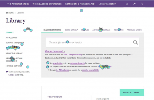
While reactions to the aesthetic design were positive, users expressed frustration with “buried” content and confusion related to specific navigational pathways. The prominence of the central search box may tend to decrease use of more specialized tools (journal finder, Reserves, etc.), especially among novice users.
In testing our Reference tab, students primarily associated “Reference” with “citation,” rather than encyclopedias, dictionaries, etc. Faculty sometimes associated this with “Reference librarians,” or a ‘reference’ to all library sources (A-Z databases), or specific subjects (research guides).
Links and menu items on our homepage were too small, and contrast was too low, for many users to notice these items.
The SFX menu is confusing, overwhelming, and irritating to students and faculty. Users did not pay attention to date ranges, disliked having “too many choices,” and did not understand why this screen was necessary.
From March 2015 — October 2016, our top pages in web traffic were:
- A-Z Databases
- Library Hours
- Find Resources
- Archives & Special Collections
- Research Guides
Files used:
Optimal Workshop’s Chalkmark was used to capture users’ first clicks in specific tasks.
Recommendation
Given the visual complexity of the current design, we need to be aware of the tendency for users to default to the main search box in most use cases. This has implications for how we customize EDS, as well as how we present other tools. As users tend to scan rather than read, we should make changes that support quick comprehension and action.
Action Taken
On the homepage, we have worked to increase size and contrast of our links and menu items, and have seen an increase in traffic via both.
In the SFX menu, we attempted to improve the interface, moving the hyperlink to “Full text available via” instead of the vendor name, and changing the date threshold text color to red — there were few other options for customization available. A re-test showed no improvement in user performance.
Related links
“New Search Box on Library Homepage,” Harvard Library Portal Working Group, 2016
“How Users Search the Library from a Single Search Box,” College & Research Libraries, 2013