

Improved Way-finding Techniques and Signage as a Means to Increase Ease of Use in Libraries with a focus on Technical Learning Commons and Other Learning Spaces Navigability
Sabbatical Report authored by Carol Will
Undergraduate Teaching and Learning Services (UTLS)
Learning Commons Coordinator/Librarian
W.E.B. Du Bois Library
University of Massachusetts Amherst
Abstract
This report is the culmination of literature research, site visits, and attendance at a national conference on Wayfinding. I spent my sabbatical immersed in reading all types of literature and studies related to wayfinding, signage, cognitive impacts on how wayfinding is perceived by human brains, studies of wayfinding in all sorts of venues, along with how important wayfinding is to the user experience. I set out to understand what wayfinding is, along with why it is so crucial to many varieties of institutions and even in outdoor settings. During my visits, I took many photos of signs, architectural wayfinding designs, and anything that spoke to me as being related to the theories of signage I was reading about. Of course, the fun part was experiencing and photographing numerous wayfinding/signage “bloopers;” somewhat sad but well-intentioned human efforts at providing directions, policies, advertisements and anything related to marketing of products and services as associated with each individual institution. My intention was to use some of these photos as illustrations of best practices (and bad) as I became more familiar with the study of graphic design, wayfinding, and user experience.
I visited many libraries so as to gain insight into what signage/wayfinding ideas might be applicable to the libraries here at UMass, however, I was most interested in seeing if I could borrow ideas from other organizations including airports, hospitals/healthcare establishments, retail stores, museums, parking garages…any place needing to entice, guide, persuade the human being into navigating any type of space/building with or without a specific goal in mind. I became tuned into a world of signs and architectural features designed for moving people along and getting them to make choices. Many times, I got lost in my own experiment in trying to navigate my way through an intended place. I was surprised at how uncertain and insecure I felt during some of my visits to new places; and discovered often that well-intentioned signage confused, stymied, or drove me almost to the point of anger. As determined as I can be, there were times that I simply gave up and backed out of places due to frustration, lack of interest, and time constraints.
Wayfinding Conference at the Miami International Airport
The most exciting and enlightening part of my sabbatical research was attending the Society for Experiential Graphic Design SEGD Wayfinding Conference in Miami, held at the Miami Airport. SEGD is a global organization whose goal is to connect people to place (Calori 2015). Miami Airport was chosen as a location because there is probably nowhere better to illustrate the importance of wayfinding than a large, dynamic, constantly changing space where people need to get to places quickly while being able to stay comfortable and safe. Most people are new to the airport making the wayfinding system crucial to getting them to their destinations.
Prior to my visit to Miami International Airport, I read the ACRP Report 52 Wayfinding and Signing Guidelines for Airport Terminals and Landside, a very comprehensive report detailing every aspect of wayfinding as connected to the entire airport, inside and out. The report describes standards and best practices with the idea that all airports would follow the same standard practices. This report is over 250 pages and describes “signing” and wayfinding as related to every part of an airport from roadways, parking, and curbside transportation to every aspect of signage and wayfinding inside of the terminal. Not only do signs and systems have to be conducive to keeping air travelers from missing flights, signage and aids must comply with accessibility laws; and, when I was touring the Miami International Airport, as part of the conference, I was enlightened as to how dynamic the space within a terminal actually is! Flights and Gate numbers constantly change for many reasons; impacting the entire wayfinding system at times. Wayfinding signage competes with advertising; on my tour I was told that most of the profits gained are from food vendors.
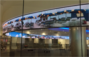
I also learned that there is an onsite signage shop that makes many of the signs. The ACRP report is extremely granular in laying out signage and wayfinding standards. “Consistency” is the “backbone” of airport wayfinding (ACRP 52) and the chaos of too many signs is to be avoided. Everything from the colors, fonts, shape, and more of the sign has to be planned; signs are not randomly deployed…data and measurements are kept. In other words, they are even aware of the pace of travelers and how far in the measured distance they can see signs and architectural influences. Again, “psychological overload” is when there are too many competing signs and distractions; the idea is “clutter reduction.” As the report mentions, ideally wayfinding begins when a building is first designed but unfortunately, as I found out from my literature readings, this is rarely the case. While touring the Miami International Airport, I was also informed of how architectural means are used to impact traveler “paths” along with the idea that art can be used as “placemaking,” the idea that a space or “place” can become a “distinctive” and recognizable place that conveys a type of emotional attachment or even a landmark. (Calori) Examples of this at the MIA were the beautifully embedded metal sea creatures in the marble floor and the impressive long scrolling electronic sign. A look at http://www.miami-airport.com/mia_galleries.asp will show the great extent that is taken to expose travelers to art…a means of entertaining and comforting harried travelers. Parts of the airport were designed to feel like a museum.
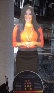
The SEGD Wayfinding Conference showed me an amazing world of not just airports but of professionals in graphic design, employees, or owners, of companies who provide wayfinding signage and systems for all types of institutions including museums, hospitals, retail businesses, as well as transportation and education solutions. Many focused on design of physical signage while others on digital options. One person I networked with designs and markets wayfinding/content management system software that allows for complete management of signs and wayfinding systems. In other words, there are software solutions that replace the human-based organizing tactics typically used in organizing and updating signage. This type of software is being used in buildings such as the Empire State Building, Disneyland Resort, John’s Hopkins Hospital and more. (http://signagent.com/signagent-pro/#ProCaseStudy) Fascinating presentations ranged from what it took to get the Miami International Airport to what it is today (from a wayfinding perspective) to theories and practices from graphic (“experiential”) design that discussed signage, branding, architectural wayfinding, sense of place design, and important solutions to wayfinding problems. To top it off, I was able to personally meet Chris Calori and David Vanden-Eynden, the authors of Signage and Wayfinding Design: A Complete Guide to Creating Environmental Graphic Design Systems; one of the definitive books on the topic (I bought the latest edition and they personally signed it for me). Needless to say, this conference convinced me of the value and importance of signage and the impact of good and bad systems on customer satisfaction and profits. I also realized that librarians could become more involved in this type of conference to the benefit of their institutions.
Site Visits
I visited many, many places and took photos at each one. Some places I deliberately sought out such as academic and public libraries, hospitals/healthcare places, and airports but I also was aware of everywhere I went. I took numerous pictures focused on signage, wayfinding, and architectural features of buildings with theories and topics of my readings in mind, illustrating both good and bad examples. I kept records of all of my visits with comments on my observations of each as related to wayfinding. Although I had planned to focus on non-library sites, I did end up visiting many libraries, particularly public libraries, because I do have a strong interest in them. As one might think, some of the brand new and renovated libraries seemed to be on the forefront of minimal yet attractive signage. As mentioned above, some libraries were less than impressive with signs ranging from ad hoc “nagging” messages still in plastic notebook binder sleeves and a

warning litany of behaviors allowed or not allowed. Some of these signs illustrated a lack of awareness about what makes a space into “ a sense of place,” or a space that one would feel welcome in or attracted to; there is probably never a time where a handwritten sign is warranted (although I did find one at my airbnb that was acceptable given the context).
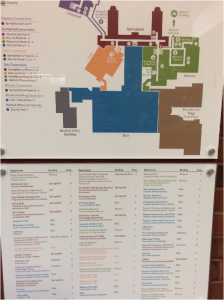
I was surprised at how health care institutions seem to be at the forefront of signage and wayfinding. Baystate Medical Center has an elaborate color-coded system along with elaborate directories. Systems this large are clearly contracted out to folks such as the people/vendors I met at the SEGD conference. Large institutions, like Baystate, still need to have staff available to help guide visitors who are simply overwhelmed by trying to interpret building directories and maps. A look at some of these maps/directories systems will show that there is a fair amount of cognitive “calculation” to be done in spite of the professional wayfinding systems.
During these visits I amassed a large number of pictures of signage, architectural features, spaces that were either carefully designed or not, and more. Currently I am working on categorizing these images so as to be able to use them to illustrate examples of best/worst practices of wayfinding theories along with showing how deployed signage can either aid or hamper wayfinding. I am still rearranging and deleting some. I plan on doing a presentation in the future to convey some of my sabbatical findings. (I am providing some samples at the end of this report).
Literature review
I have amassed a large bibliography of my readings. I read all or some parts of the resources I have listed in the attached bibliography. My focus ranged from the history of signage and wayfinding (as connected to libraries or not), the principles of graphic design or architectural design, psychology, neuroscience of how humans perceive their environments and follow directions (or don’t), and more. The list of related topics to signage and wayfinding is enormous and so I only point out a few in my report so as to provide a taste of aspects of wayfinding considerations.
I became fascinated with old and new theories of why humans get lost and whether or not they are born with an innate sense of directions (most scientists say no) (Pollet, 1979). I learned about information overload and how the brain deals with it (not well). While some think that more signage equals better directions, there is a tendency for the human brain to block the message due to too much “noise.” (Dudchenko 2010).
I discovered that there is a person at the University of Rhode Island who wrote her entire dissertation on investigating public library user wayfinding behavior. (Mandel, L. 2012) To greatly simplify, Dr. Lauren Mandal spent a lot of time researching and observing the particular routes that users took in a public library. One of her conclusions (among many) was that there were simply too many signs in place and that navigators often did not “see” them or use them in their wayfinding endeavors. (Mandel, 2012). As with other institutions, I’m confident that Mandel’s research techniques, along with some of her findings, may be applicable to studying academic libraries.
The classic piece Romedi Passini’s Wayfinding in Architecture (1984), begins with illustrating how many built spaces are like labyrinths and difficult to navigate. (p. 14). He discusses the process by which human wayfinding becomes a cognitive process of understanding the environment, along with making subsequent decisions and then executing these decisions into “behavioral actions.” (p. 46). While we don’t need to necessarily understand all the basics of wayfinding behavior, it is interesting to see that wayfinding is a lot more complicated than one might initially think. Passini discusses the cognitive perception of the “built environment” and how architecture can be used to assist or hamper wayfinding. I did take some pictures illustrating how the “built environment” aided in moving people toward a direction or destination.
I did some research on digital signage which comes with a host of concerns such as cost to deploy, special issues regarding the content of the message, maintenance, return-on-investment, and more, including the fact that there are actually scientific formulas determining how many templates to use to keep a digital sign content “fresh,” (Kelsen, K. 2010, p. 65). In other words, digital signage is not a matter of set up and leave on if they are to be successful in their messages. Airports are the experts in digital signage deployment probably due to their need for quick-changing messages and to appeal to contemporary crowds.
What Signage and Wayfinding Mean to the Libraries at UMass
I amassed a great deal of information during my sabbatical time, much of which may be pertinent to thinking about signage and wayfinding in our own libraries. I am still in the process of organizing my material and thoughts.
It is fairly evident that the W.E.B. Du Bois Library and the Learning Commons (my particular focus) need to study human traffic patterns of users coming into the library (as did other researchers). Possible methods to do this would be to recruit students unfamiliar with the library and have them perform some navigation tasks while being observed. One method was to use Go Pro Cameras to record the path taken by the student and to note the “decision points” in trying to perform a task/goal. (Kinsley, Schoonover, & Spitler, 2016). Signage should be looked at holistically with each sign examined carefully as to its purpose. We should resist the temptation to heedlessly add more signs to a system that is in need of an overhaul.
Surveys could be designed in order to gather and study intended tasks of users when they visit the library. By determining desired goals and tasks, signs could be better designed/placed so as to enhance those particular tasks. Ex: This fall I volunteered for the Welcome Desk in the lobby of Du Bois and realized that one of the most asked questions was “Where can I print?” Yet, there are no signs directing people to where the printers are; there are signs saying “Learning Commons” yet many students might not know what that is. At some point in the future, we might want to consider the idea of a Content Management System for signage (as I had mentioned above when I met a vendor at the wayfinding conference). At the very least, we need to look at our signage with new eyes with the idea that we could decrease the number and lessen the “noise” of so many signs. There is talk about renovating the lobby/entranceway of W.E.B. Du Bois and issues of wayfinding need to be addressed when moving forward with any lobby plans.
Just last week I joined a User Experience group of academic librarians that met at Smith College to discuss wayfinding and signage and its impact on our users. I plan on discussing some of the findings of my sabbatical with this group along with showing some of the images from my many visits to institutions. I plan to use my research and the information gleaned from my sabbatical to improve wayfinding and signage as the Learning Commons is renovated.